Onwards, Together
PhonePe is one of India’s most used and trusted digital payment apps. In May 2021, it crossed 1.14 billion UPI transactions, translating to a whopping 47.7% share of the total UPI market in India. Its registered user base, in June 2021, includes over thirty crore Indians and over two crore merchants.
We partnered with PhonePe to create a dynamic brand identity system enabling the brand to express its distinct voice and build strong recall across its rapidly growing universe of experiences.
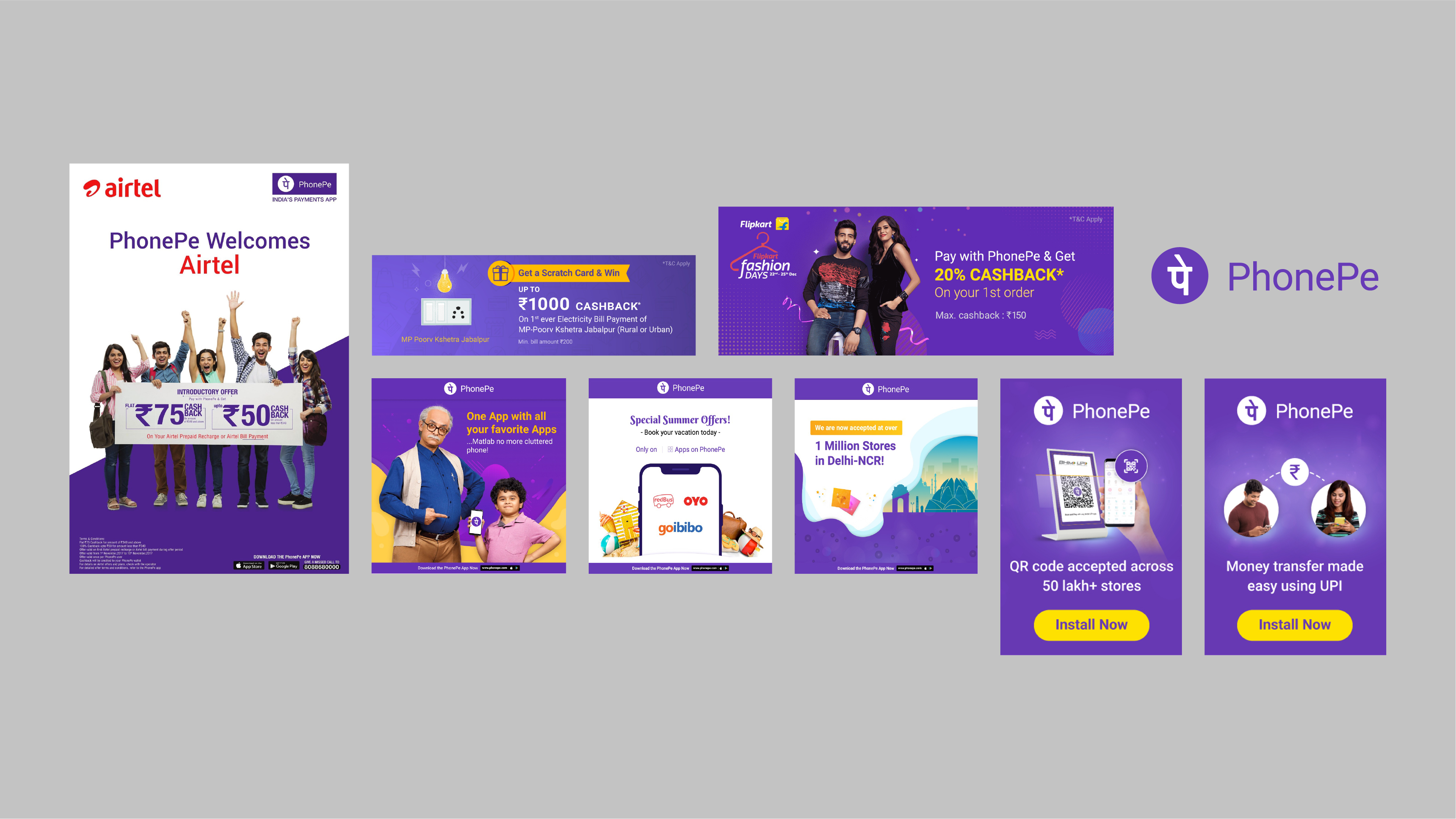
Initial PhonePe brand design (before rebrand)

The spirit of "Karte Ja, Badhte Ja"
Background
The initial PhonePe brand identity had evolved organically and intuitively in response to different needs of an emerging business, and limited primarily to the logo & primary colours. By the end of 2019 the user base had reached significant proportions. These numbers were only set to grow, and by most projections, at an astoundingly accelerated rate. In parallel the organisation had a deeper “experienced” sense of its needs, and their own internal impulse. Therefore the time was just right—at the intersection of massive growth and clarity of purpose—to look at brand identity to support growth.
The Voice of Collective Progress.
The new identity brings to life the energy and optimism that the PhonePe brand infuses into the lives of people, by providing freedom to mobilise money to fulfill big and small aspirations. With joyous bursts of colour & movement, the identity system expresses the confidence and delight of smooth, seamless financial transactions.
A Toolkit for every Brand Moment.
The PhonePe identity system is a vibrant toolkit that anchors brand presence in offline and online environments. Integrated design of visual, motion & sonic identity assets, builds seamless and powerful collective recall, across different interactions—from in-app experiences to OOH advertising and radio ads. The system encourages creative play to suit myriad communication scenarios, for the rapidly growing ecosystem of services & utilities—now and for the future.
Impact
The brand identity system not only brings consistency to the rapidly growing PhonePe universe, but also provides meaningful character when embedded into different aspects of users’ lives—giving the fintech platform a positive, human voice. Through different sensory cues, it gives form to the delight, that the product enables for its consumers.
For internal teams & deployment agencies, the system provides characteristic building blocks by way of assets & their behaviour, that allows them to create new instances for design with high brand recall.
Since its deployment in 2020, the identity system has impacted and driven a 360° transformation in Phonepe’s brand expression, from marketing promotions to delightful product experiences. The system has paved the way for structured innovation & exploration by teams at PhonePe that allows them to continuously build for better and more meaningful experiences, while staying true to the brand’s core personality.
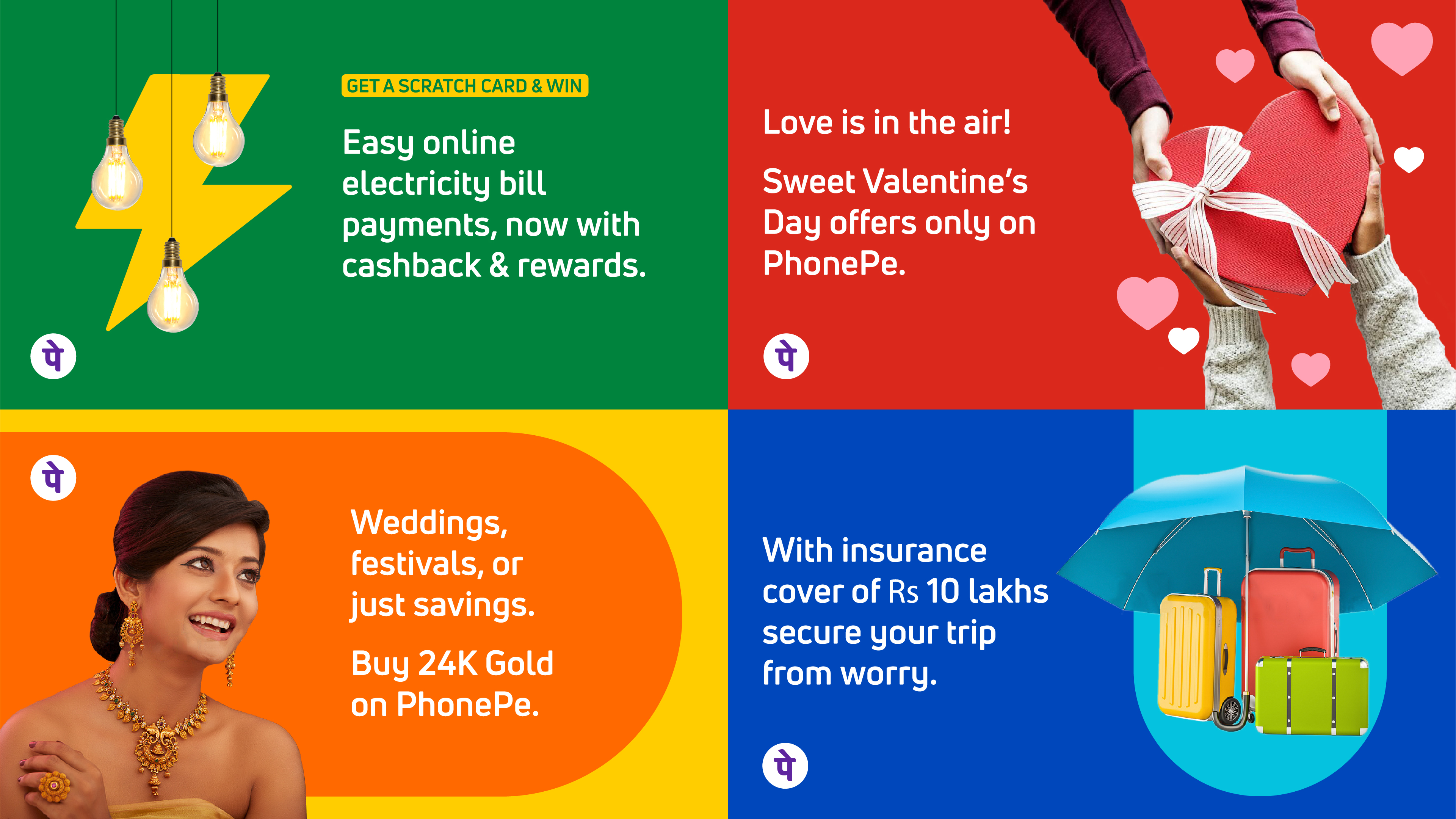
The PhonePe brand identity project was developed in close collaboration with internal stakeholders, enabling deeper understanding of the implications of the identity system on various aspects of consumer experience & execution challenges across these experiences. Here are a few snapshots from the design system:
Logo Refresh
Old Logo (left), Refreshed Logo (right)
The refreshed PhonePe logo builds on the recall of the original logo, adding distinct characteristics that amplify its confident, warmer character and enables bolder visibility in both online & offline usage.
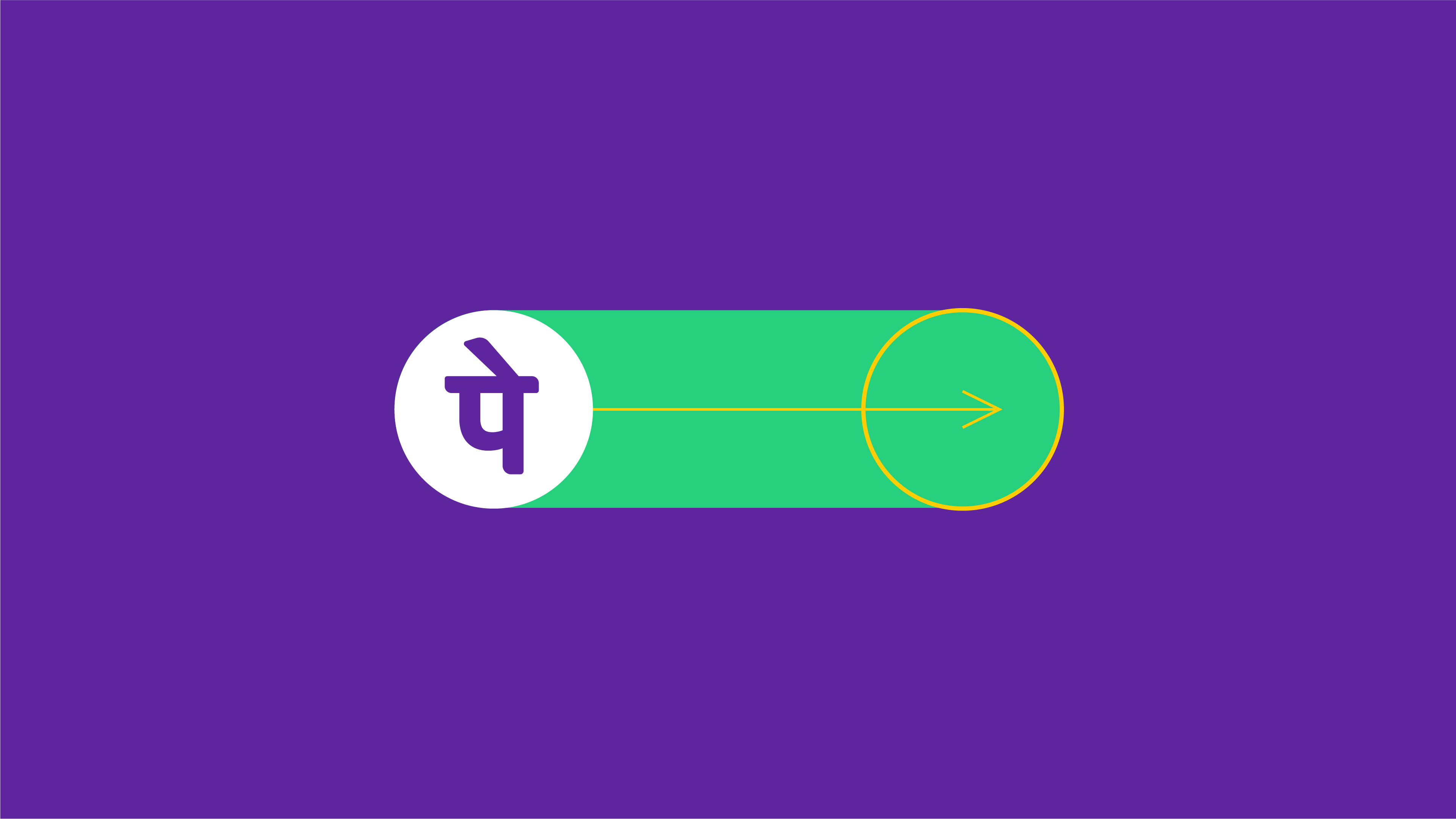
The Beam
Always moving forwards & upwards, the Beam is a flexible yet consistent brand marker for PhonePe. It integrates with communication in static & moving media, with flexibility for use with images, video, typography and illustration. While consistent in form—variations of size, colour, movement & composition of the Beam—allow purposeful adaptation and add expressive vibrancy to the PhonePe brand world.
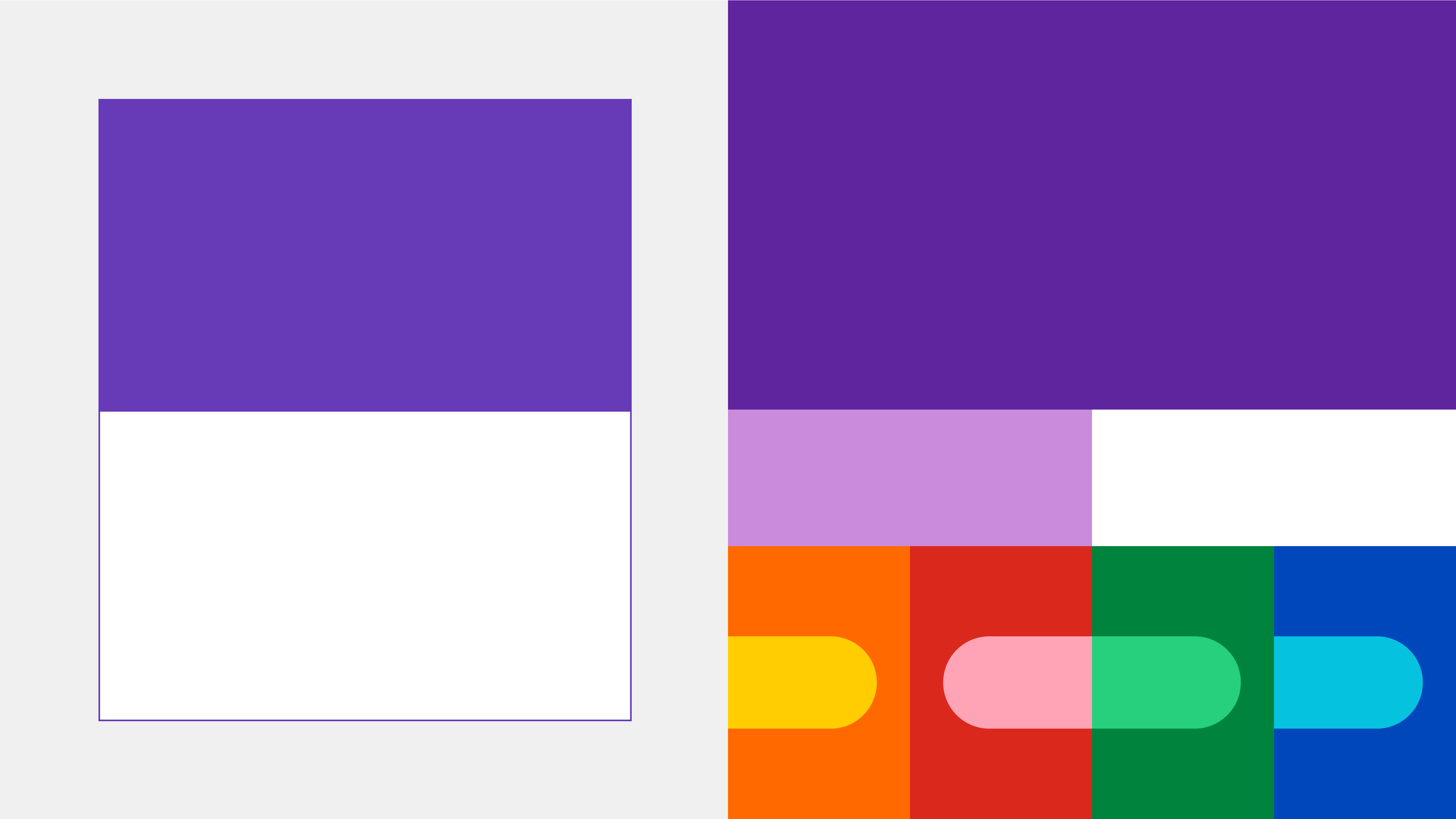
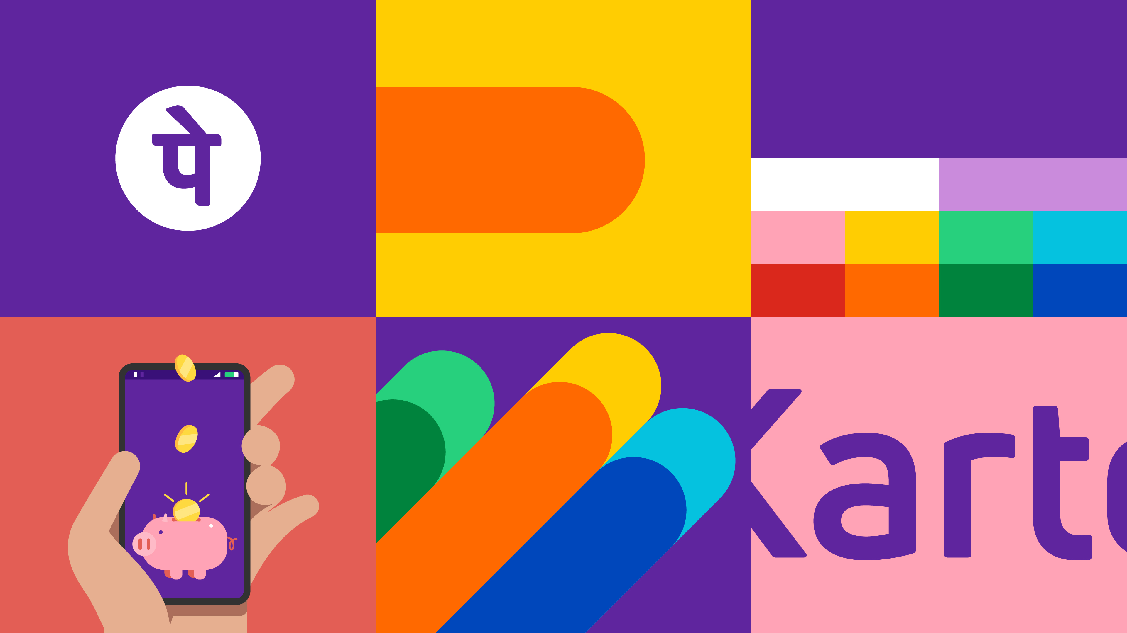
Colour Palette—Old (left), New (right)
Use of colour for varying content.
Colour System
While the primary brand colour was updated for stronger presence in offline & online media, an expanded secondary palette of vibrant hues was created to support contextual play for communication across diverse offerings.
Movement
With a focus on screen-first applications, motion behaviour provides stronger character to moving media for PhonePe. Built around principles of bold, smooth and joyful movement, a toolkit of animation guidelines, custom transitions and effects provides ingredients to build engaging on-brand content.
Sound
The sonic identity for PhonePe uses auditory cues to express the optimistic & inclusive character of the brand in communication.
The brand soundscape is a harmonious composition that captures Phonepe’s ambitious vision of collective progress. With its ascending energy and richness, it is the sound of aspirations on the move.
The sonic logo for PhonePe is a distilled expression cuing decisive simplicity of the product experience, and used as brand sign-off for advertising films and other video content.
The payment notification draws from the sonic universe, to build functional & powerful brand connect in product usage and is engineered to cut through ambient noise in environments.
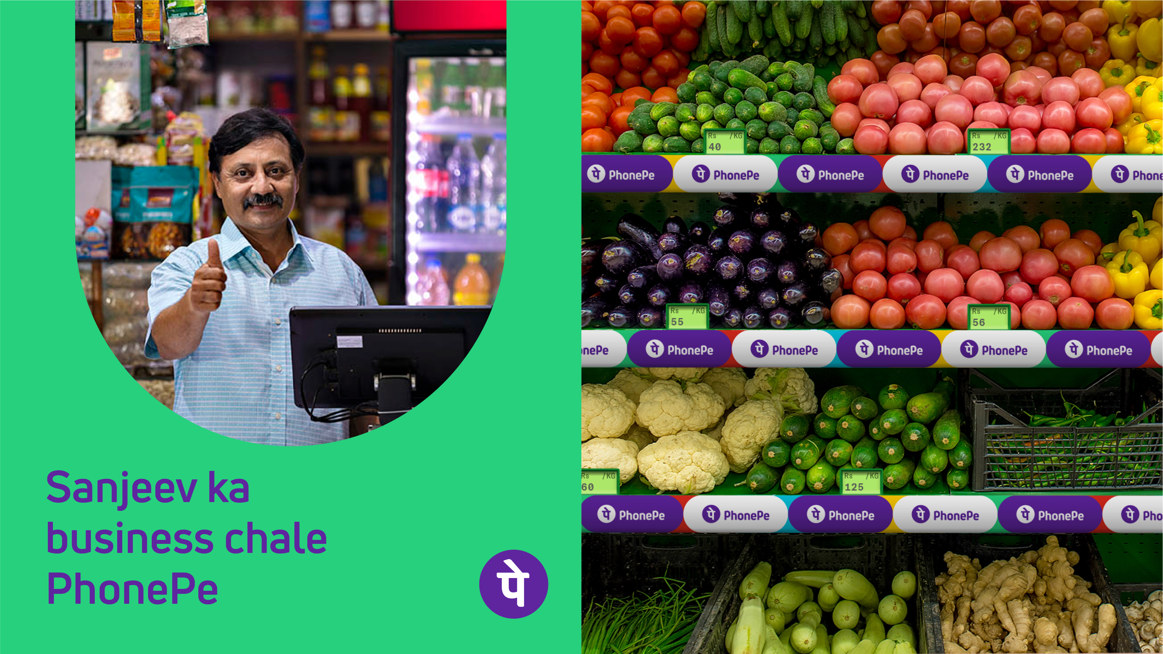
Image-making
Guiding principles for image-making, from photography to illustration, were developed to extend the vibrant brand personality to visual content.

Team
Shreeya Kurien, Nikhil Ranganathan, Siddharth Nair, Vishnu M Nair, Mohor Ray, Rajesh Dahiya, Addikt (Motion & Sonic design support)
Featured
The Hard Copy. Read the full story here.