Riding Into the Future
Redesigning a brand identity is always challenging, warranting a keen understanding of the overall shift in a brand—first internally, and then manifesting externally. Even more challenging is redesigning for a brand that carries a century-long legacy and lives in the hearts of its lovers—its riders, explorers and tinkerers. The Royal Enfield visual identity, starting from its early form of inception, has grown organically over the years. When commissioned for the redesign, we were conscious of the unmistakable influence of its historical heritage on the brand. In parallel, along with the internal stakeholders, we were also looking towards the future of the brand—poised for consolidation, growth and diversification. The challenge thereon, was to evolve the idea of legacy, which has traditionally been Royal Enfield’s strongest asset, into the purity of the Royal Enfield motorcycling experience, that is enduring and eternal.
Our year-long engagement resulted in the creation of a finely crafted visual identity for the brand, that consolidates experiences across business verticals and touchpoints, through a distinct presence. Taking cues from heritage, and embracing the future, the new identity expresses the spirit of Royal Enfield motorcycling—leaping into a brand space that is timeless, iconic and vibrant.
Research and Immersion
The first phase of the project, apart from a month-long immersion by way of conversations with brand stakeholders and first-hand experience at the manufacturing plants, entailed a three-part study of—(a) the motorcycling sector with focus on brand identity, (b) understanding the nuances of British post-war design (wherein lies the provenance of the brand) and, (c) translation of the insights from consumer & brand research into cues for visual identity. The distilled cues for visual identity created a strong framework for design development and evaluation, in subsequent months.
Cohesive Vibrancy
One of the areas that needed a deeper understanding at the commencement of visual identity, was the quality and character of craftsmanship that the brand genuinely owned. This was critical as it guided decisions at both strategic and drawing-board levels for the visual identity. One of the key insights, that the brand’s view craftsmanship is human, led to the overall identity family’s openness in embracing diversity and quirks. The resultant family of assets, was not oversimplified or brought under a strictly uniform mould. Instead, a consistency of richness and restraint, of beautiful functionality and purposeful craft, binds it together.
The Royal Enfield Logotype
The new Royal Enfield logotype is an evolutionary step forward from its predecessor, inspired by the commanding presence of the design of the motorcycles, and drawn for higher recall and finer translation into both 2D & 3D renditions. From the selection of a drawing direction that best represented the enduring legacy of the brand, close to 100 iterations of detailed drawing variations were created, rejected and refined to arrive at the final face, taking into account the nuances of movement, power and craftsmanship that are integral to the motorcycling experience.
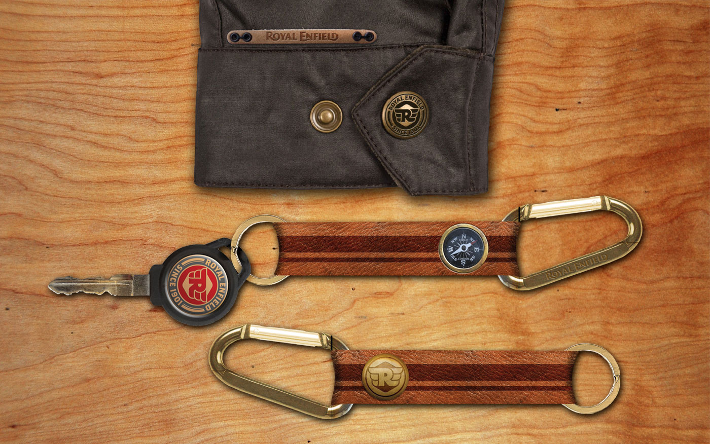
The Royal Enfield Stripe
The hand-drawn dual stripe on the tank of the iconic Bullet model from Royal Enfield is a living testament to its human-crafted approach to design. We identified and recreated this iconic element as a unifying graphic asset to be used across brand communication & touchpoints—retaining a sense of the parent brands with flexibility to adapt to individual contexts.
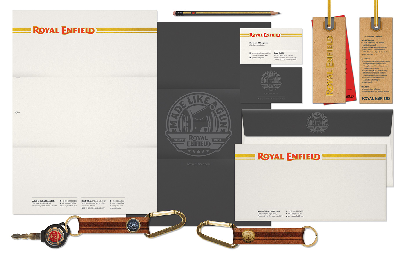
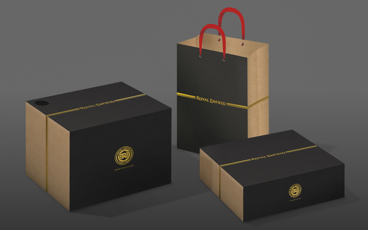
Supporting Brand Assets
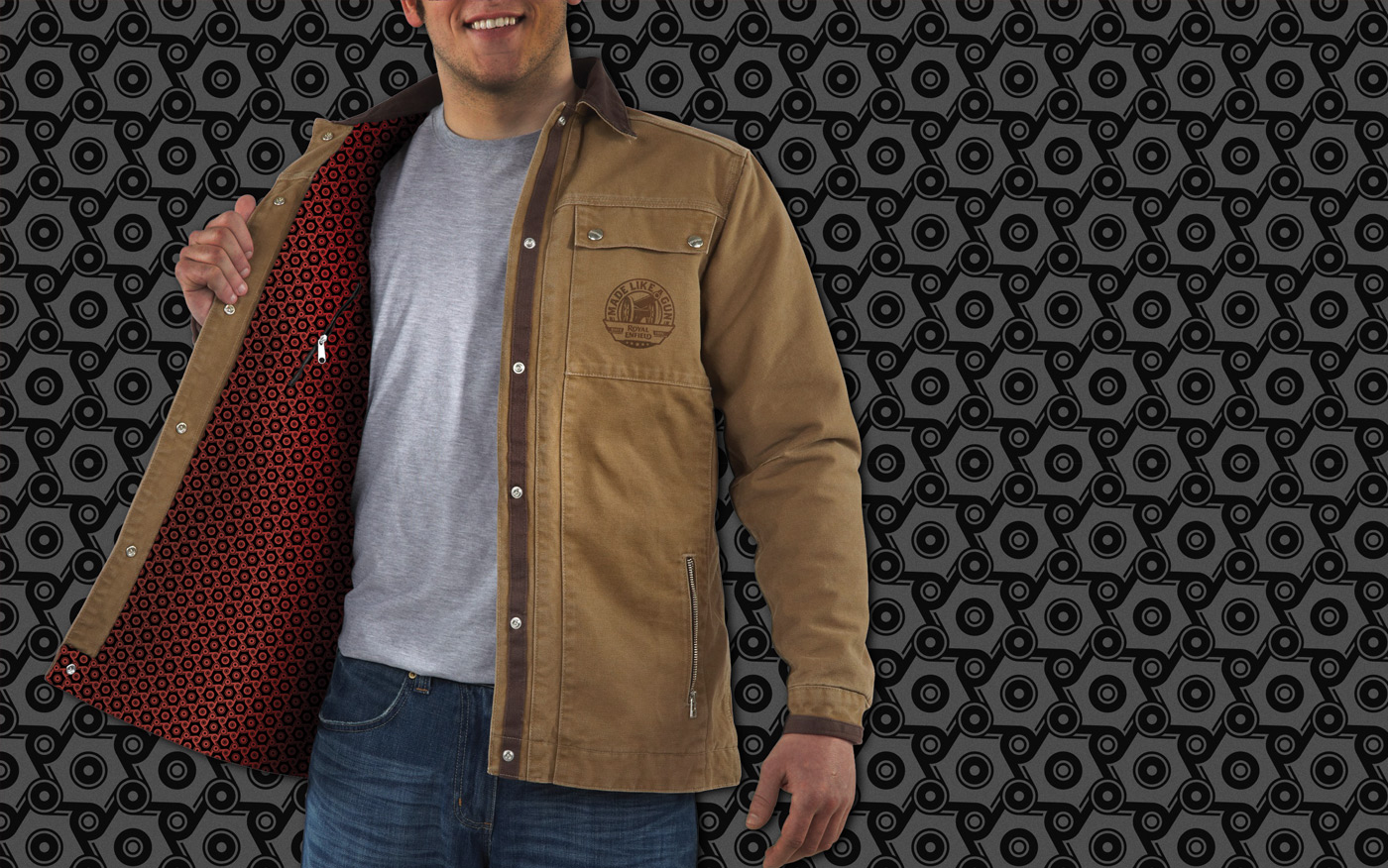
Additional brand assets like the Crest and variants of the Seal were reimagined and rearticulated, both in form and added meaning in application. For instance, the Crest inspired by the original mark dating back to the brand’s origins in weapons manufacture, is designed to highlight and celebrate the provenance of the brand. The ‘RE’ Seal is a contemporary monogram, affording multiple variations to brand different verticals and touchpoints.
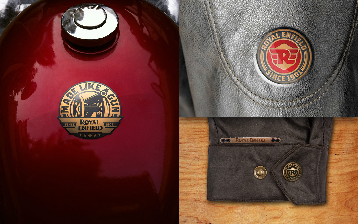
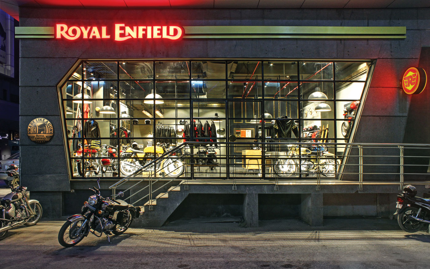
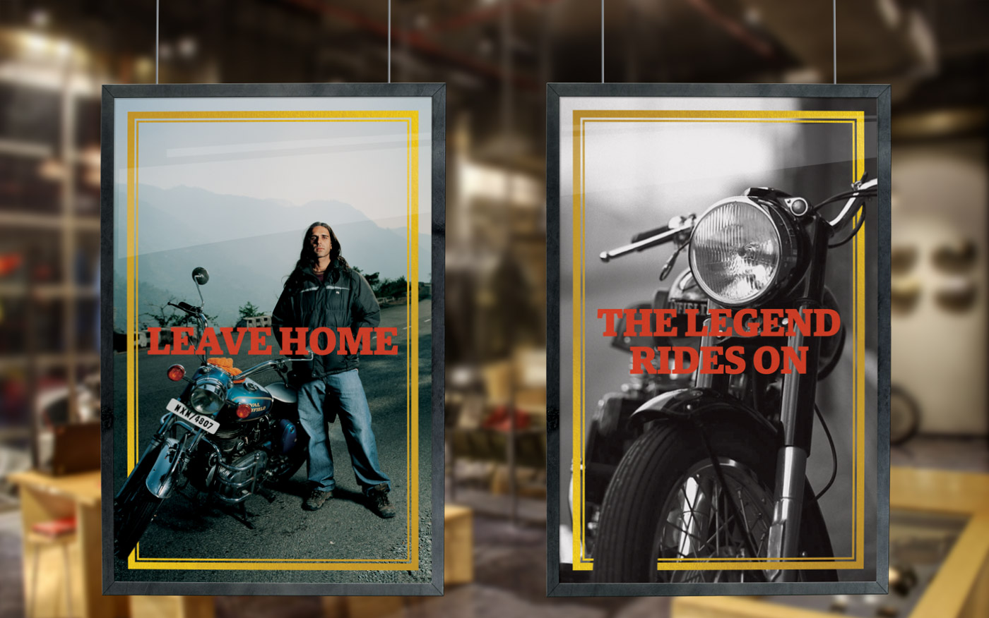
To consolidate the handover of the comprehensive identity system, application and extensions of the assets & language, for high-engagement touchpoints like Accessories, Packaging and Retail Stores were designed.
Visualization support for 3D Badging: Trampoline Design
Retail Spatial Design: Lotus Design