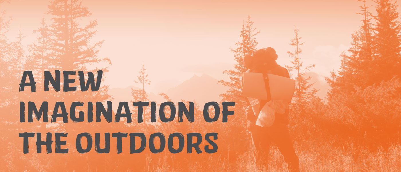
A New Imagination of the Outdoors
Background
Beginning in the 1990s, Wildcraft grew into India’s most loved home-grown brand of outdoor outfitters. The brand was born when a group of friends who were passionate about the outdoors and pained at the unavailability of quality outdoor gear in India, started making quality, affordable gear in their garage. The brand grew organically from the ‘garage years’, and garnered an unprecedented loyal following in the next decade owing to the design & endurance of its products.
The Brand Shift
In 2014, as part of holistic brand revitalisation, Wildcraft began to expand the brand vision to more inclusive view of the outdoor experience, that embraced both professional and leisure segments. The timing was opportune with a growing culture of outdoor exploration India, and was coupled with sharper focus on the youth segment. Redefining the identity became key for holistic brand re-alignment.
The Premise for Design
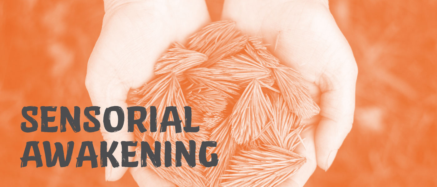
Extended or brief, sporadic or periodic, the stirring of the senses in outdoor interactions is universal and undeniable. As we mined the brand and consumer research to find the core, the sensorial awakening through outdoor interactions emerged as a strong central idea. It opens the brand to an inclusive voice, breaking down barriers associated with high-performance, extreme physical activities. Instead, it celebrates exploration and engagement with the outdoors, at any scale; and it represents a basic human longing for liberation.
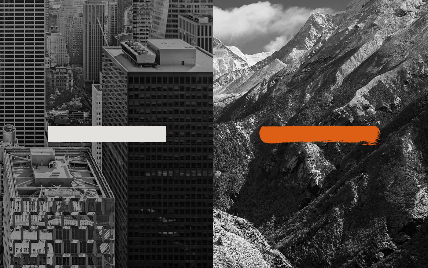
Life vs Living. The liberation of the outdoors, represented by the 'Wild' stroke—the building block for the Wildcraft identity.
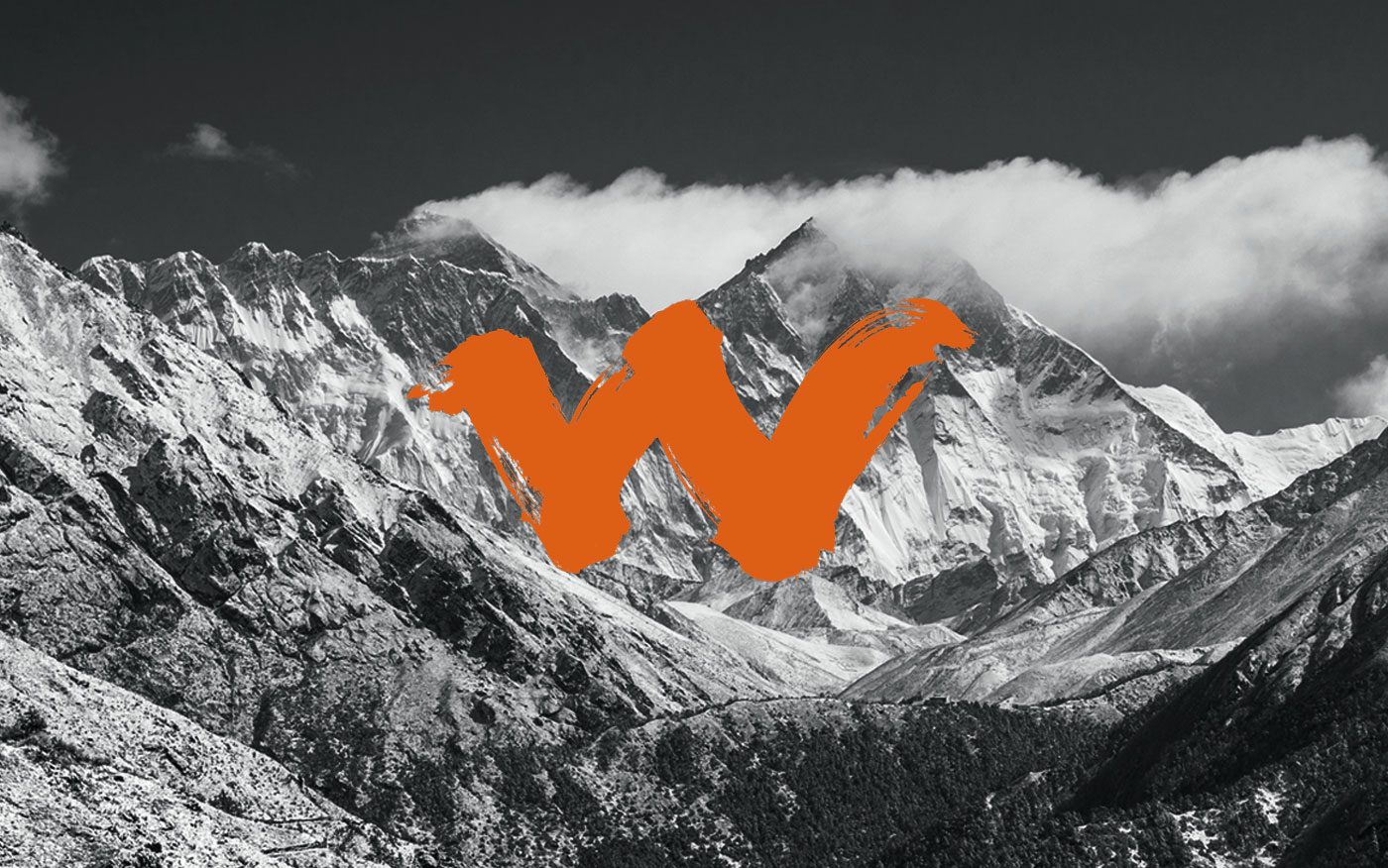
The Wild mark
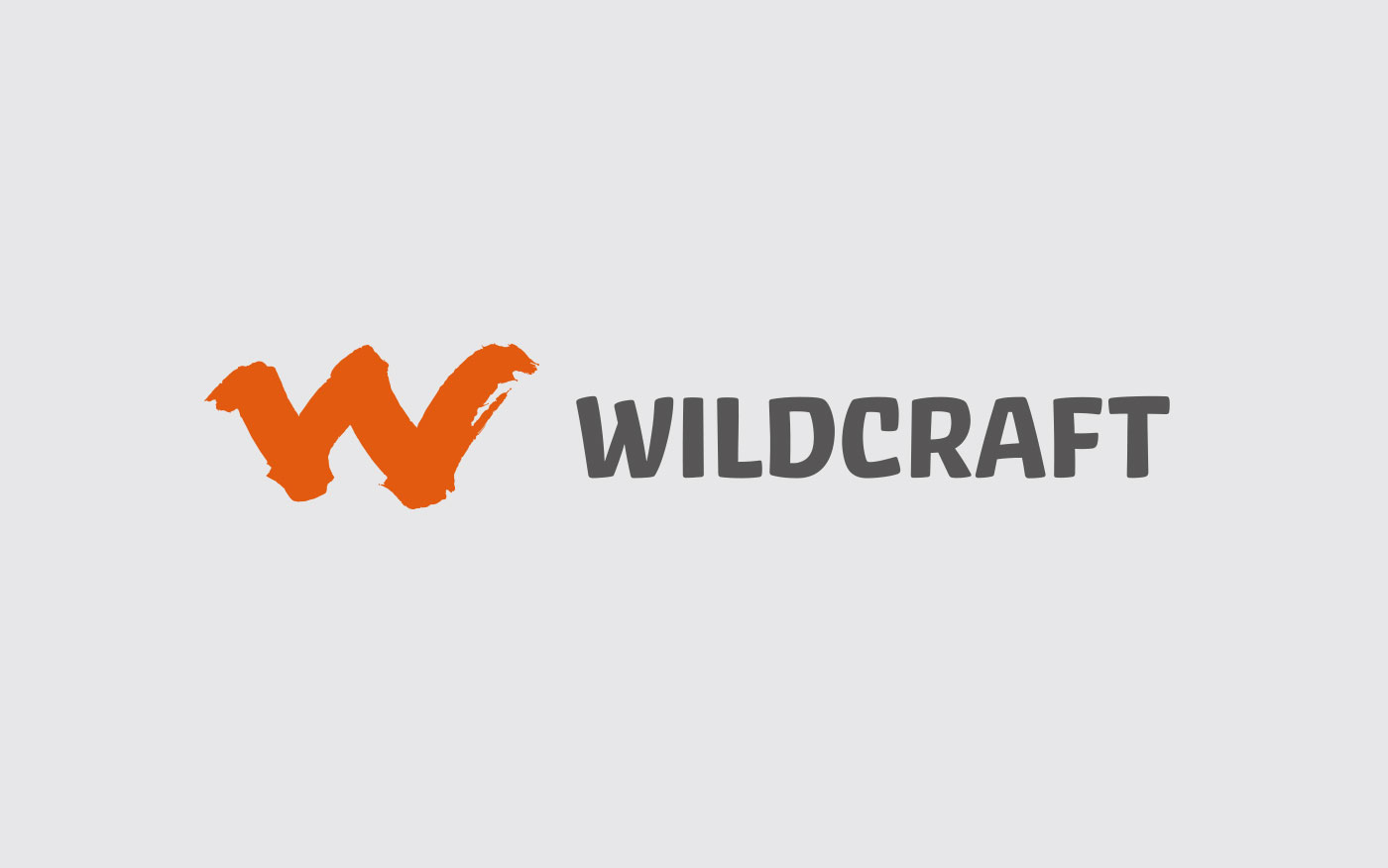
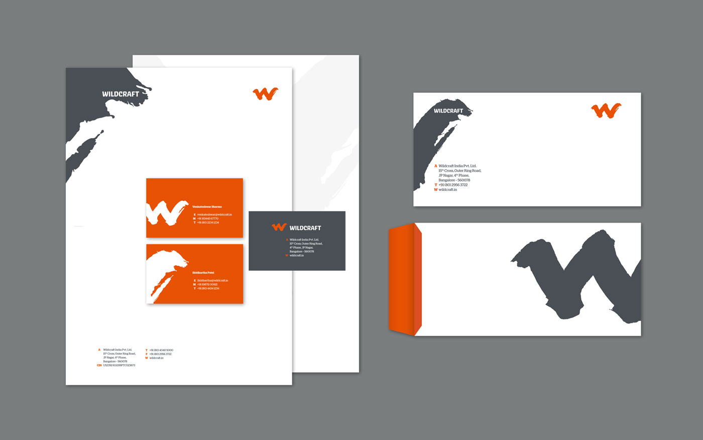
The Wildcraft Logo
The Heart of the Identity
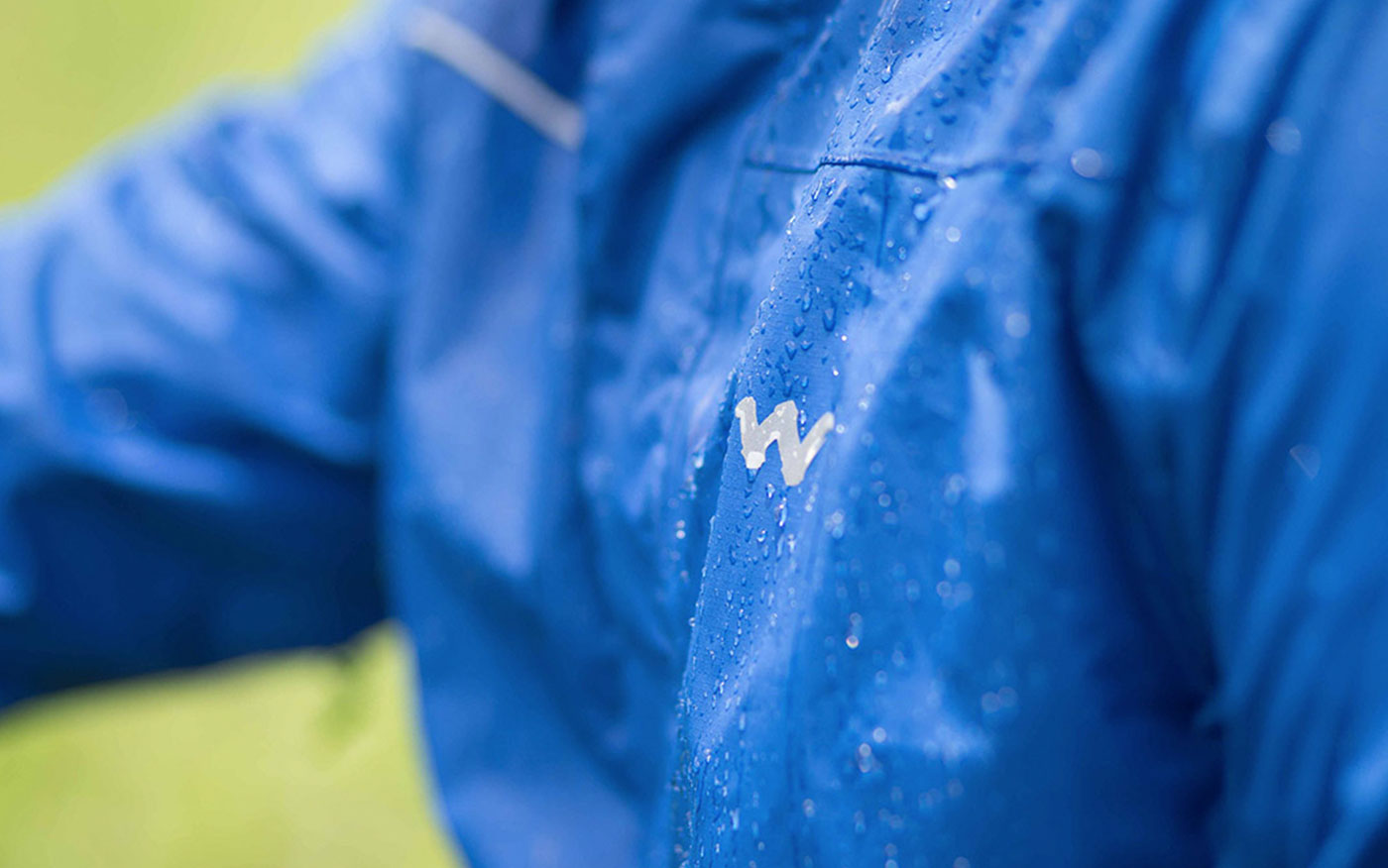
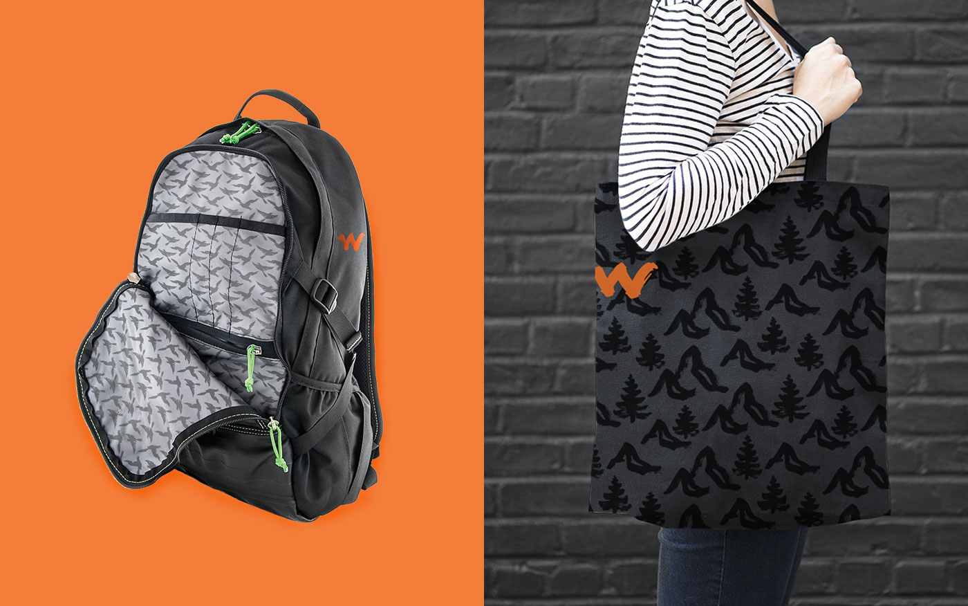
At the heart of the new Wildcraft identity is a sense of raw liberation that outdoor experiences bring, visualised as a characteristic Wild ink stroke—primal, vigorous and unfettered. The Wild stroke moves across the spectrum of identity assets to create an entire brand world of forms, type, patterns and icons, establishing its raw, liberating personality across diverse channels & campaigns. Collectively it brings strong recall, differentiation and vibrancy for the Wildcraft brand.
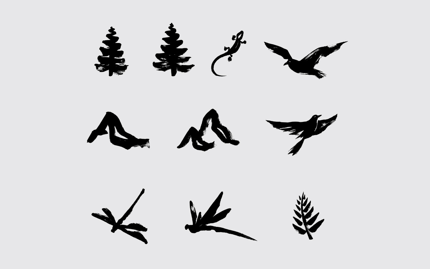
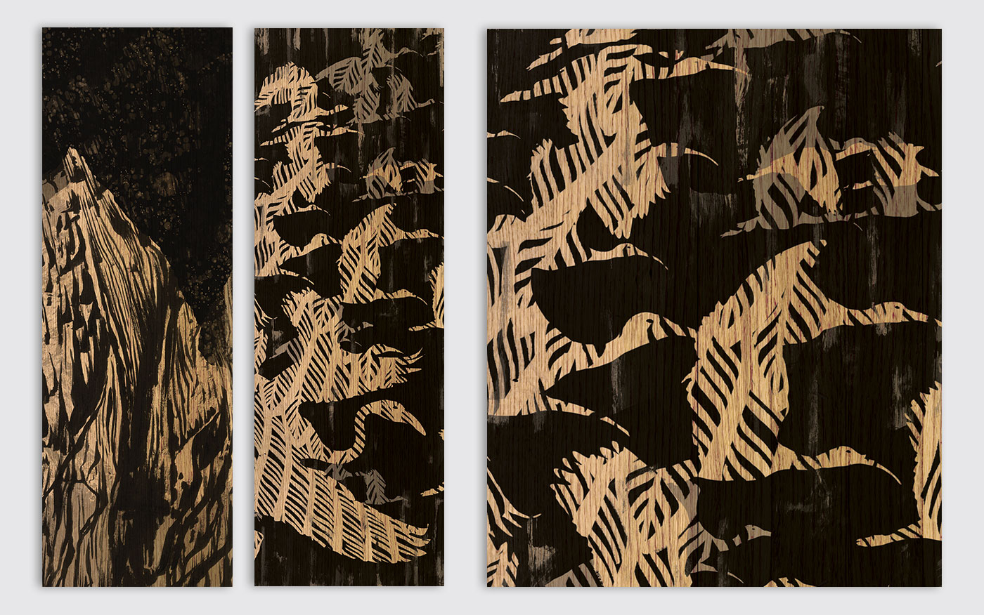
Illustration style for pattern development
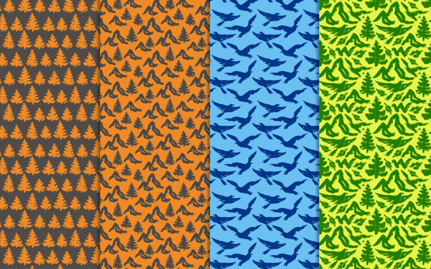
Brand pattern versions
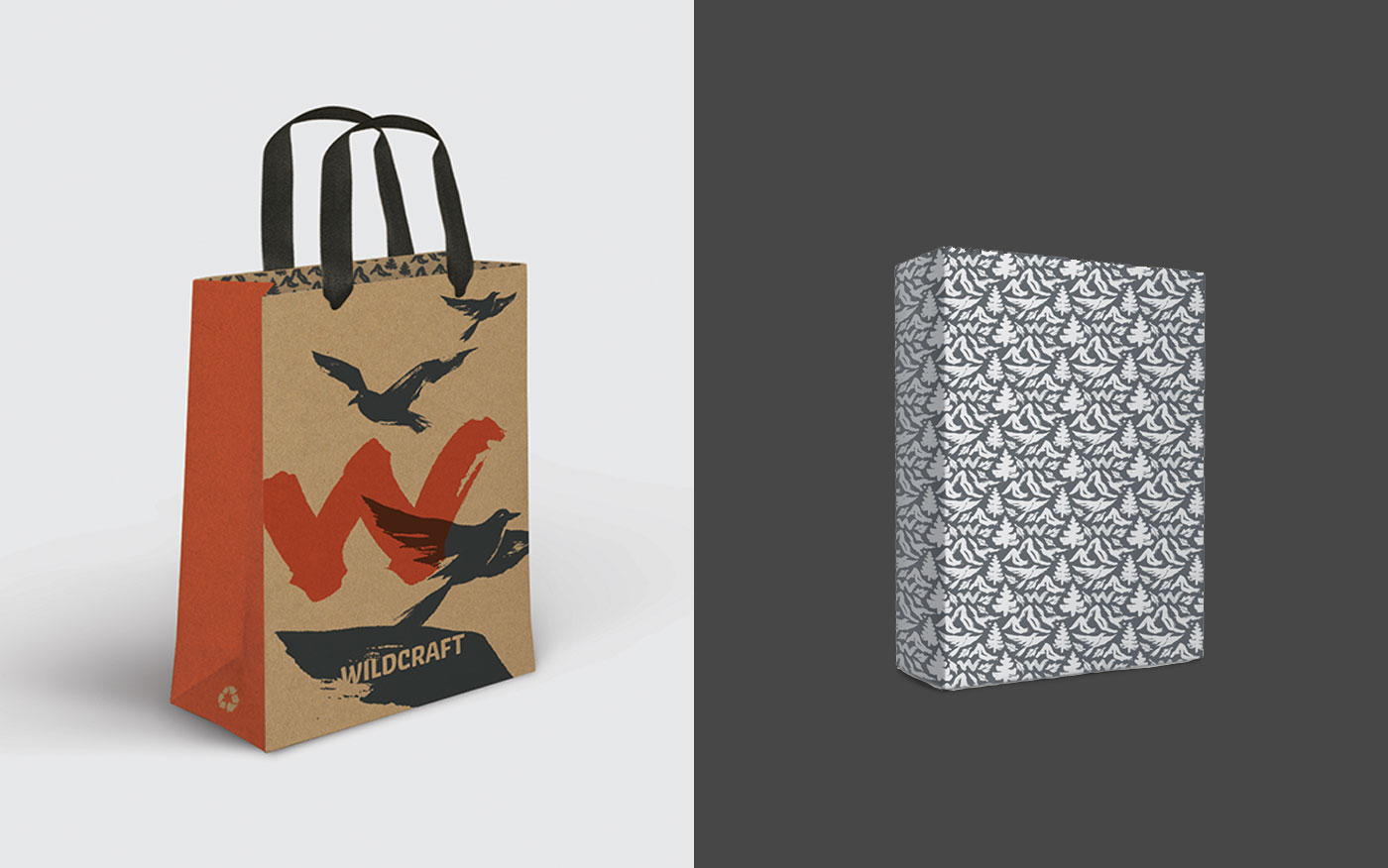
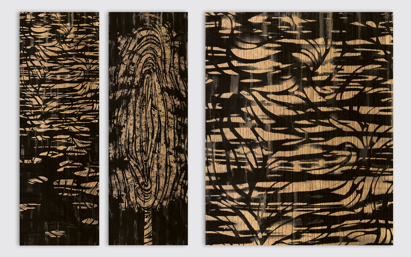
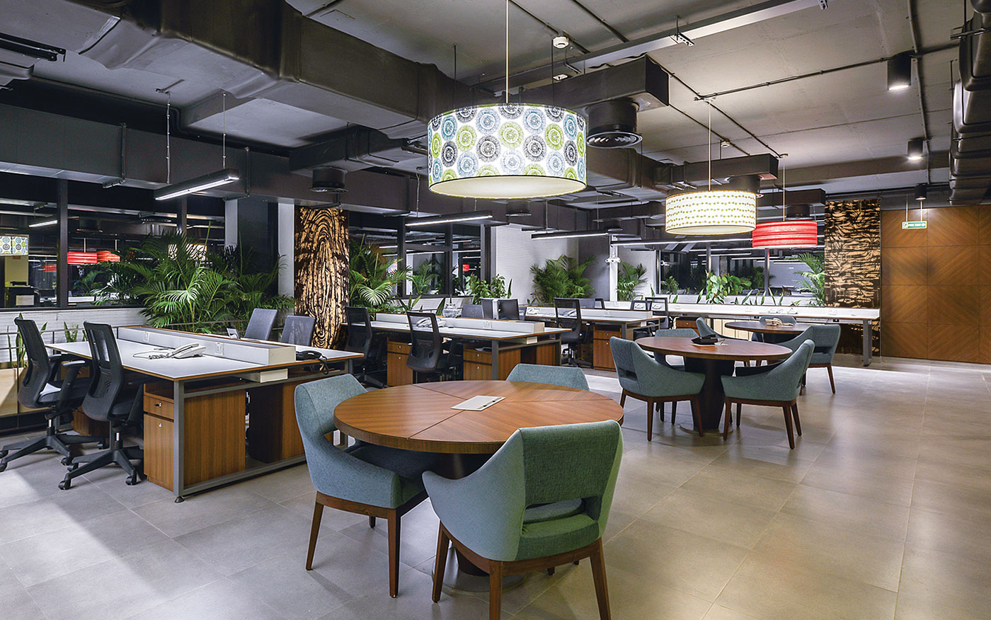
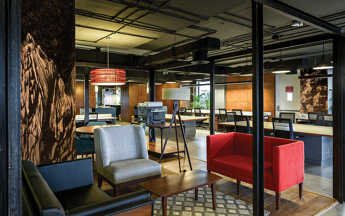
Ambient graphics, bringing the outdoors inside
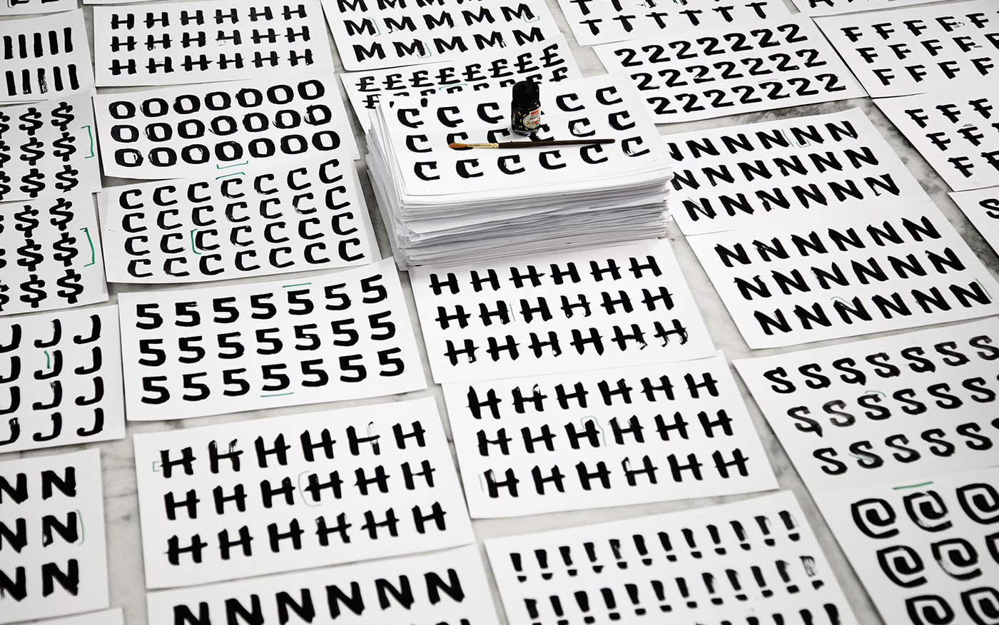
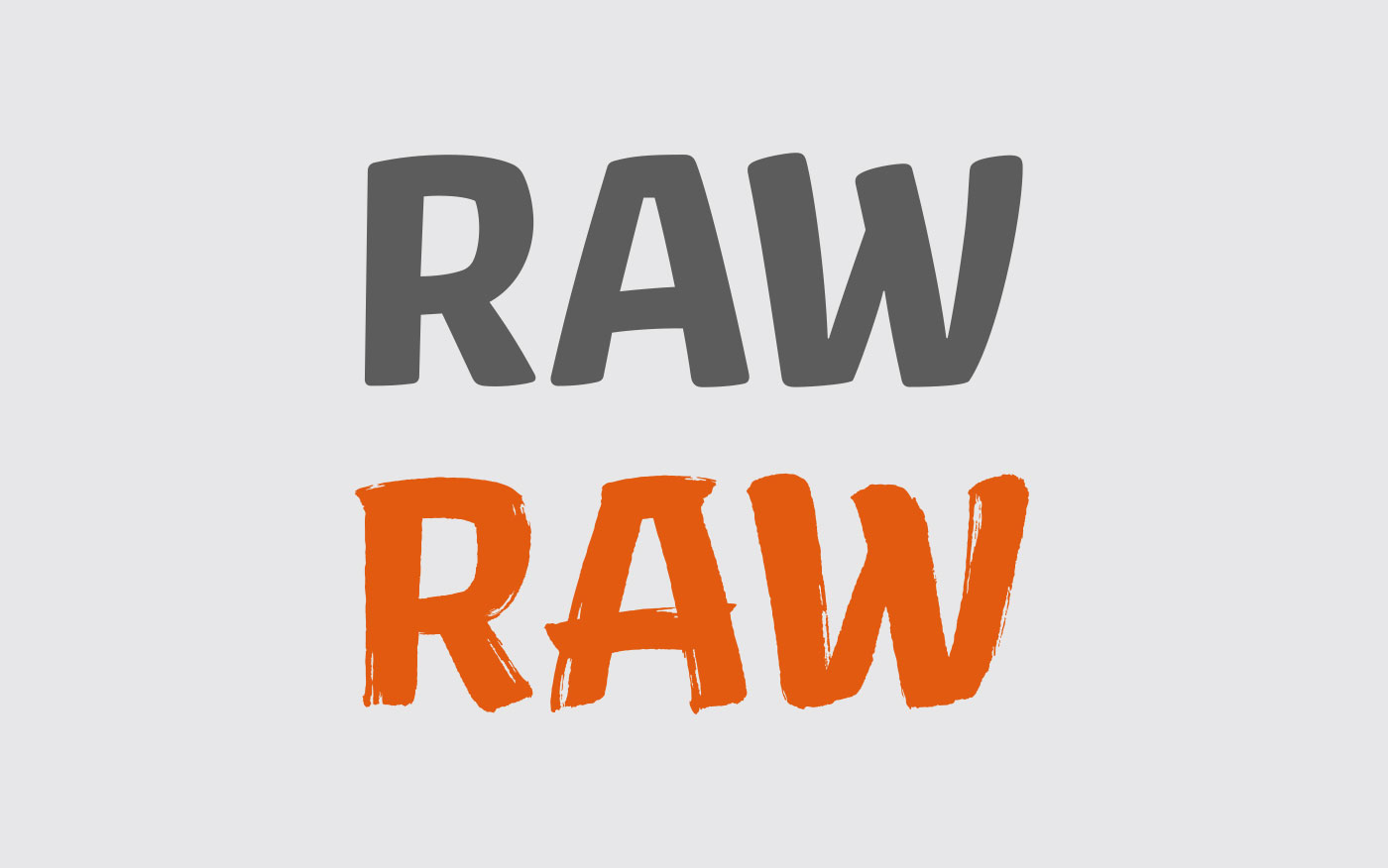
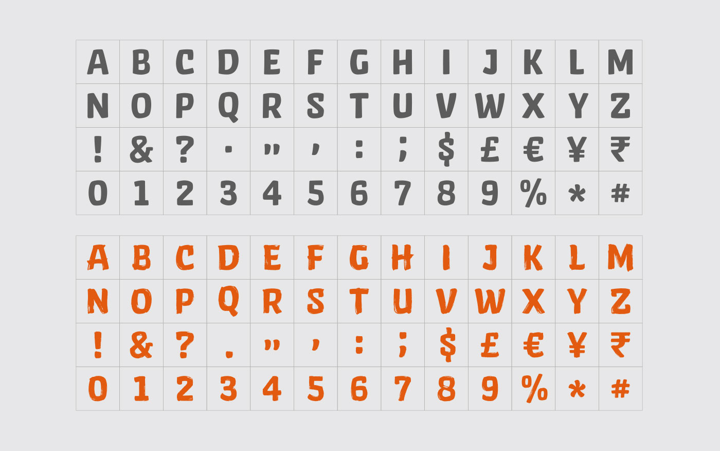
The Wild font
A custom display font—Wild, based on the essential qualities of the Wild stroke, was designed to bring consistency to textual expressions in campaigns and touchpoints. Designed in 2 variants—Wild and Wild Brush, the font brings strong recall to the brand when used alongside evocative photography or independently. The Stag font family was selected as supporting brand font, for its versatile character and functionality.
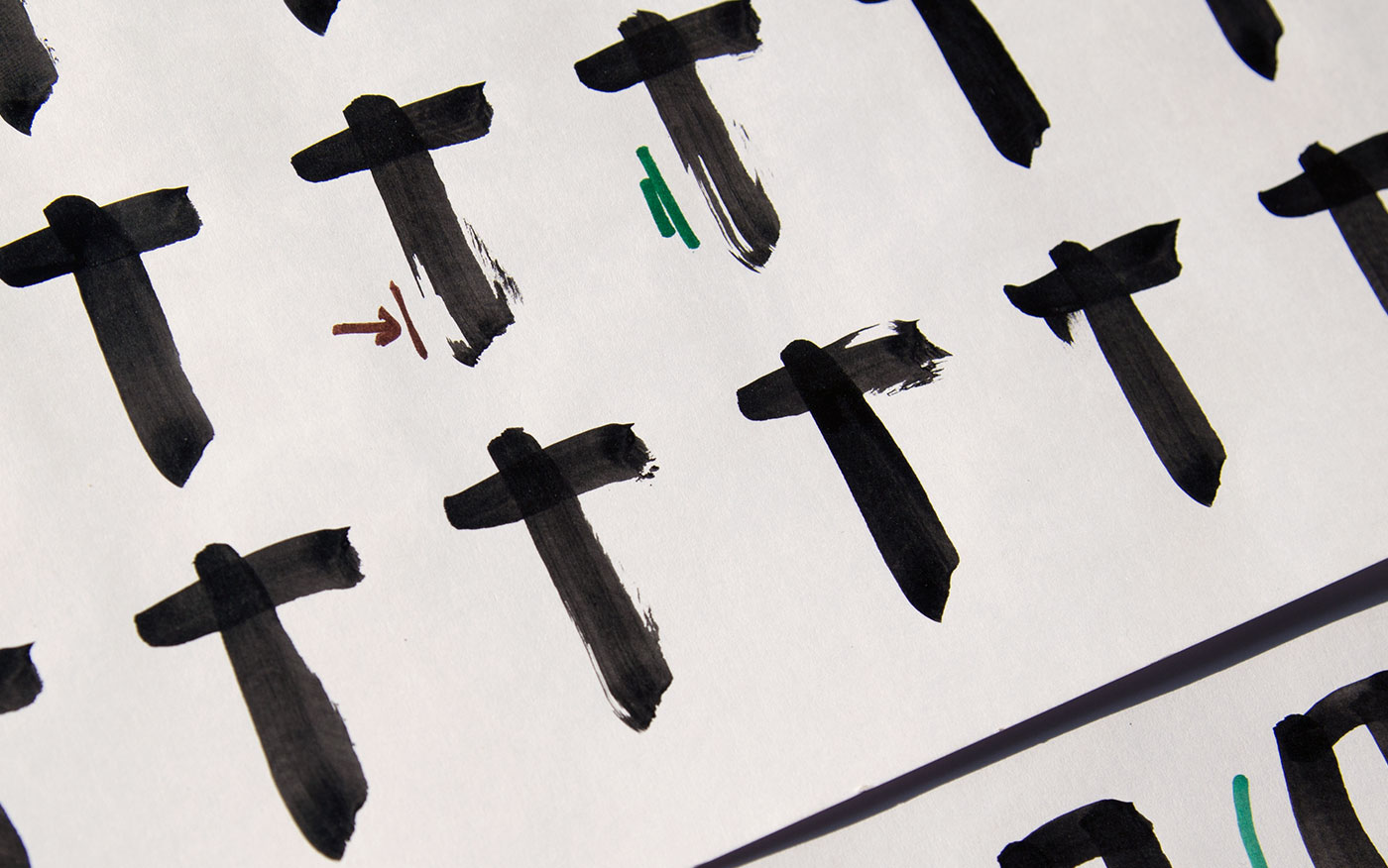
Font development, with handcrafted origins for authenticity of stroke quality
The Wild font
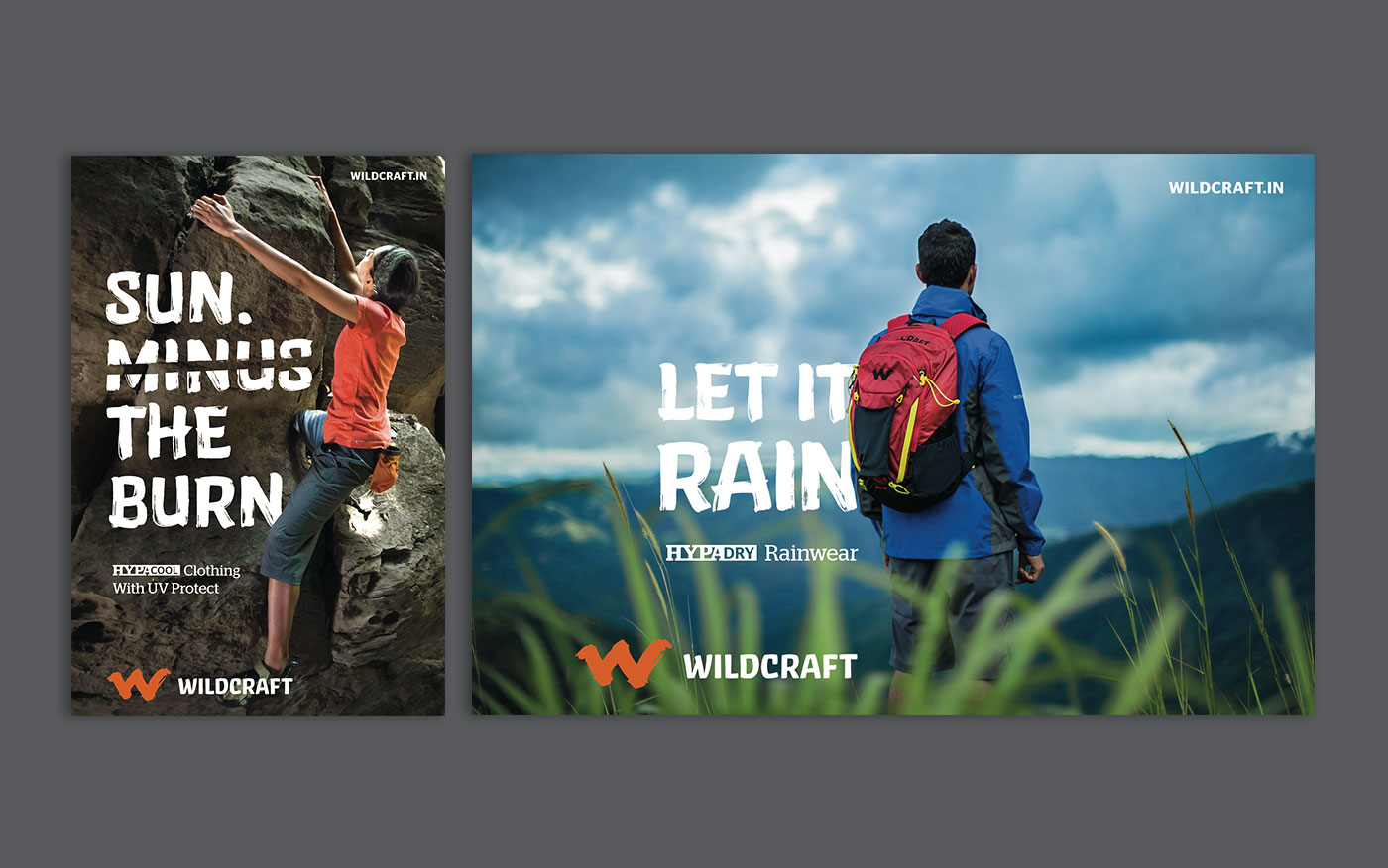
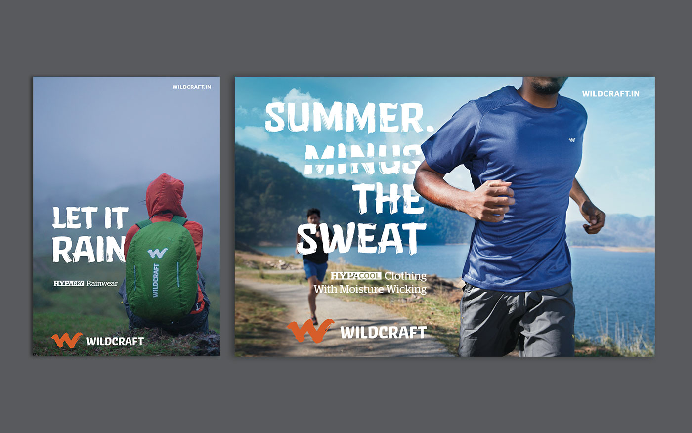
Campaign layout style
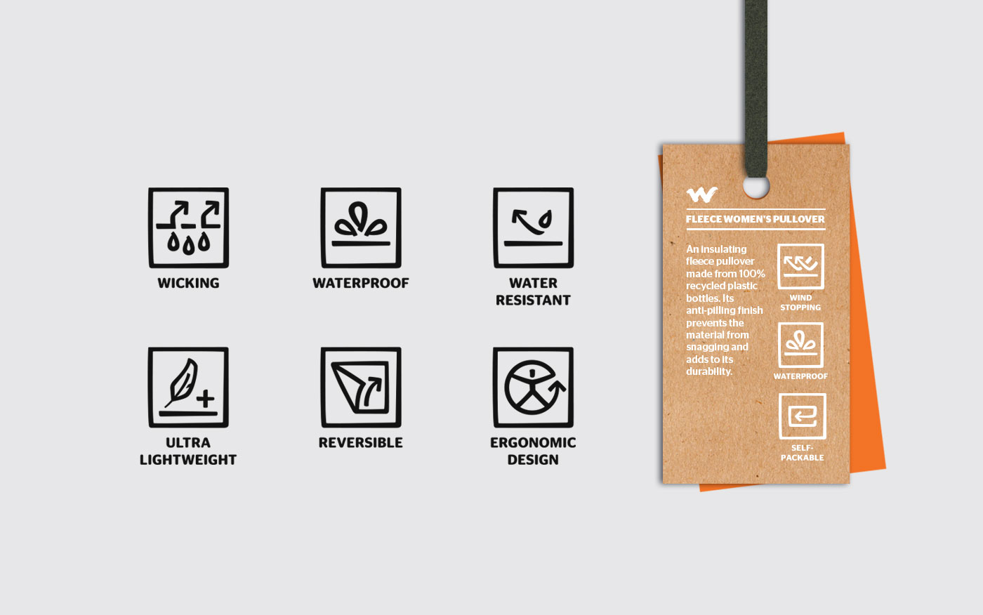
Icon Design
A custom style for icons was created for Wildcraft, complementing the brand language and supporting communication of functional product features. This became a critical exercise in the process of brand refresh to communicate the strengthened functionality and durability of the products through material and product design innovation.