Background
SEWA Grih Rin Limited (SGRL) provides affordable housing finance to under-served, low income households in urban and peri-urban locations in India. By creating an asset in the woman’s name, SGRL champions their financial inclusion and active participation in improving the quality of living for their entire family.
Poised at the threshold of pan-India expansion, SGRL commissioned Codesign to create branding & identity that could express its unique development-driven finance offering, and connect across its audiences of women loanees, investors & policy makers.
A Collaborative Journey
Field visits to branch offices and settlements provided insights through conversations with women loanees, cluster and branch managers. These conversations were valuable to understand the roots of the institution in community, current perceptions and witness first-hand the pride financial inclusion brings for the women loanees. An extensive workshop was designed to orient all internal stakeholders to the rebranding journey, and collectively chart challenges and goals for the exercise, bringing together needs of different facets of the organisation from loanees to investors. Through the course of the project, we worked closely with a core team consisting of management & field representatives, to continuously integrate internal & external stakeholder perspectives into creative decision-making.
In the process of rebranding SEWA Grih Rin Ltd, we created a brand name that could live in the hearts & minds of its audience—for progress is not just numbers, it is the joyful hope of a better tomorrow.
A New Identity
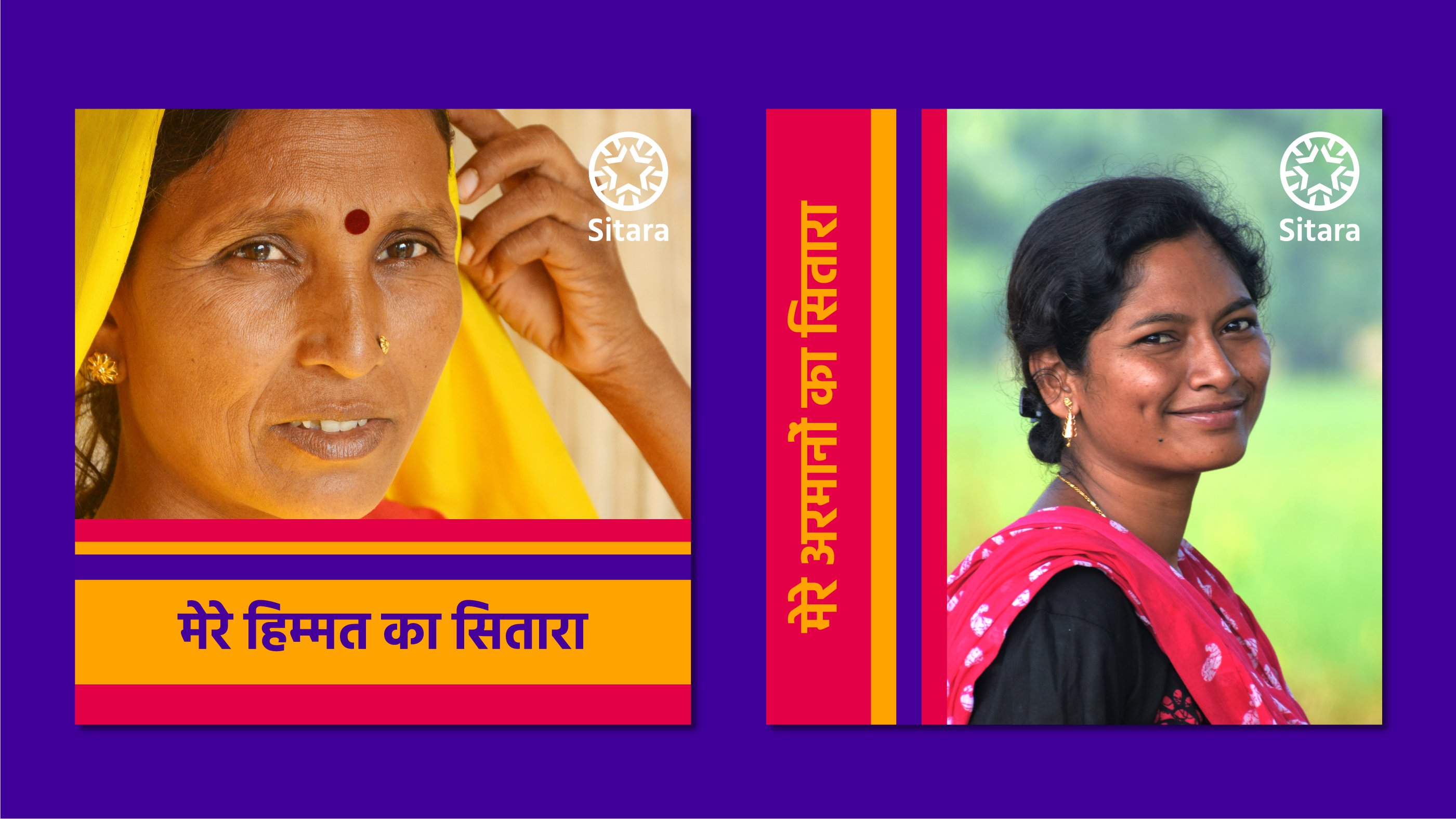
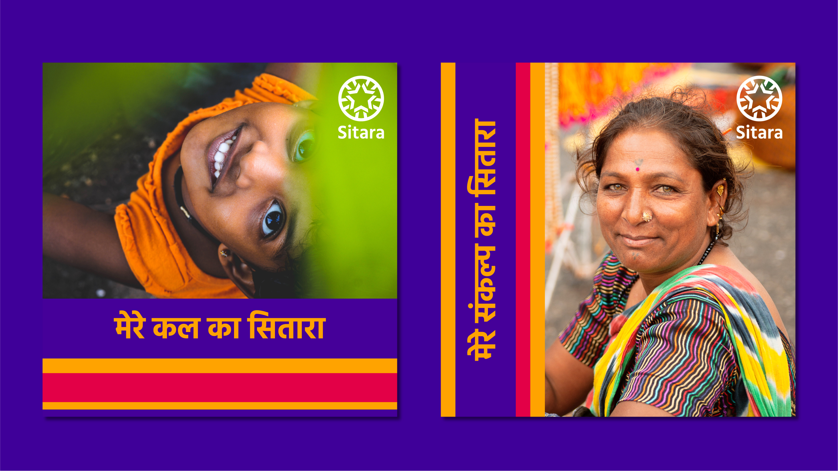
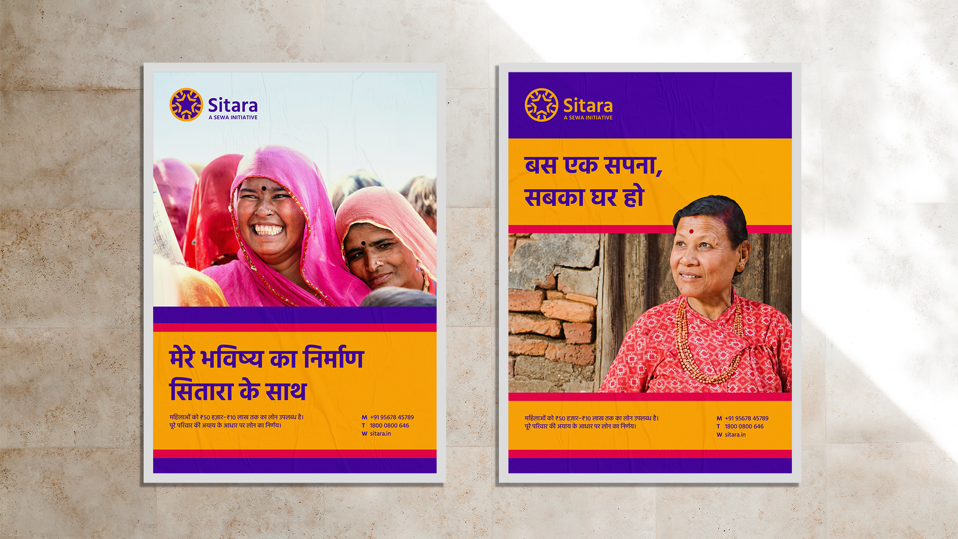
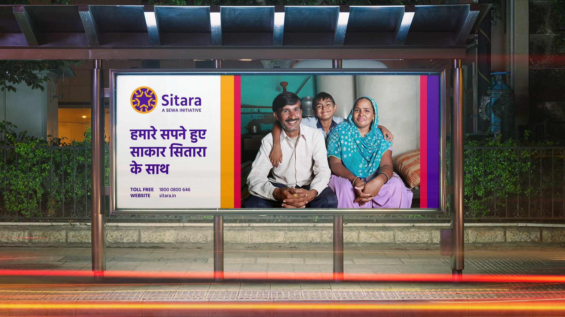
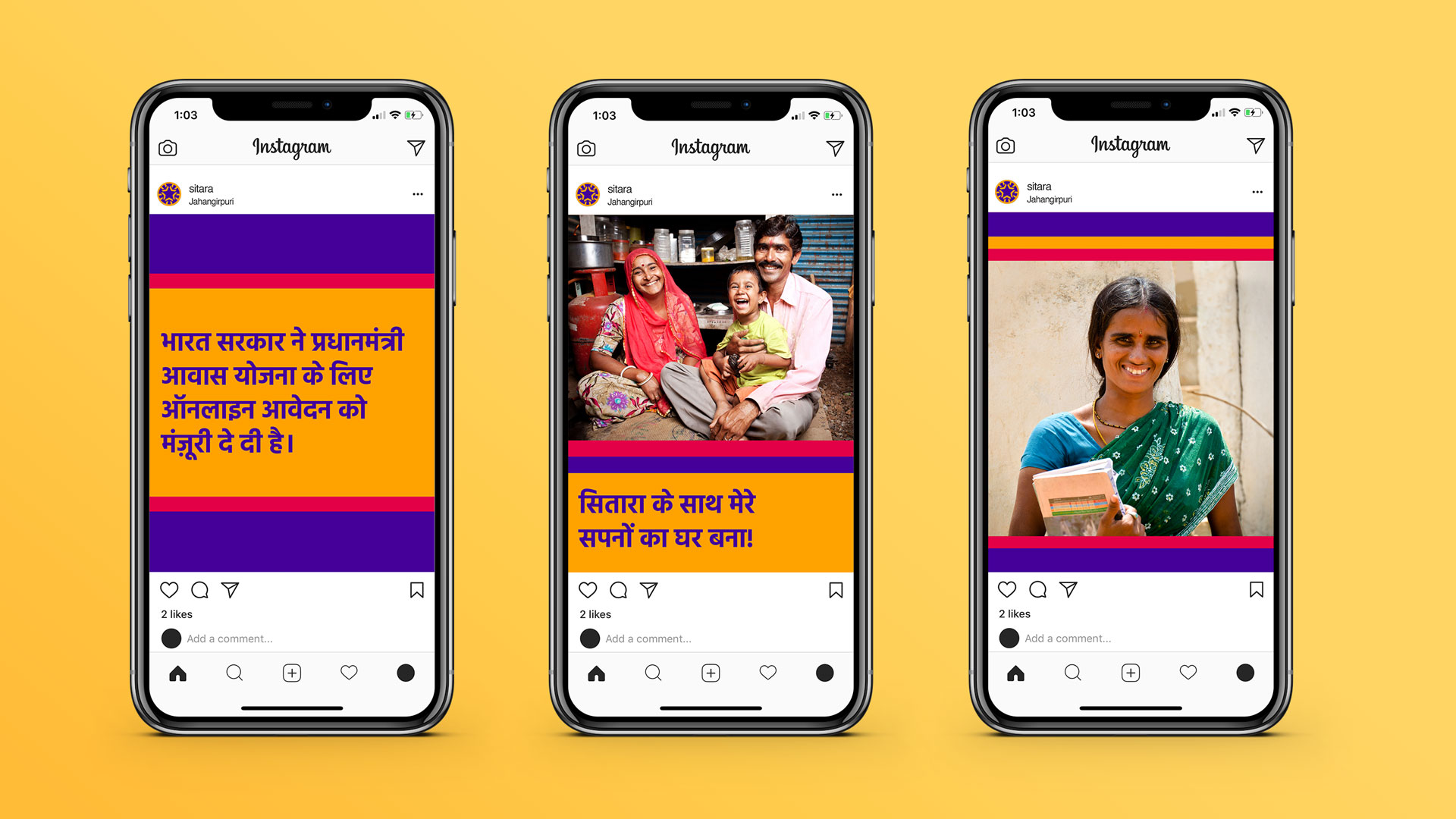
We designed Sitara as the new face of SGRL. It is a positive & bold expression of the organisation’s joyful view of progress. The new brand discards impersonal, intimidating stereotype of finance institutions, and instead, embraces the roots of SGRL in community-driven, social enterprise. For its consumers (the women loanees) Sitara extends a warm and optimistic image of progress; for other stakeholders like investors & policy makers the new brand presents consistency and strength of an efficient, sustainable business. The new brand identity provides direction for the institution to grow, diversify and expand its presence—while preserving its core social motivation.
New Energy, New Name
The complete original name ‘SEWA Grih Rin Ltd’ presented recall issues owing to its length and use of uncommon terms like Grih (home) & Rin (Loan). While it captured factual description of the offering, it sounded formal, impersonal, and lacking the warmth of the organisation. The full name in conversation, was often replaced by shorter versions like Sewa Grih, SGR or SGRL, leading to inconsistencies in recall. The need for a new name, emerged from practical issues of recall and understanding. It also opened up the opportunity to rethink the name as an expression of the organisation’s inherent warmth & joyful view of progress.
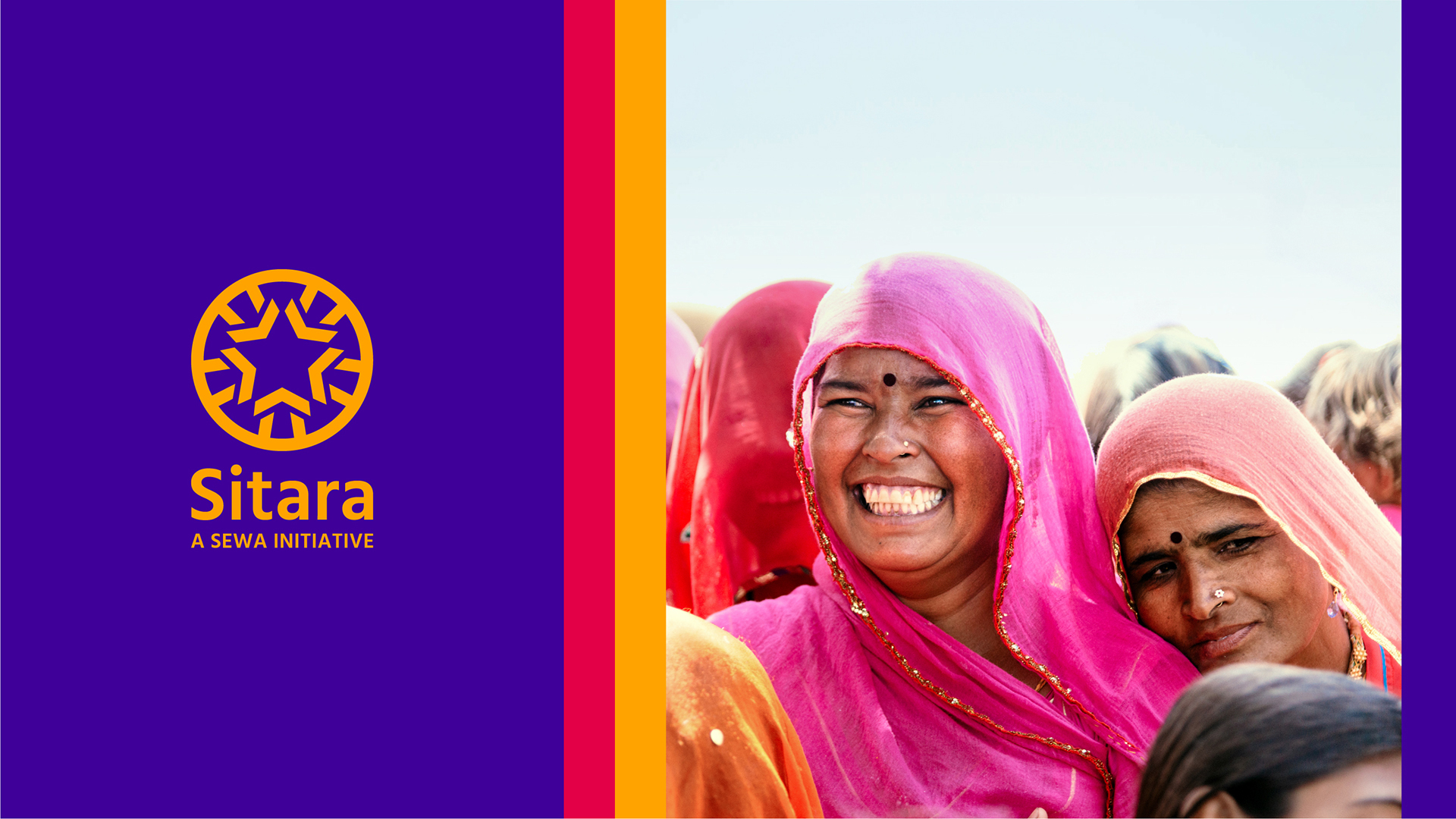
The new brand name Sitara, means star. Always a shining symbol and associated with ideas of hope, fortunes & direction—the word connects meaningfully to the brand’s view of progress.
A familiar and simple term across several languages in India, Sitara is also used as a girl’s name in India, cuing the organisation’s core of women-centric initiatives.
A Shining Symbol of Hope
Keeping in mind varying levels of literacy amongst women loanee audience for Sitara, the symbol was crafted as a key asset to illustrate brand purpose and aid recall. Inspired by Indian traditions of illustrative decorative arts, the ornamented symbol carries direct references to housing, community and star, brought together in a harmonious composition. Its strong seal-like character cues stability & strength providing it stature in the world of finance & banking.
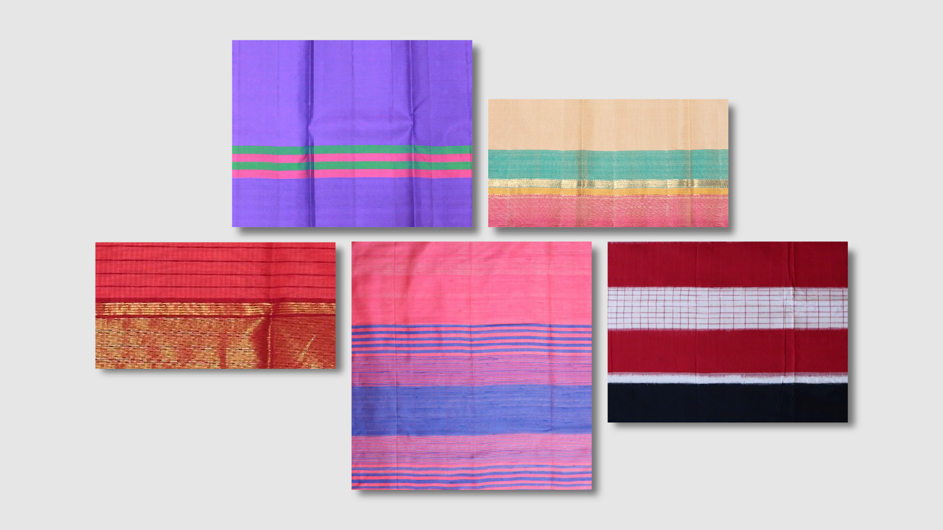
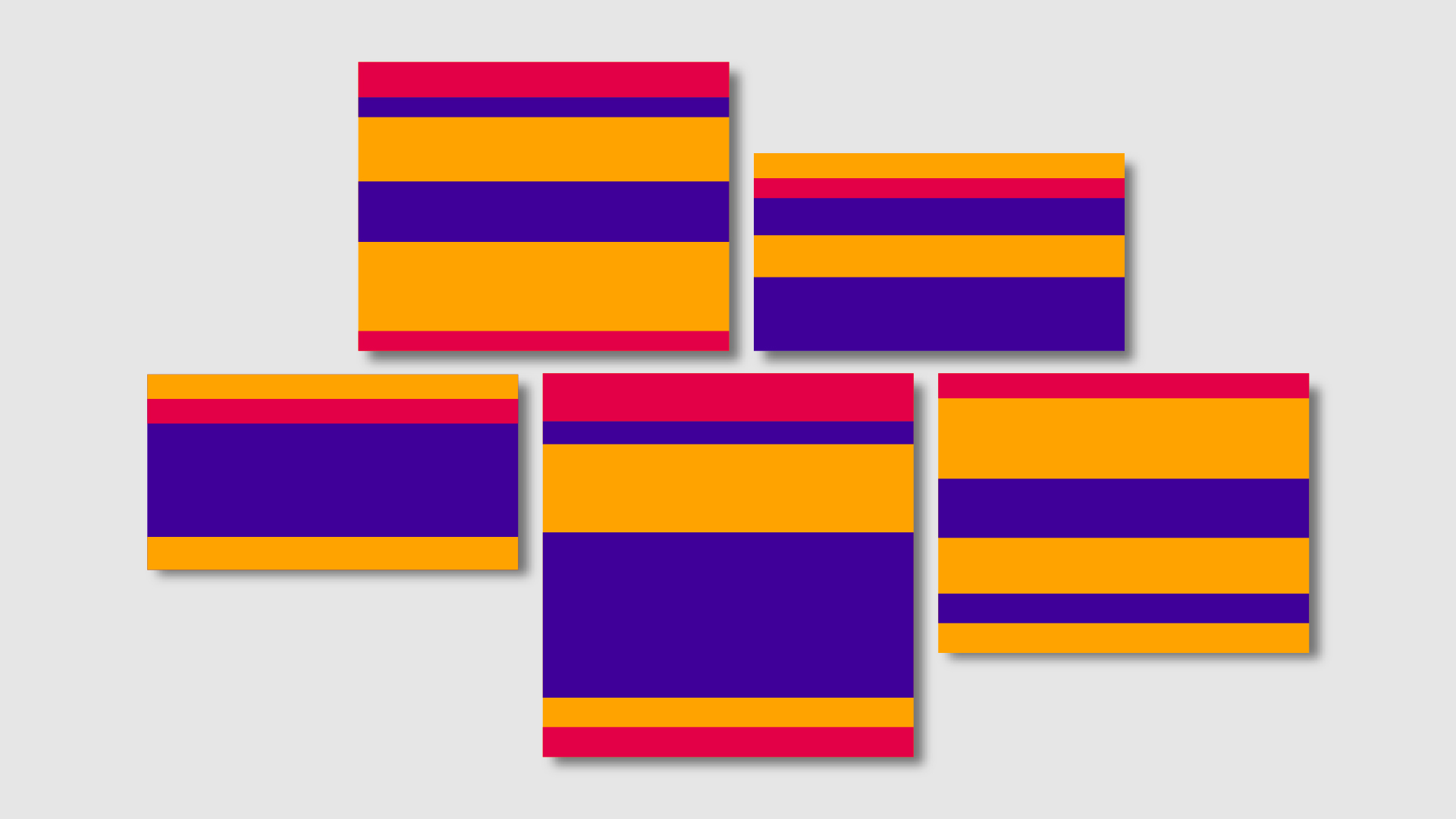
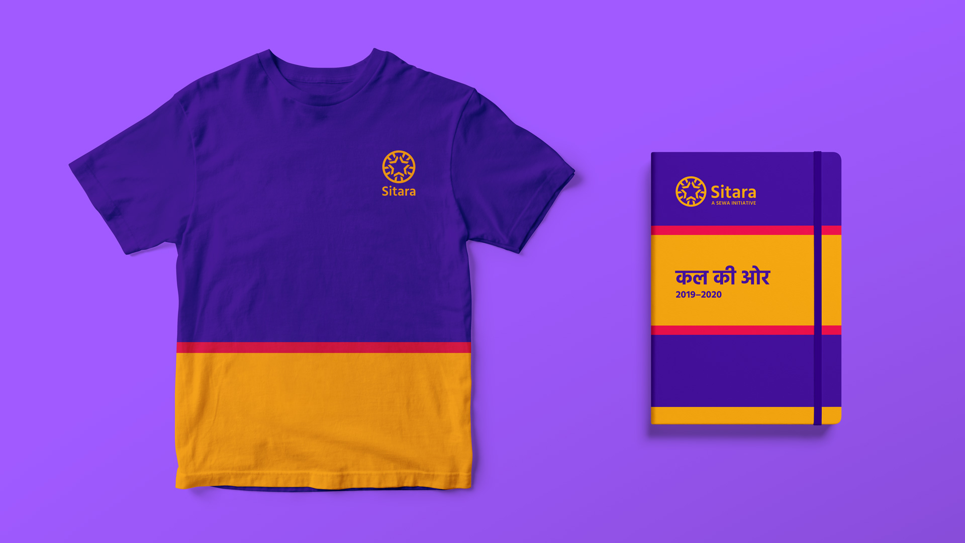
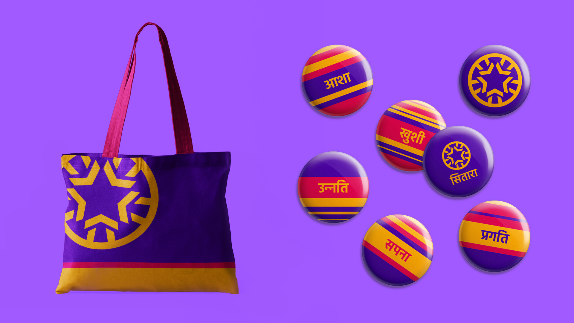
A Vibrant Language of Progress
A simple schematic of bright colours and bands, was designed to bring strong ownership and distinction across all brand touchpoints. Inspired by rich hues of Indian textiles, the visual language exudes joyfulness and frames communication in an optimistic, confident tone. The simplicity & flexibility of the design elements, ensures that implementation across different channels and media is seamless and consistent.