
Comfort, Refreshed
Project Background
Sleepwell is India’s leading brand of mattress, cushioning & comfort products, with large-scale manufacturing and retail penetration extending to 100 distributors and over 5000 dealers across India. Across five decades, the Sleepwell brand has established strong trust amongst its customer-base, while actively investing in research and technology to consistently advance its product folio.
An overall brand rejuvenation programme was initiated by Sleepwell in 2017, with a desire to express its distinct leadership in a marketplace with low brand-differentiation, and re-align brand communication with a refreshed energy for the future. We created a new brand language to bring together communication for a diverse and ever-growing range of products, for unified and distinct brand recall.
Please note: The original Sleepwell logotype was retained by brand and not within scope of the visual language redesign.
Design Approach
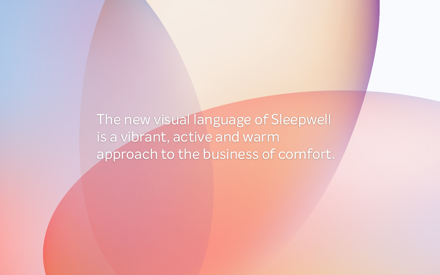
To rethink the visual vocabulary for Sleepwell, the first step was to think afresh about the idea of comfort itself. Typically comfort in this segment is looked at through the lens of sleep—peaceful, quiet, isolated and inactive. We looked at comfort as the source of rejuvenation, focussing on the positive and uplifting experiences that follow comfort. Therefore the brand visualisation moved from serene to more active & vibrant settings, while retaining warmth. A conscious lightness was adopted for visual tone, cuing contemporary intelligence and confidence to stand apart from the market clutter.
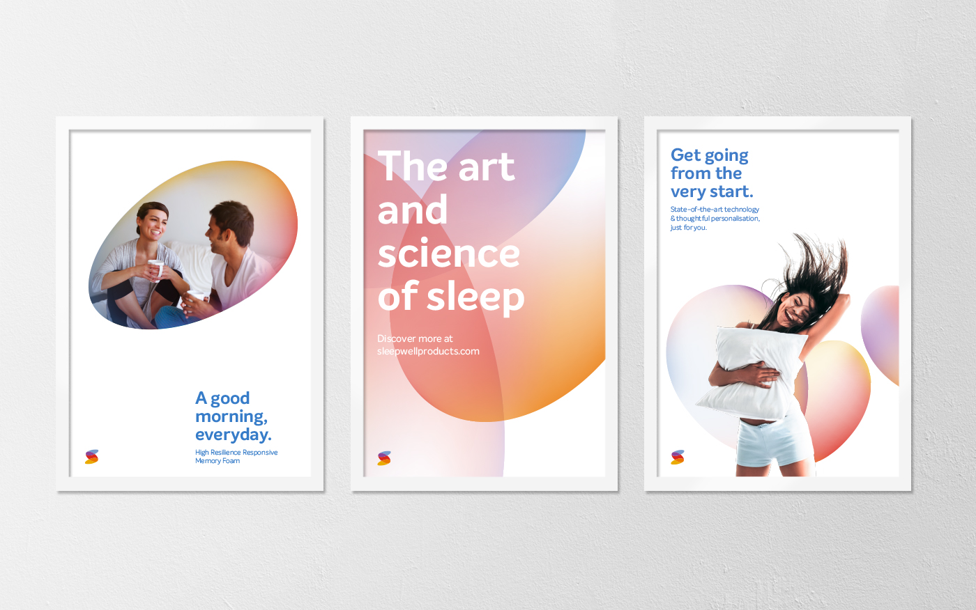
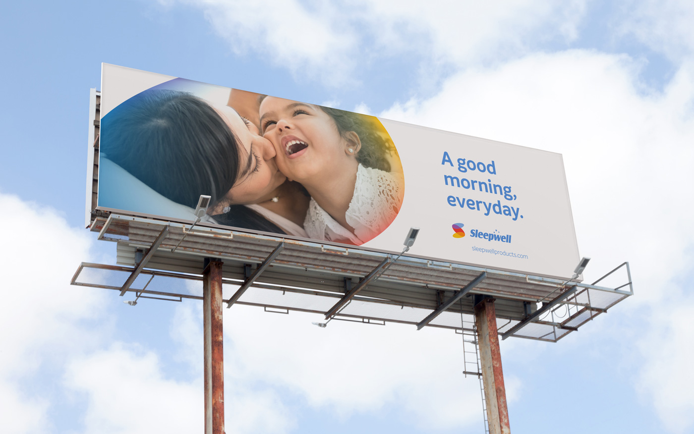
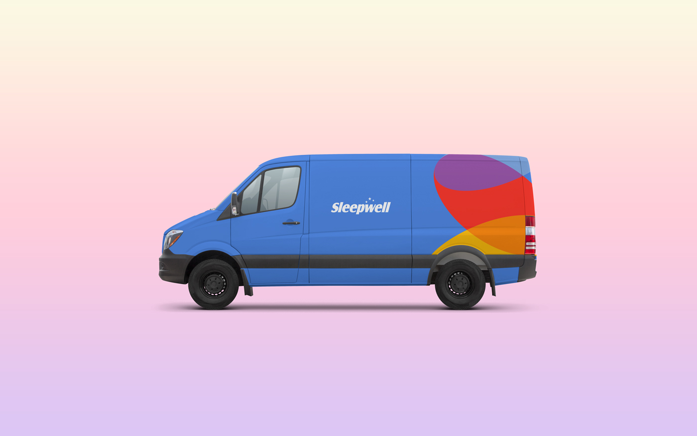
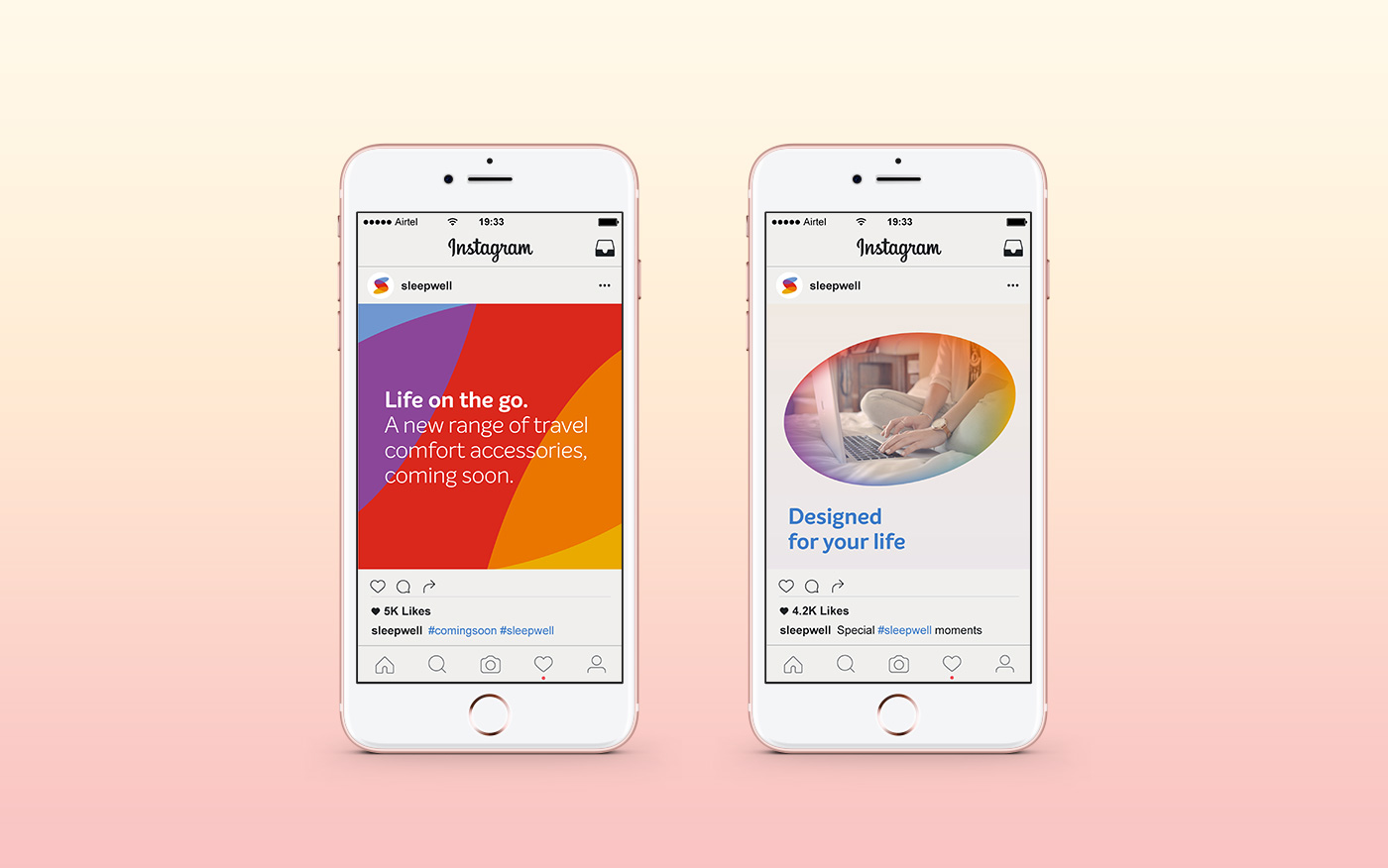
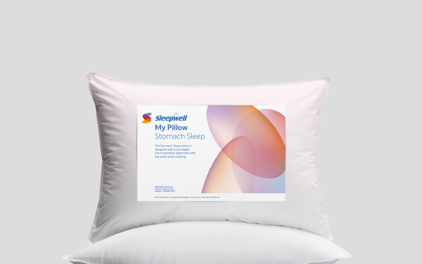
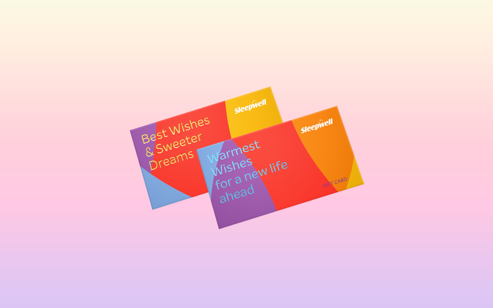
The new brand language for Sleepwell is a universe of visual elements that play together to create characteristic instances of brand presence across the length and breadth of communication touchpoints. Simultaneously light and dynamic, the language places the brand in a contemporary picture of warmth and comfort. It brings a sense of openness, optimism and sophistication that strengthens the shift in communication to more human stories, and aspirational settings.The brand universe is designed to provide a range of expressions for discrete and product-related communications, including budget to premium offerings, subtle to bold usage, and varying media-specific requirements.
Brand Sound
To enable stronger distinction in media-rich environments, we designed a sonic identity for Sleepwell with Addikt, which translates the new direction of design into sound. In addition to the sonic sign-off, a soundscape was designed to provide ready assets and references for future use & creation of sound for brand communication. Light, warm & modern—like the visual language—the soundscape offers a section-wise progression of comfort moods from mellow to active, that offer multiple possibilities for use across touchpoints from ambient retail music to campaigns.
Design Impact
The new brand language for Sleepwell cuts through ambient clutter in the segment and establishes distinctive brand recall. Clean, bold and consistent, the language expresses the confidence of the brand as market leader and its relevance as an intelligent modern player. With its versatility, the language offers smart variations across Sleepwell’s large and diverse portfolio—and balances brand consistency with vibrancy in communication.

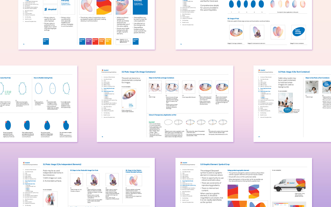
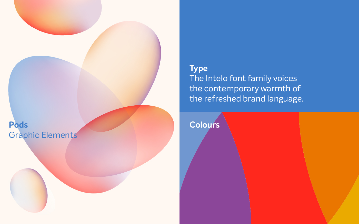
Snapshot of guidance for use of elements in communication.
Watch the new soundscape in action, used in Sleepwell’s new TV commercial titled ‘Maa Jaisa Aaram'.