The growth of India’s manufacturing, e-commerce, and retail industries, has provided a giant boost to the B2B logistics market in India. New emerging players in a segment that has been largely considered unorganised and inconsistent, are changing the game by investing into technology that enables greater efficiency and transparency in services.
The Strength of Human Touch
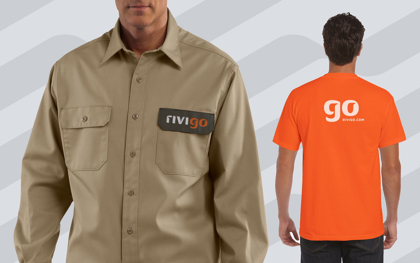
Founded in 2014, Rivigo (formerly known as TrucksFirst) goes a step further. Identifying the poor quality of life of truck drivers as a major impediment to holistic efficiency, the Indian startup built a service framework with a human touch. From professional training, to an innovative relay system of driver rotation, Rivigo brings sustainable and strong all-round efficiency through its driver-centric approach.
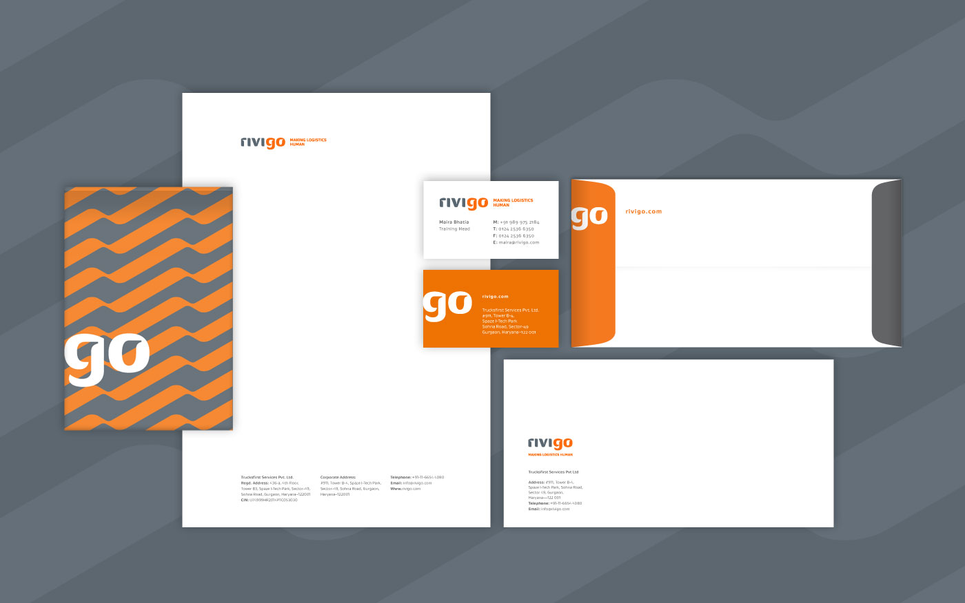
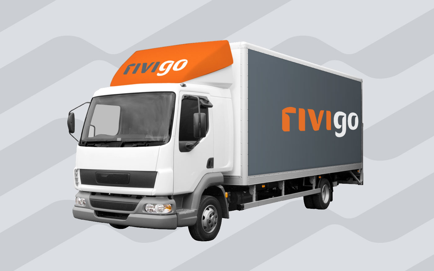
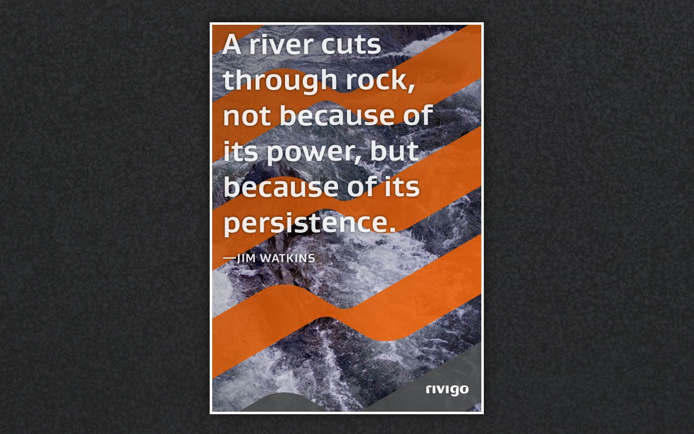
The development of brand identity for Rivigo draws from the strength of its driver-centric approach. The name takes inspiration from the idea of a ‘river’—an analogy used often within the core team—to describe its belief in steady movement with gentle perseverance. The visual identity represents the strength through elements designed with robust flow, choosing resilience and thoughtful movement, over superlatives of speed common in communication within the sector. Together in use, the identity presents a fresh outlook, backed by confidence to deliver.
In December 2015, Rivigo successfully raised $30 million Series B funding by SAIF Partners.