Spirit of the Times
Background
Recognising the prolific market for brandy in southern India, Bacardi created a premium blend specifically for Indian consumers, and Codesign was commissioned to create the positioning, identity & packaging for the new product. The new brand was set to compete against decades-old favourites in the market, and appeal to a new generation of brandy drinkers.
Honouring the timeless tradition of brandy, but breaking free of archaic codes, we created the Good Man brand to offer a sophisticated and modern take on an ageless spirit.
Scope
Brand Positioning, Naming, Bottle & Packaging Graphics Design
Positioning
Southern India is a significant market for brandy, with a majority of consumers being men. Existing local brands had not evolved with the audiences, often relying on dated expressions of masculinity and an over reliance on pastiche codes of European provenance in absence of a clear personality. The existing market felt dissonant with the expectations of the modern Indian consumer.
Recognising this opportunity, we conceptualised a brand that champions contemporary aspiration and style, and opens up the imagination of brandy beyond limited codes of provenance.
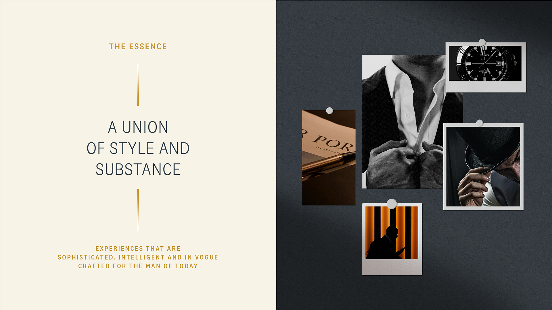
The brand is positioned as an embodiment of the discerning consumer—an individual who stands out confidently and makes bold style statements. The brand brings together style and substance, with experiences that are sophisticated, intelligent and in vogue.
This became the strategic underpinning for the naming and packaging design; one that builds newer and more personal connection to brandy and heroes the modern consumer at the heart of the brand.
Naming
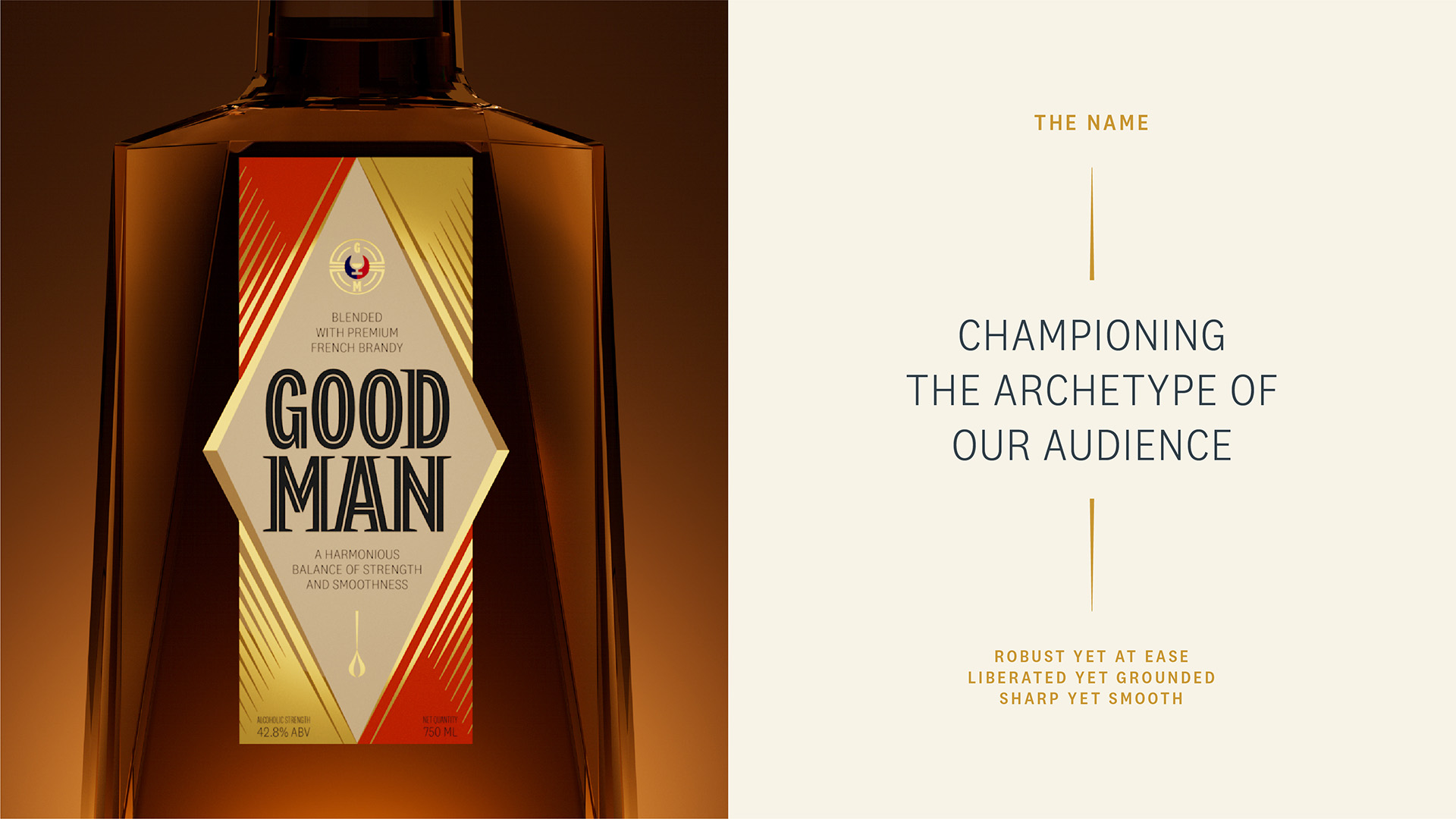
The name ‘Good Man’ directly champions the archetype of the consumer. Rooted in goodness, ‘Good Man’ evokes the strong, enduring and holistic qualities of the modern man. The classic, yet contemporary name builds connections with good company and good times. Its simplicity sets it apart in a market saturated with discordant and dated European names.
A modern, multi-faceted expression of style
Good Man is sharply outfitted in step with the times. Eschewing delicate old world ornateness in favour of modern simple luxe, each element of the packaging is thoughtfully crafted to bring the brand to life.
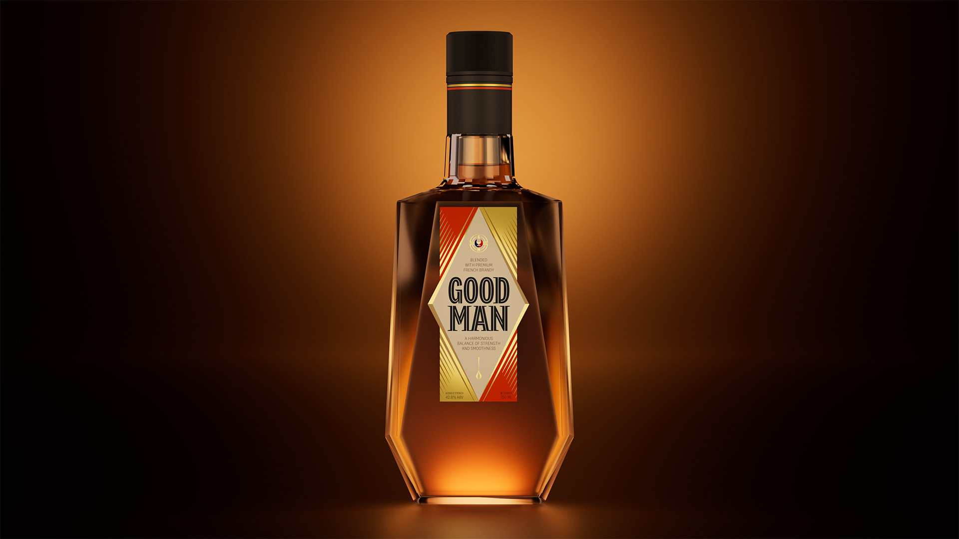
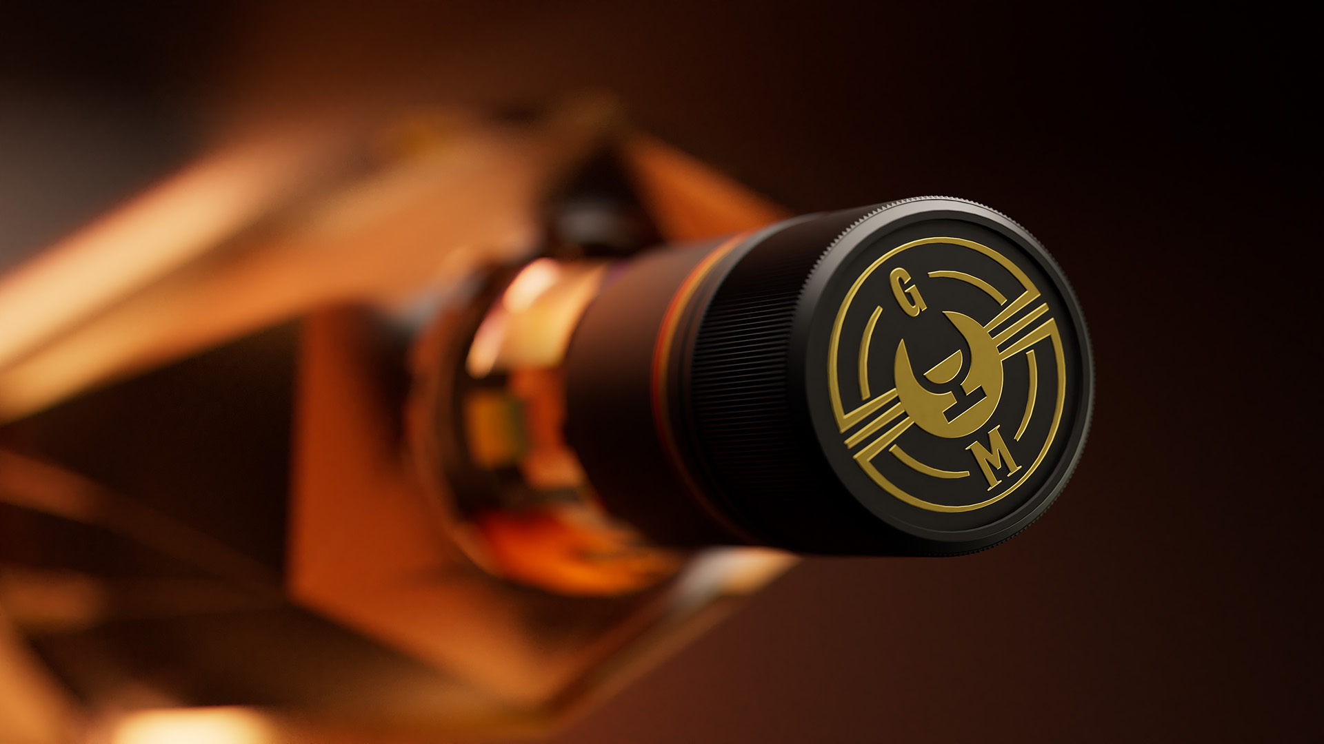
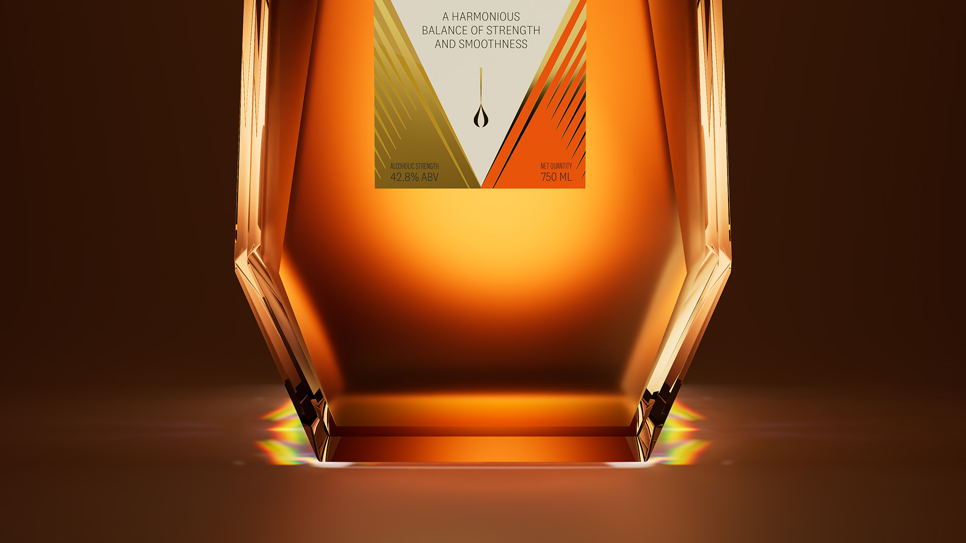
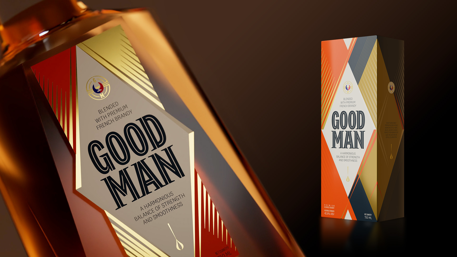
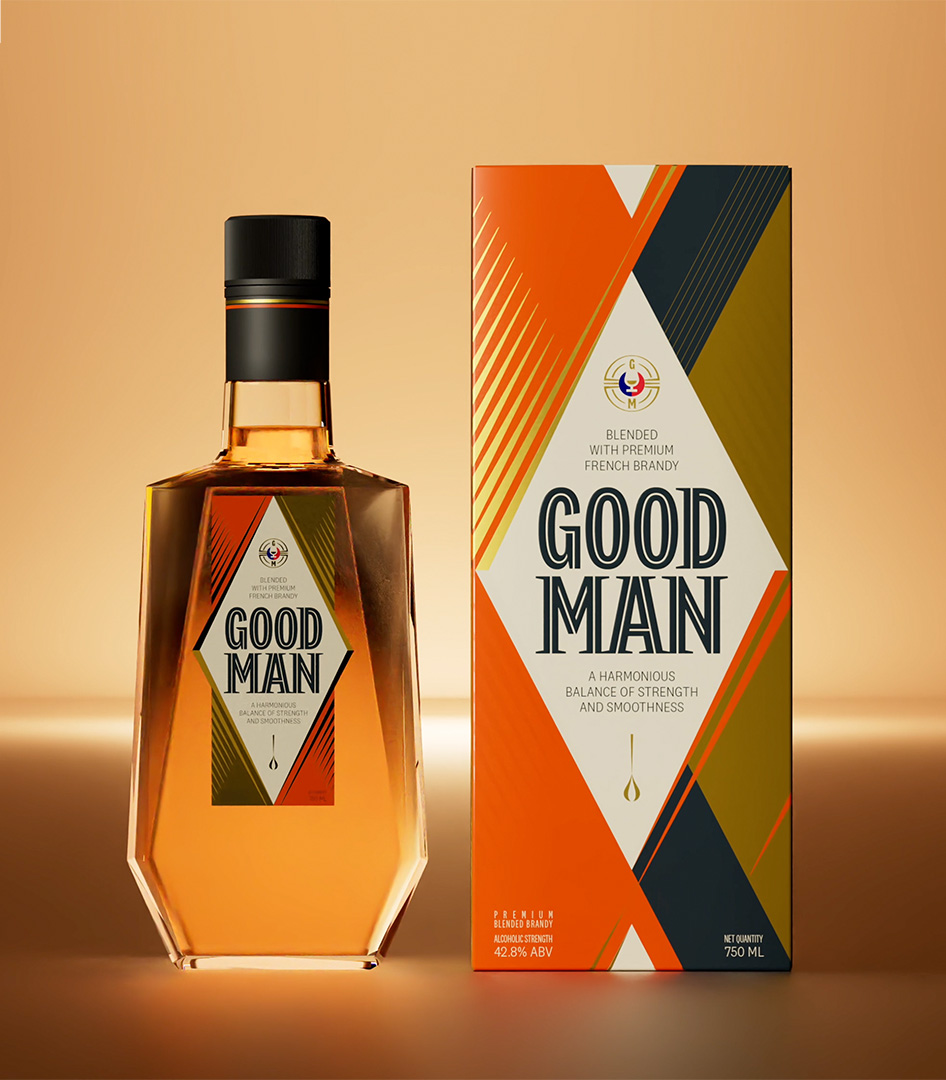
Bottle Design
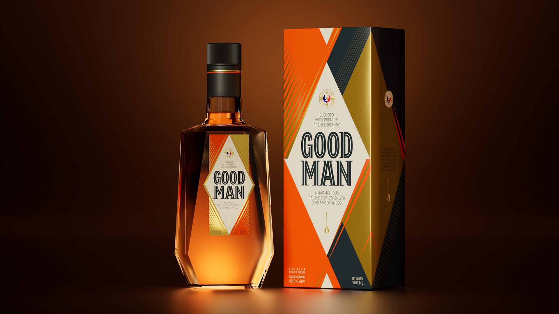
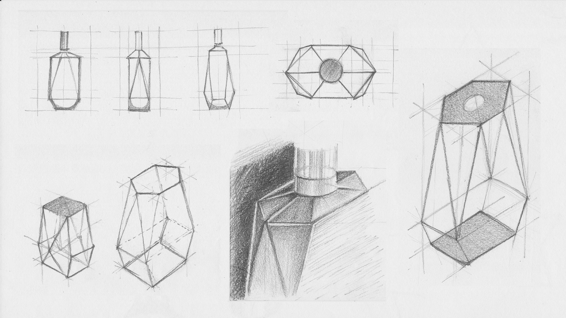
The chiselled bottle is a physical manifestation of Good Man. Its sharp facets offer a luxurious play of light and liquid at all angles. Inspired by sharp cuts of gemstones and crystals, the bottle design brings luxe presence and distinction to the brand.
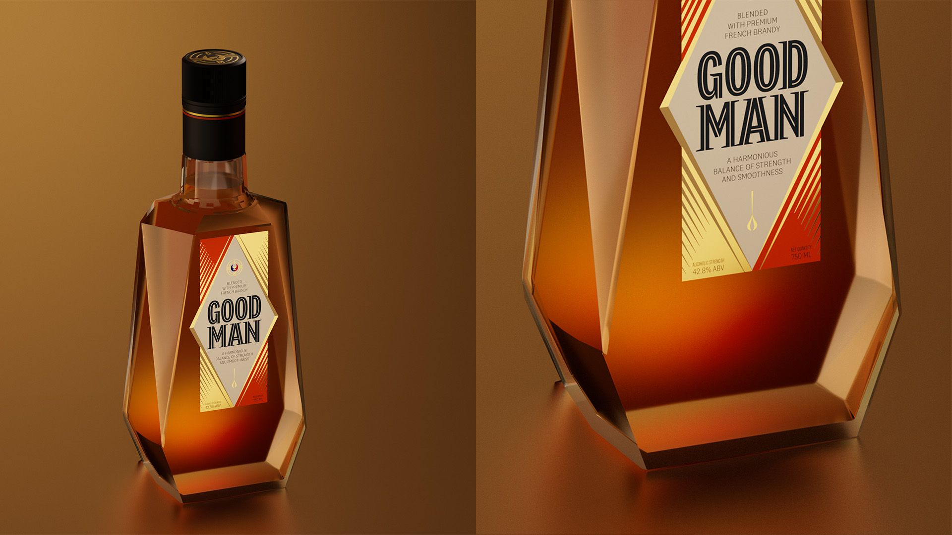
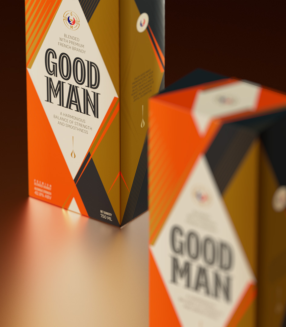
Packaging Graphics
Good Man’s bold, sharp brand personality extends to its packaging graphics. The strong and faceted character is brought to life through the use of angular ornamentation and a colour palette of bright orange and deep charcoal with muted gold highlights. Complementing the design of the bottle, the use of printing techniques, carries forward the play of light on to the box surfaces.
Team
Aayushi Katare, Mohor Ray, Nikhil Ranganahtan, Rajesh Dahiya, Ritwick Nandi, Shreeya Kurien, Ved Uttam, Videet Desai