From Cure to Care
Project Background
Following a brand rejuvenation exercise, Indian multinational pharmaceutical brand Dr Reddy’s identified communication design for packaging as a key touchpoint to reflect their new patient-first philosophy. We were commissioned to create a communication design system for Schedule-H drug packaging, across all 300 brands and 550+ SKUs in India.
What are Schedule H drugs?
Schedule H drugs are drugs which cannot be purchased over the counter without the prescription of a qualified doctor. In India, these are marked by a thin red line and the ‘Rx’ symbol on packaging. The drugs are governed by a stringent set of regulations in all aspects of production & distribution—including packaging & communication.
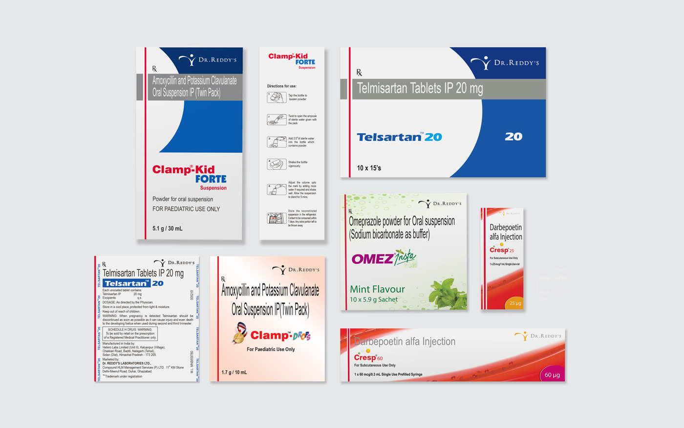
Sample of existing packaging, before redesign.
Challenges
Creating differentiated brand recognition & recall.
Identifying opportunities for enhancing experience through design of communication.
Achieving consistency across a vast product portfolio, including an ever-growing range of product brands and SKU-s.
Adherence to stringent regulations in Schedule-H drugs sector in India.
Enabling deployment at a systematic and rapid pace with existing internal resources.
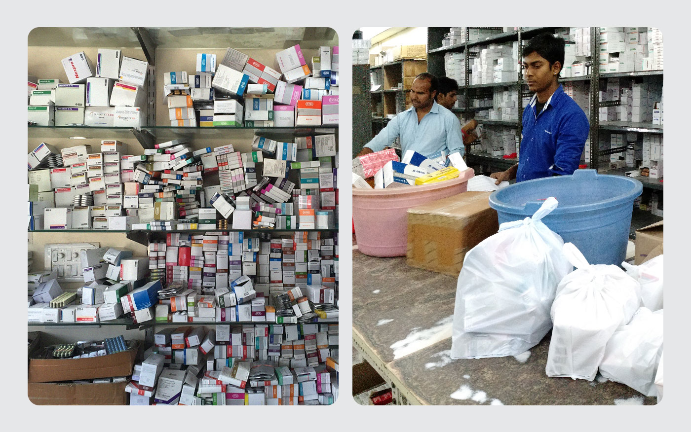
Snapshots from the field: A common reality of stocking & retail storage in India.
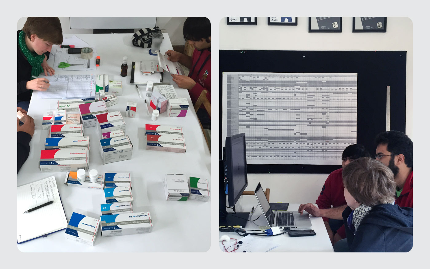
Early days: collecting, organising and making sense of content across existing product ranges.
Our Approach
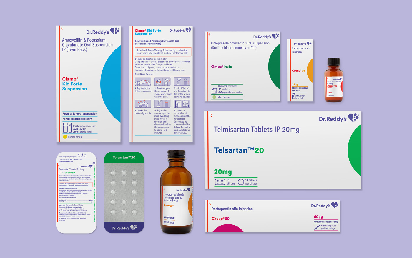
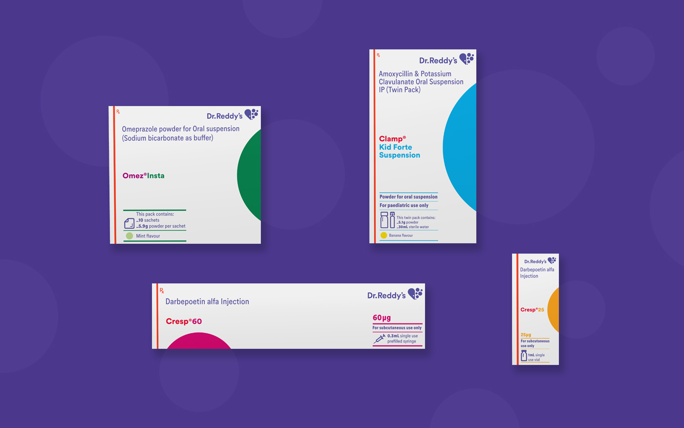
New, redesigned communication system.
The project was driven to build a systematic, sustainable & scalable framework for variation—so that design could be meaningfully executed across offerings and address requirements of different user types, product brands and formats.
The design project addressed innovation along 3 tracks for holistic impact: Information Design, Visual Design and Workflow Design for Deployment.
Information Design
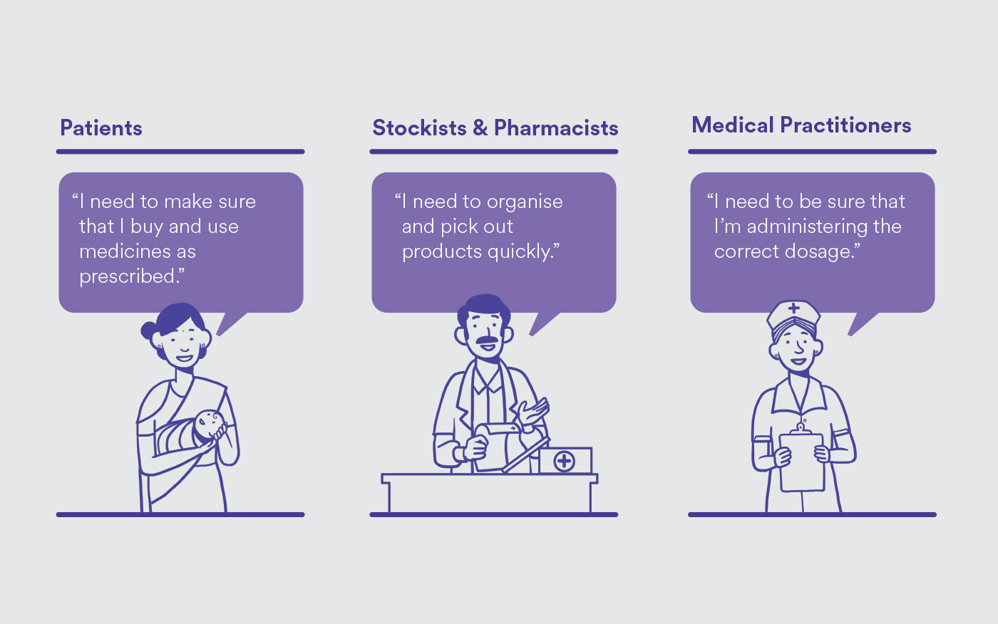
Expanding the idea of the user of packaging, into 3 distinct types—patients, stockists & pharmacists, and medical professionals.
Finer recognition of and distinction between user groups. With deeper inquiry into the usage of packaging, we created a fine-grained distinction of the primary user into categories of (1) Patients (2) Stockists & Pharmacists and (3) Medical Professionals. This new typology of users, each with their own distinct requirements, was used to create a first level of classification for communication design, leading to relevant customisation of information and visual design. For example, for secondary packaging with stockists as primary user, product identification was given high priority on all surfaces given the cluttered storage conditions seen at warehouses.
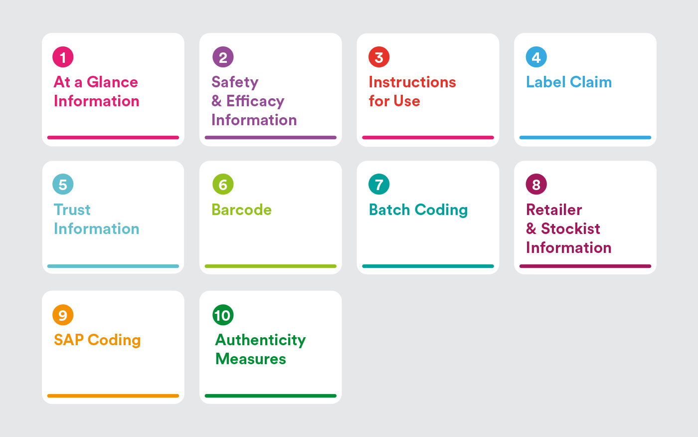
New grouping structure for information.
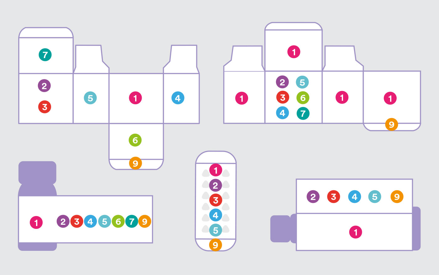
New content flow according to pack format & user typology.
Information grouping and structure to consolidate and systemise content collection for packaging communication. A new all-encompassing structure was created to organise information. This enabled logical and usage-based clustering of a large volume of information that varies across the brand spectrum. 10 product brands and over 60 SKUs were studied to create a grouping system that could accommodate variables, and ease locating and understanding key information for users. For internal brand teams, it provided a consistent structure to collect and create content for design teams. For the internal design teams, it provided a steady reference to apply and adapt designs, without compromising on intended user experience.
Visual Design
The design system strategically deploys visual elements to support functionality, bring clarity and enhance user experience. Here are a few examples:
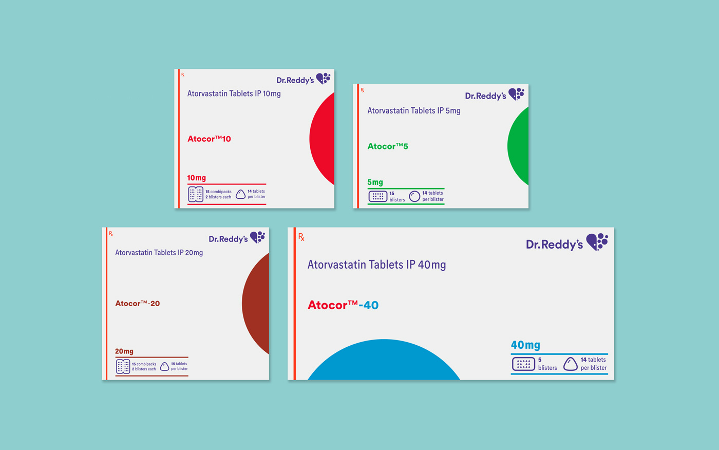
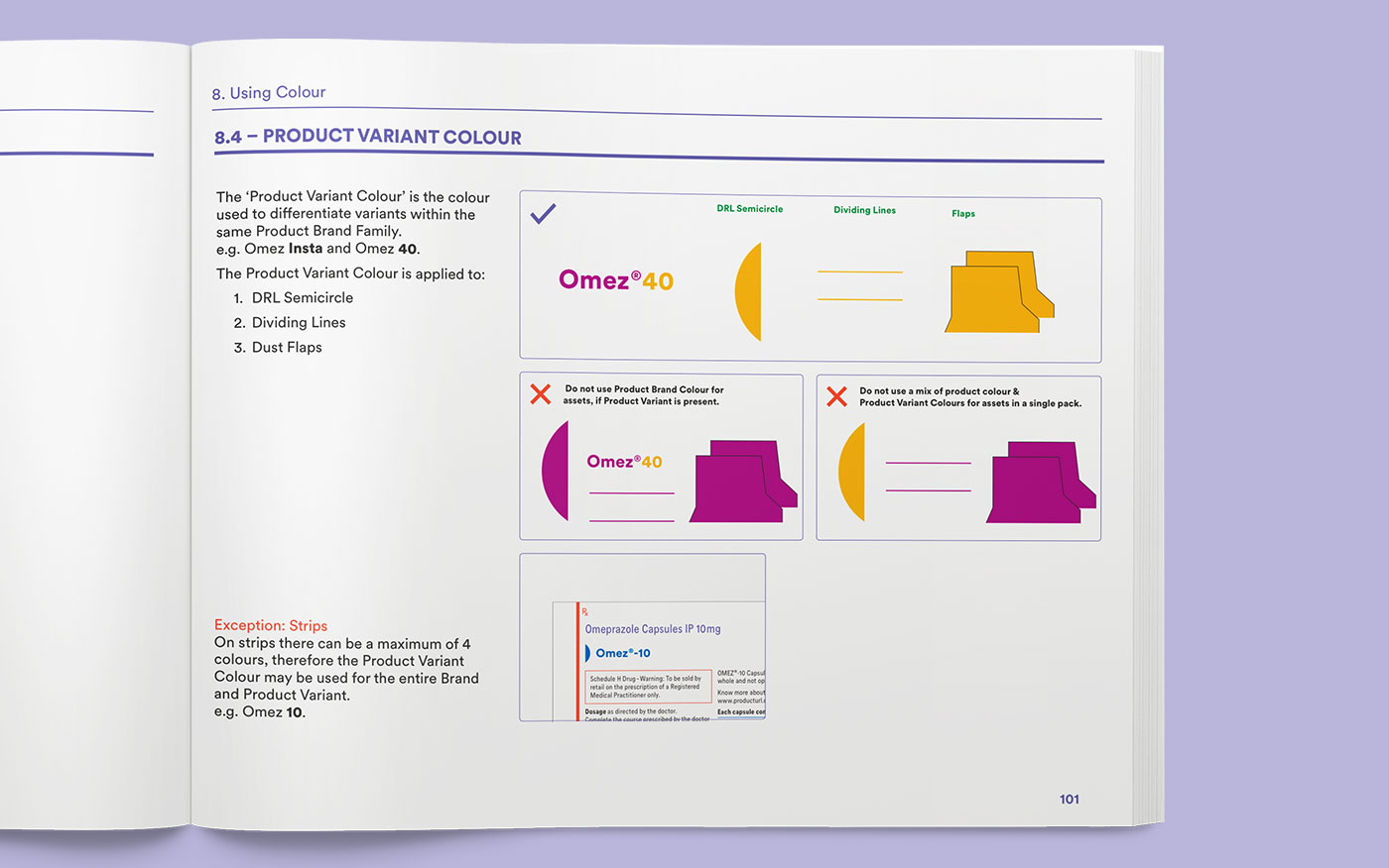
Variants of a product brand are commonly placed together in retail/storage formats. A new system of colour coding was designed to eliminate errors in identifying variants within a product family, by assigning prominent & distinct colour to variants.
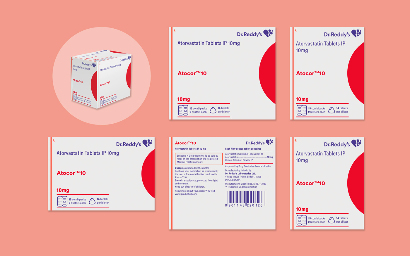
For quick and correct identification of products, in commonly disorganised warehouse and retail storage, product identification information was made visible on all faces of secondary packaging.
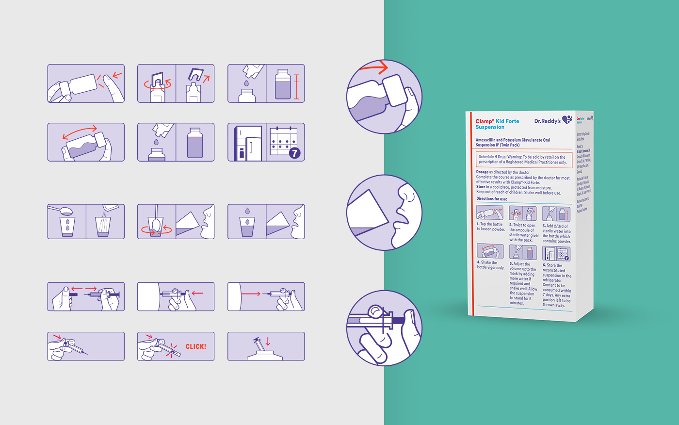
A custom, detailed language for instructional illustrations helps patients with varying levels of literacy correctly administer and use products.
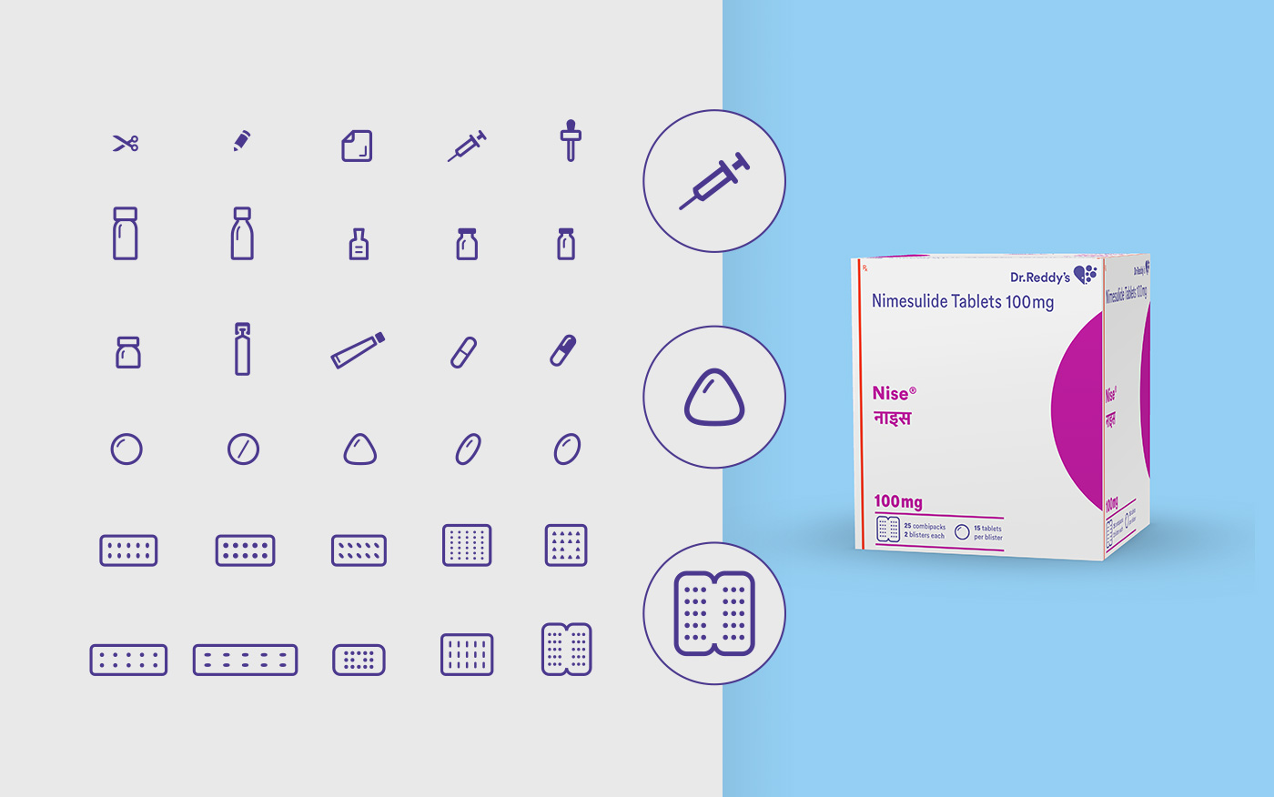
A new system of product icons helps users in product identification and understanding package contents.
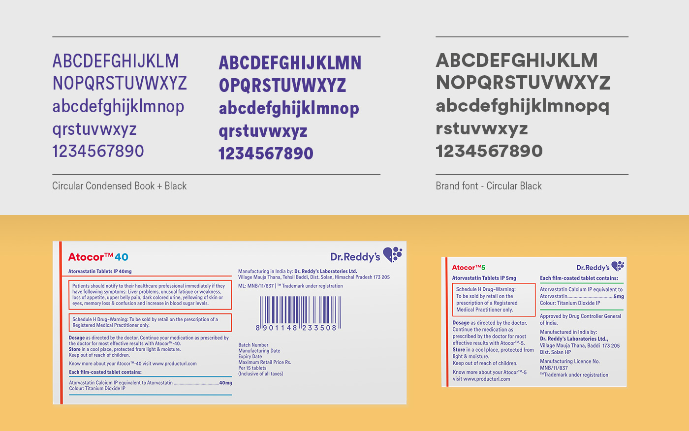
Condensed variants of the brand font were commissioned to allow for clearer readability at smaller type sizes, especially for small pack sizes.
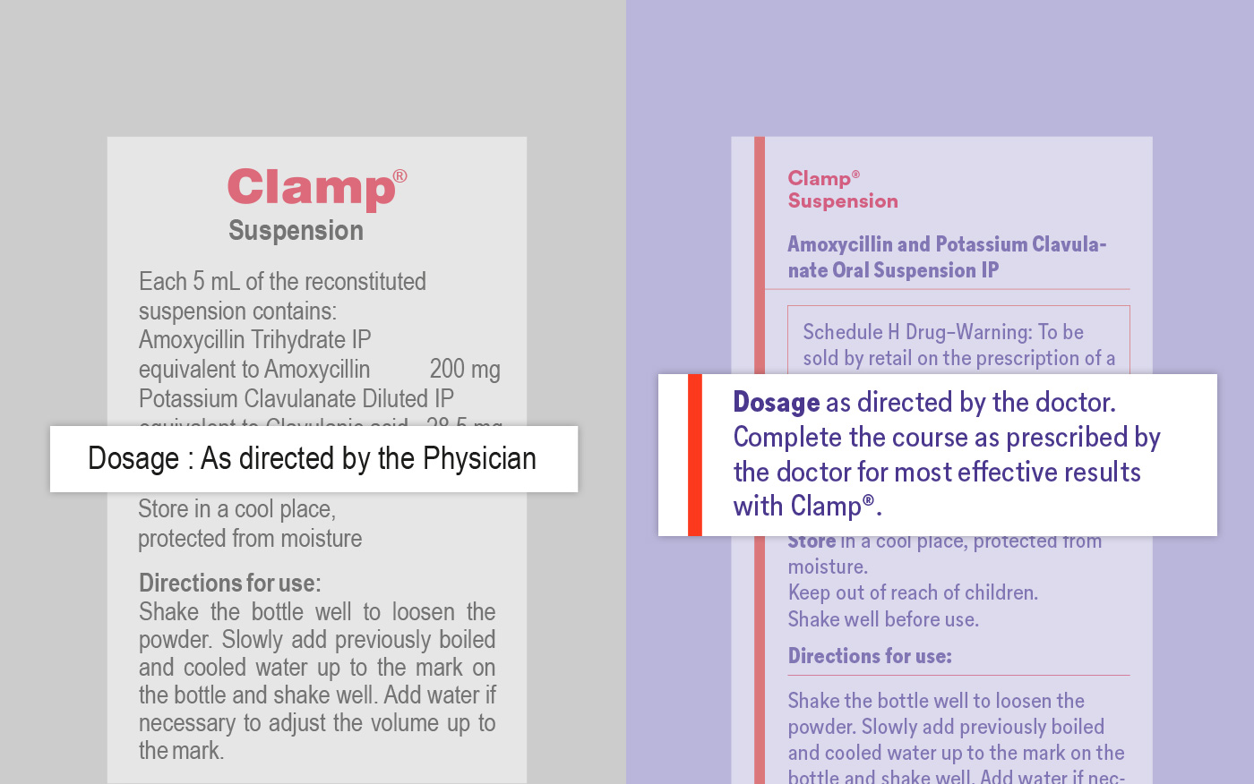
Recommendations for language modification to help users understand significance of use as per instructions and prompt better adherence. Left: Old, Right: New.
Workflow Design for Deployment
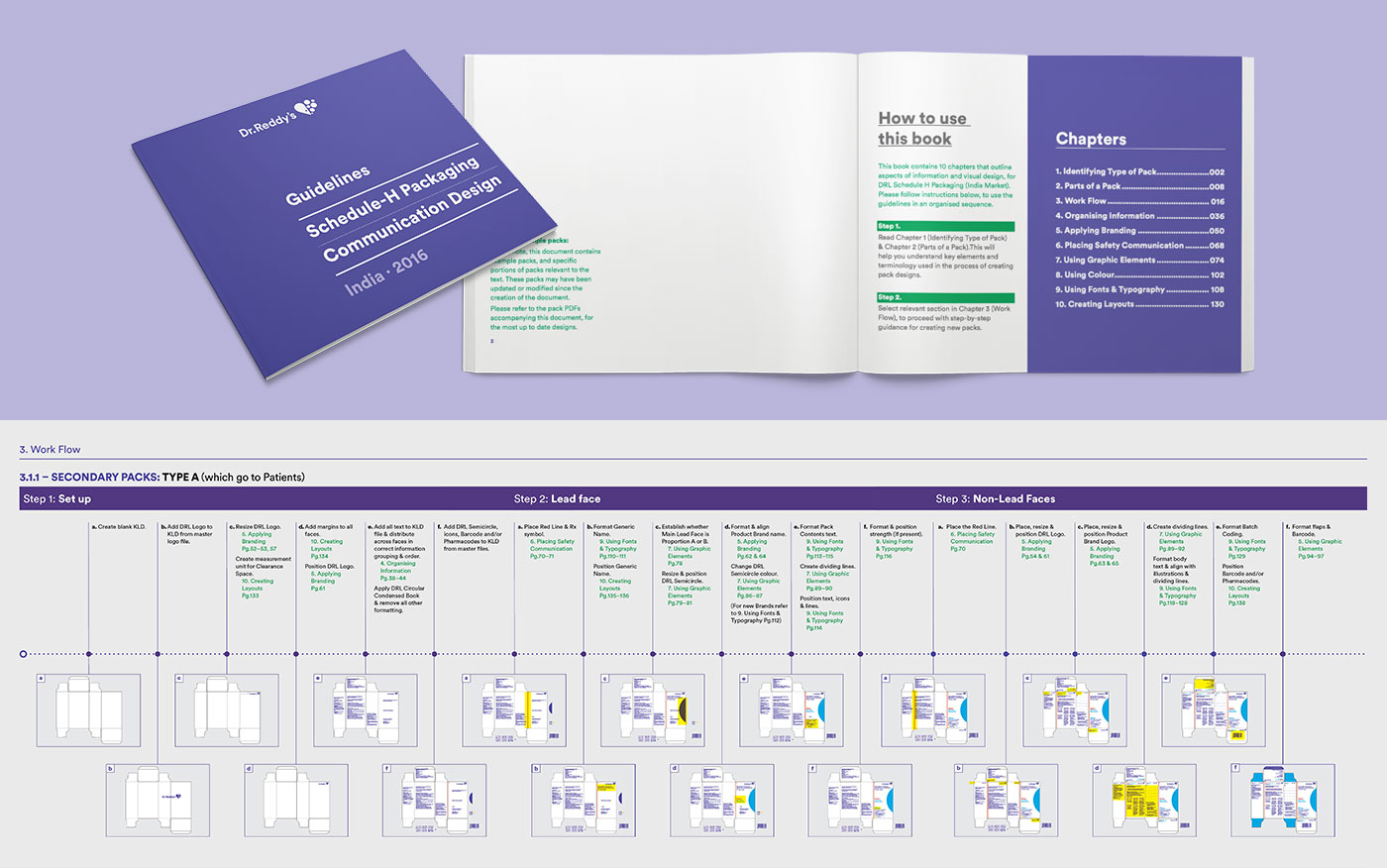
A critical delivery for the project was designing a workflow that enabled the team to work rapidly, but without losing consistency and design impact across 300+ brands and 550+ SKUs for India market.
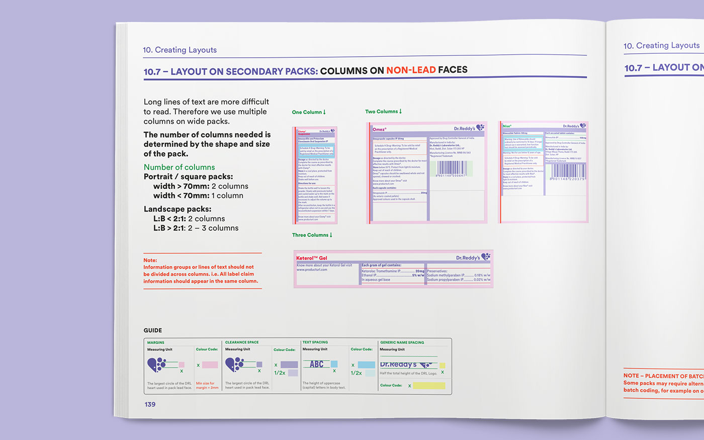
The step-by-step guidelines are designed to enable designers to select a specific task and navigate the detailed guidelines accordingly—optimising time and retaining relevant design detailing.
Impact
The communication system design project for Dr Reddy’s Schedule-H packaging is the only large-scale effort of its kind in the pharmaceutical sector in India. It is being successfully and rapidly rolled out for the ever-growing portfolio of product brands and SKUs in India. It has established distinct presence in a market that is cluttered with inconsistent and formulaic packaging which is brand-centric and not user-centric. Recognising the value of the project created for India market, the same system is now being adapted to Dr Reddy’s 40+ international markets.
Recognition
Finalist, Visual Communication—Packaging Graphics Category, CII Design Excellence Awards 2016.