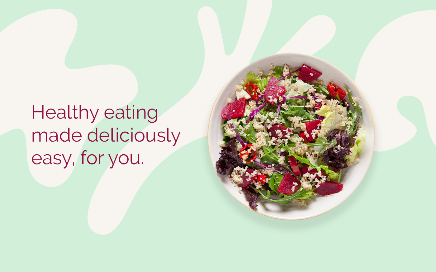
Healthy Eating made Deliciously Easy
Fig is a new business that brings healthier food choices to those who care about healthy living, but are strapped for time to make the necessary lifestyle shifts—key amongst those, being what we eat on an everyday basis . In a nutshell, it makes healthy eating a simple and sustainable choice. We worked with the passionate founder at Fig to create a simple visual identity system for the new business, to help establish its presence in early days and grow into newer expressions as the business grows in the future. As a starting point for the branding, a clear brand articulation sets the tone with key talking points to drive communication & content generation. With its light and fresh aesthetic, the Fig identity stands out amongst a bevy of players with the 'home-made & healthy' tag in this sector. The quality of craftsmanship helps establish a premium brand experience, which extends from the quality of ingredients, the exquisite spread on the menu to the bespoke meal planning service. All together, the brand presents a fresh, buoyant expression that captures the resultant goodness of everyday wholesome eating.
Here’s to a healthier everyday, in style!
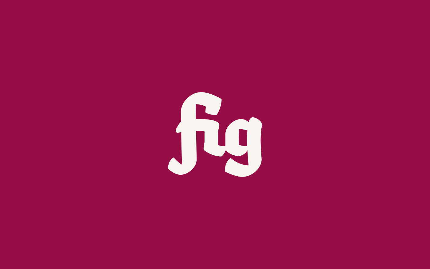
Custom crafted wordmark, that cues the warmth & simplicity of both the food and services.

Food forms—a set of custom-illustrated graphic elements to evoke the simple beauty of great ingredients.
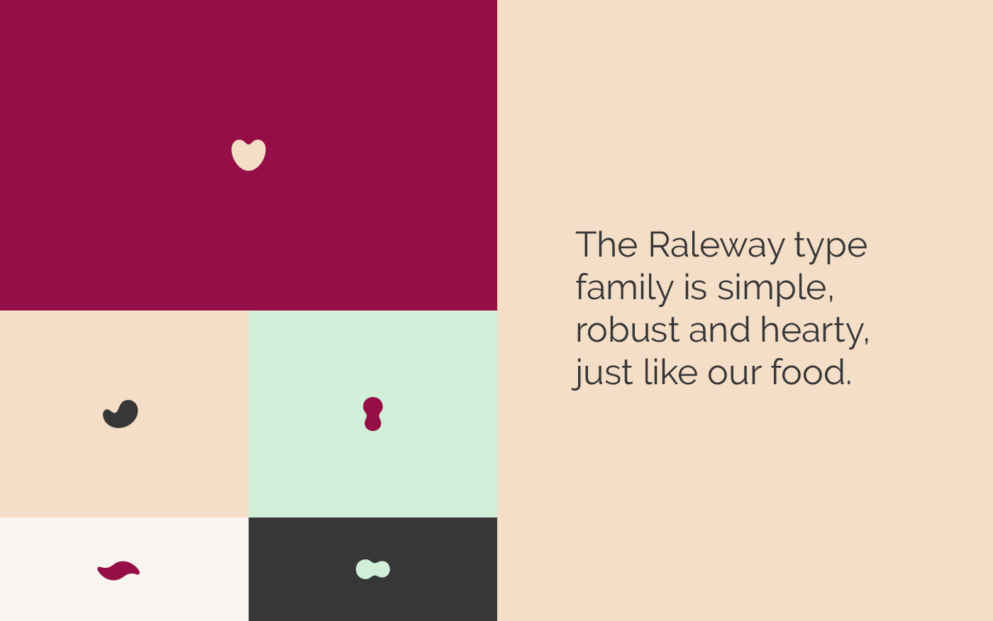
Light & warm—brand colour palette & type to match.
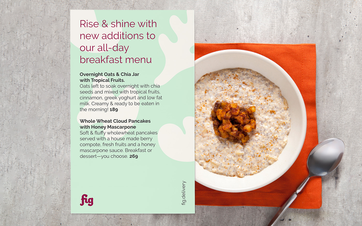
The visual language sets a fresh, buoyant tone for all brand communication.
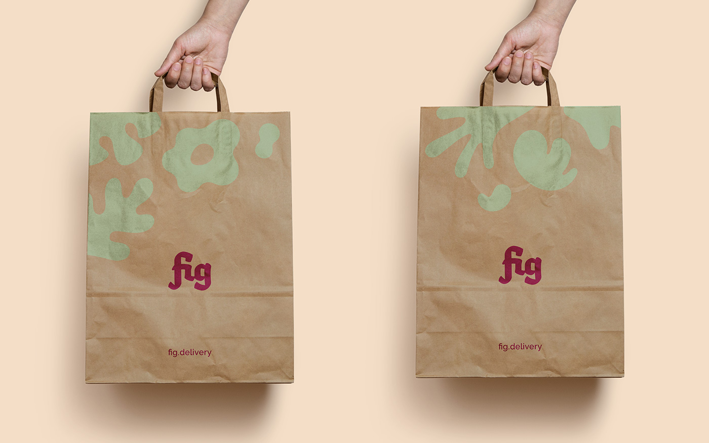
Take-away Bags
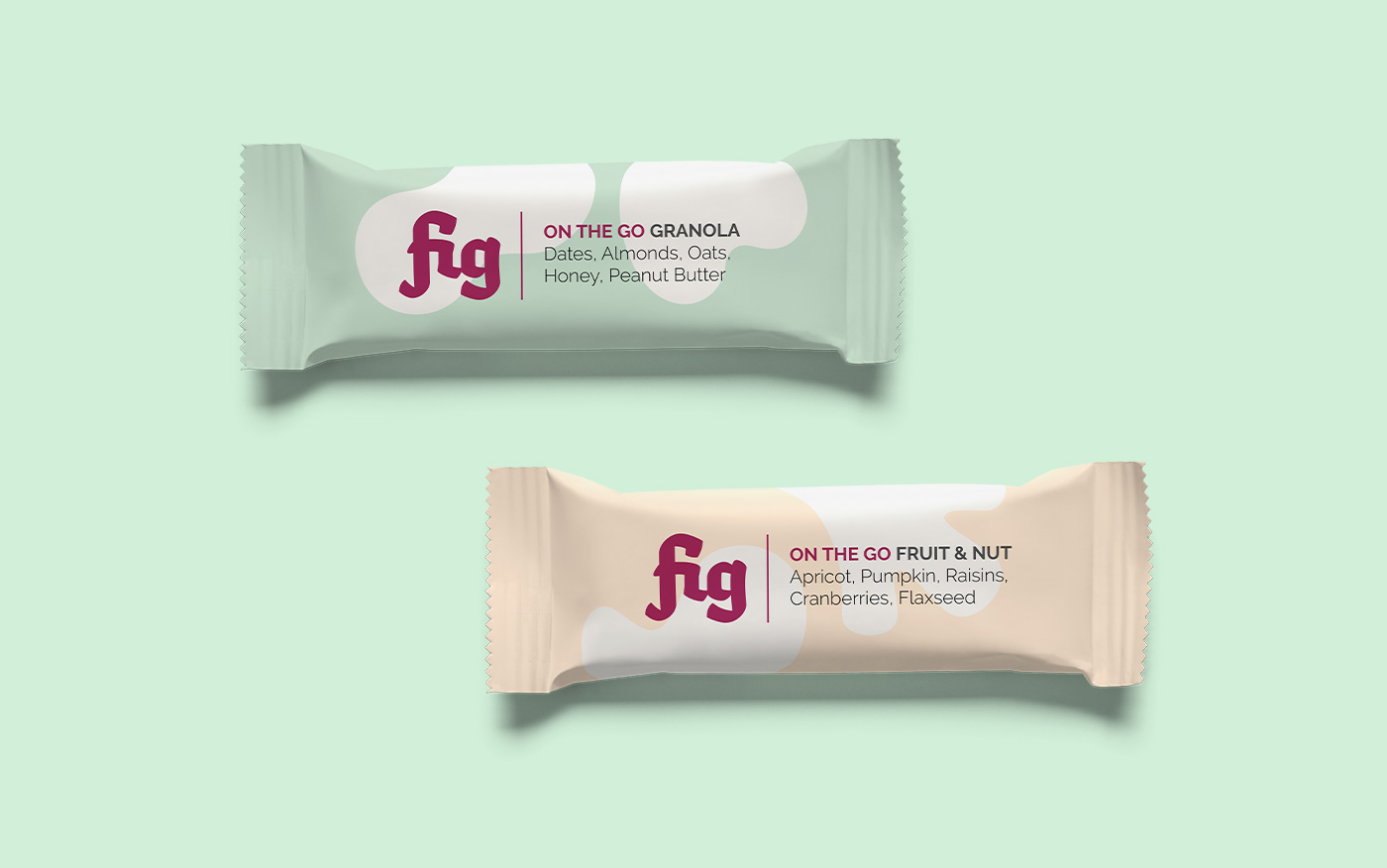
Packaging Extensions
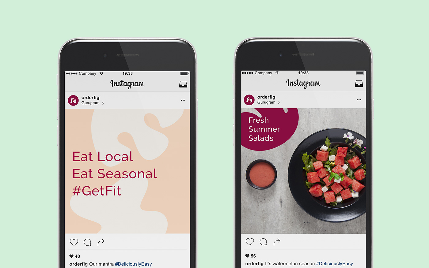
Social Post Styling