Intelligence at Work
ET Money is one of India's most popular fintech apps for mutual fund investments and personal finance management. The transformation of the brand was led by the ambition to play a greater role in their consumers’ lives, empowering them with confidence & knowledge to make the most of their investment journey.
The new brand identity breathes fresh energy into the traditional investment & financial planning landscape. It brings alive a dynamic imagination of financial planning, with a vibrant brand toolkit that evokes a sense of intelligence at work, for you.
- From Promise to Expression: It translates the brand promise of intelligent, dynamic customisation into a distinct and own-able language for the brand.
- Digital-first Implementation: Designed keeping digital-first engagement in mind, it offers multiple ways to embed the identity into digital communications and product experiences.
- Building Appeal: It builds appeal and excitement around financial planning, lowering barriers for newer audiences.
"The design outcome has impacted the brand and the way we engage with our customers in ways that we hadn’t fully imagined. It has inspired a bolder, more engaging user experience on our app and website. It has added vibrance, intelligence and a sense of integrity in all our customer facing efforts—from CRM to social media."—Santosh Navlani, COO, ET Money
Scope
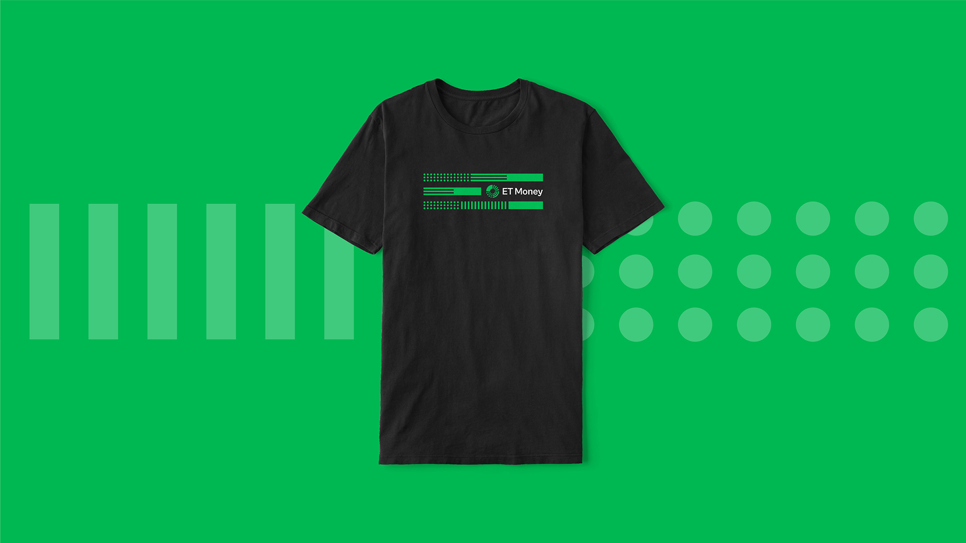
Brand Identity, Motion & Sonic Identity, Sub-brand creation, Elements for Product Branding
A new view of growth
Growth, especially in the context of finance, is commonly visualised as a linear journey. In contrast, ET Money’s imagination of financial planning is of a continuous process that adapts and reconfigures to the user’s changing goals and aspirations.
“ET Money has built a reputation of sorts, where our investors trust our intention of keeping their interests at heart. We were clear that ET Money was not another transaction-led fintech platform. We wanted to build on this belief to establish a one-of-a-kind investment platform that understood investors as individuals and could personalize investment solutions for them accordingly. Design needed to bring alive this promise of a personalized wealth creation journey and infuse the experience of investing with a new found sense of belief and freedom.”—Mukesh Kalra, Founder & CEO, ET Money
The new ET Money brand identity expresses this decisively dynamic approach to personal financial growth. It is designed to signal a fresh approach to thinking and engaging with financial planning—celebrating agility over passivity, informed confidence over deference, and most of all a promise of continuous, intelligent change.
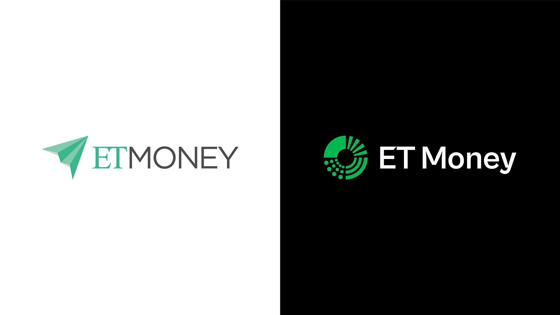
Moving away from linear and rigid ideas of growth, the new logo symbolises balanced, diverse and adaptable investment planning centred around the user. Each quadrant cues a different pattern of growth, representing the diversity of the portfolio and coming together in a strong circular unit representing our individual-centric approach.
Motion brings alive the dynamic mechanism of the logo in resonance with the brand promise while the sonic identity evokes a tech-inspired sound of money on the move.
“The outcome of the exercise has created a powerful set of brand assets held together by what we like to call, the wheel of wealth. It is a powerful symbol that represents our understanding of the individual’s journey and our commitment to help them navigate it no matter what.”—Santosh Navlani, COO, ET Money
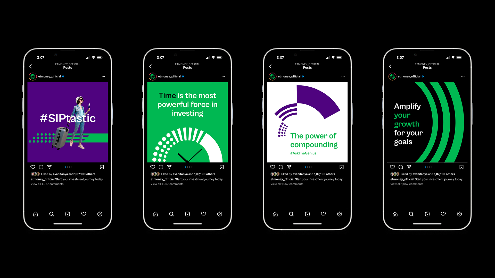
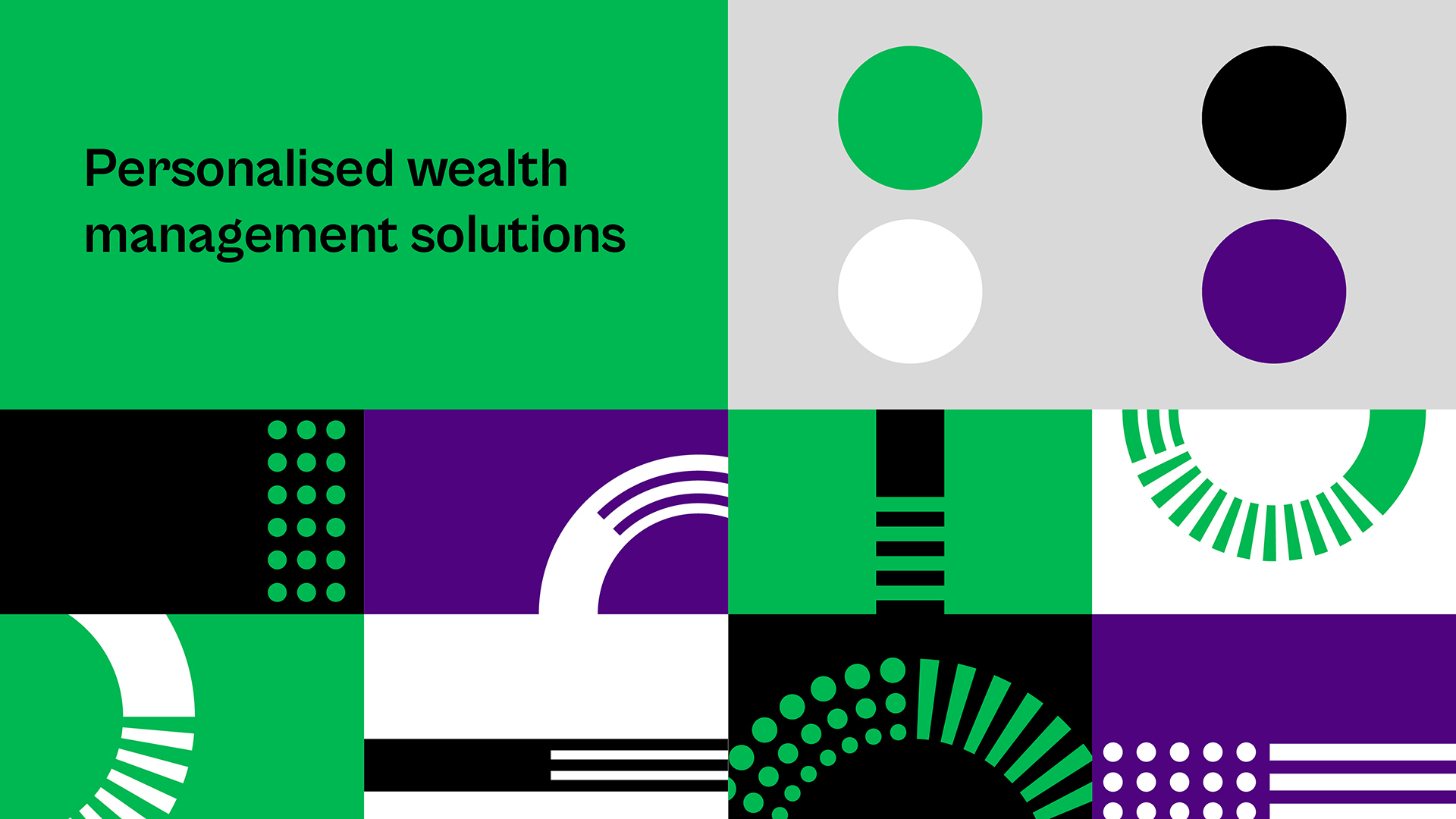
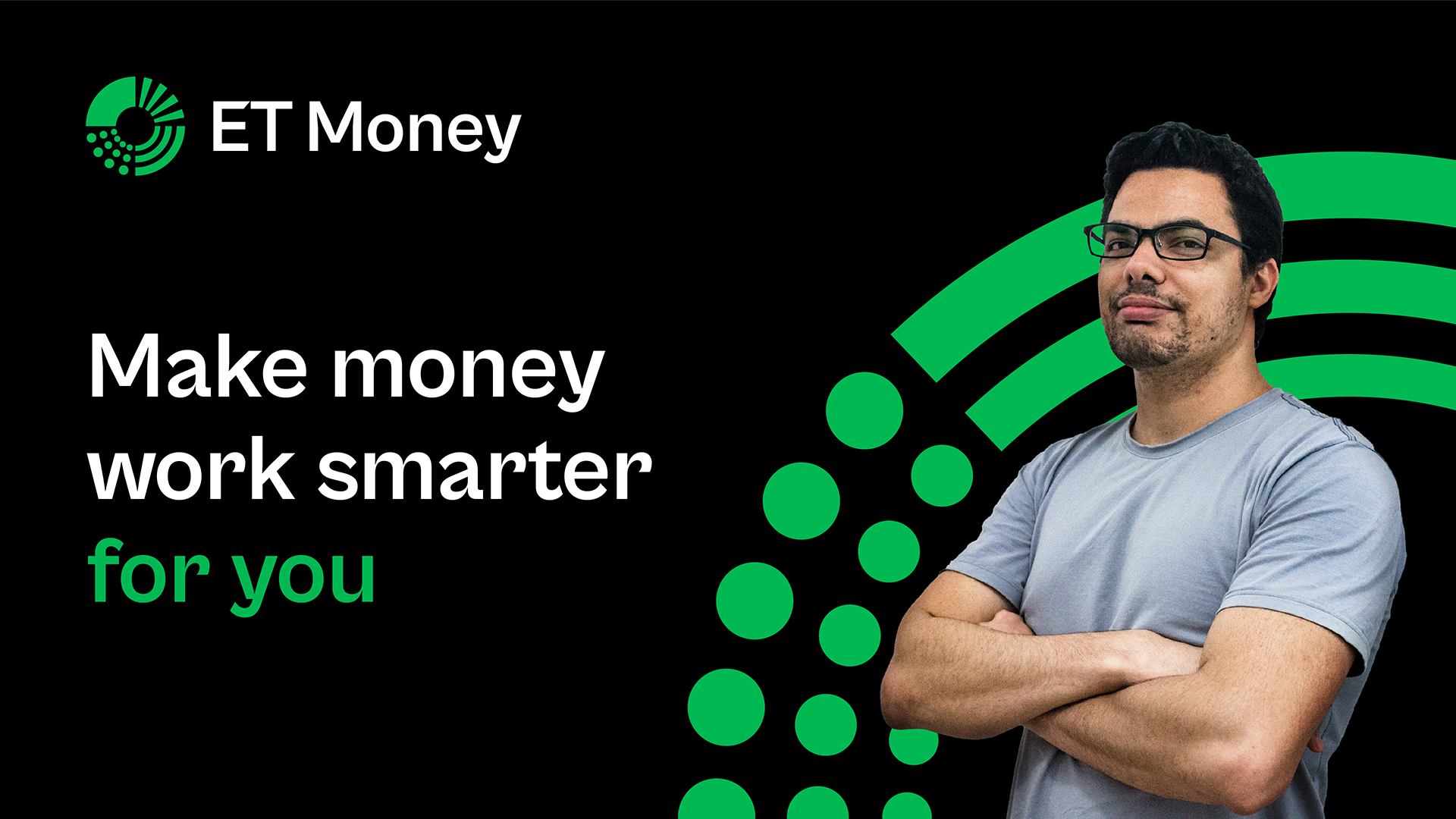
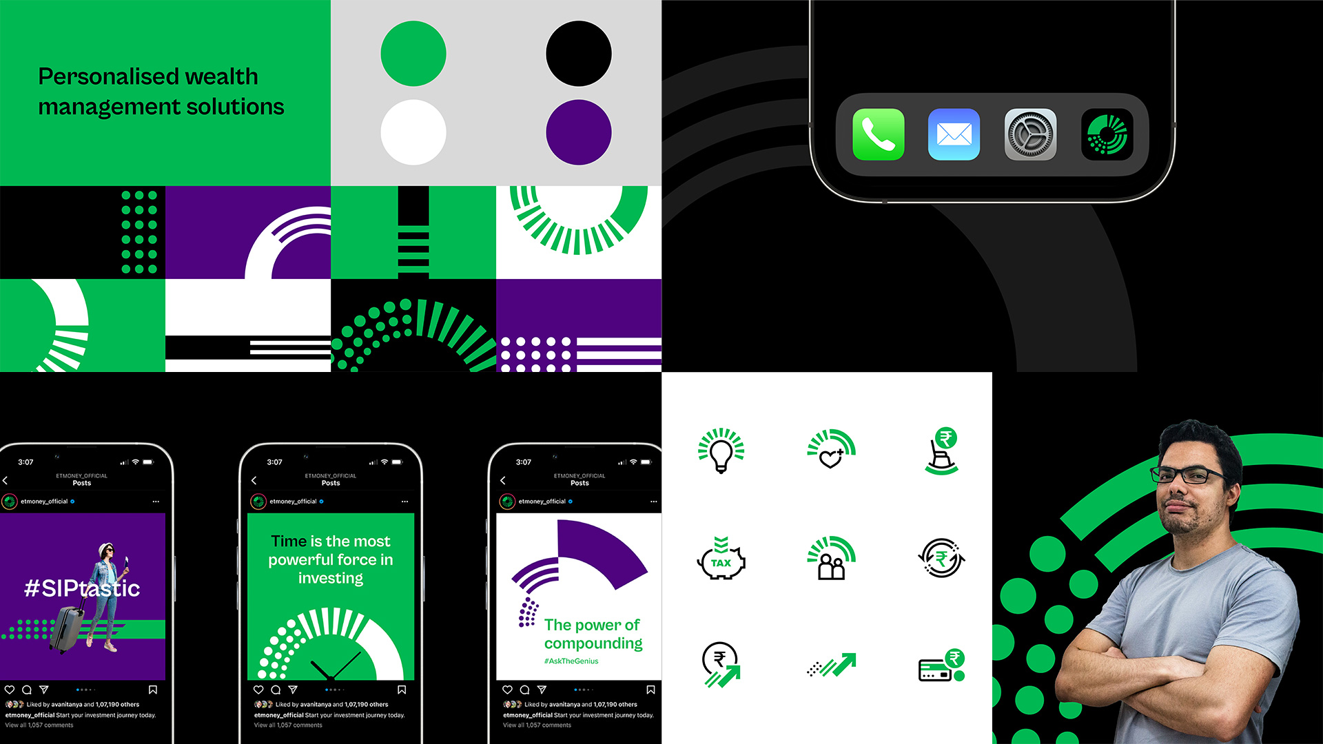
Elements of the identity come to life in the brand touchpoints, extending vitality and visible expressions of transformation to all communication. Designed keeping screen-led engagement in mind, the toolkit offers multiple opportunities to embed the identity into both digital communications and product experiences. The new brand colour palette strikes a bold note with an all-new shade of Money Green, paired for smart contrast with black and white. The strong colour palette speaks the language of growth with a confident and sharp voice, and is complemented in character by the screen-friendly brand font—Cabinet Grotesk. In the product interface, the identity breathes fresh life with custom icons, animated cues and clear information visualisation. The new identity system also introduces Genius, an upgraded personalised experience, designed to complement the parent brand in a premium shade of gold.
Team: Aayushi Katare, Mohor Ray, Nikhil Ranganathan, Rajesh Dahiya, Siddharth Nair, Ved Uttam, Addikt (Motion & Sonic support)