Confidence in Action
Background
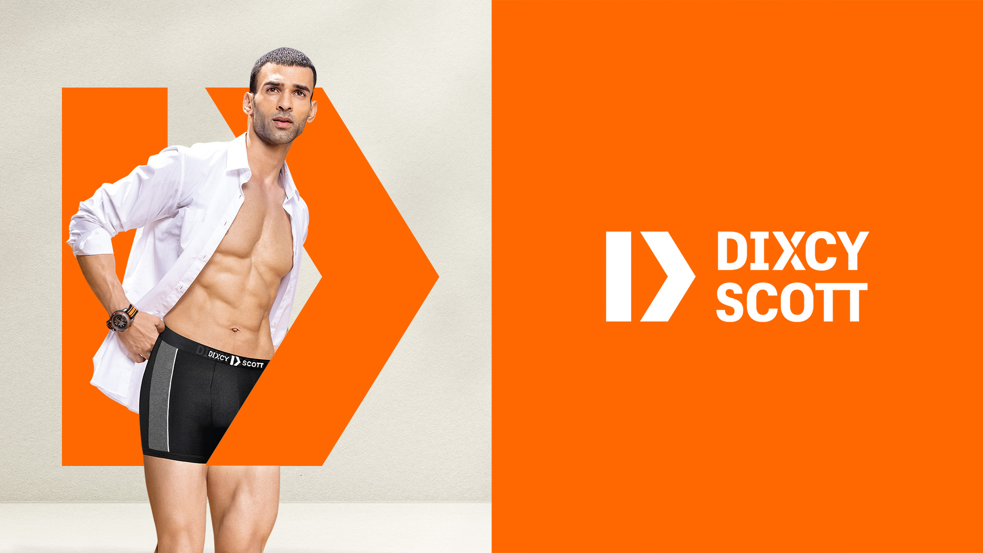
Dixcy Scott is one of India’s largest inner wear & casual wear brands for men, providing style and quality at accessible pricing. With a growing network of more than 1,000 distributors, Dixcy Scott is available at over 120,000 retail outlets across India as well as through online channels. With renewed ambition for increased growth, differentiation and market relevance, Dixcy Scott initiated a complete brand transformation with Codesign leading brand identity design.
Scope
Brand Identity, Packaging Design System, On-product Application, Sub-brand Naming
"Dixcy Scott is a brand that has established its legacy in India for 4 decades now. Codesign has done an exemplary job in understanding the brand, its existing and potential market and taking the right approach in building a new brand identity, transforming the brand language and making it aspirational without alienating our core consumers."
—Sunil Sethi, Executive Chairman, Modenik Lifestyle Pvt. Ltd.
L: Old Logo, R: New Logo
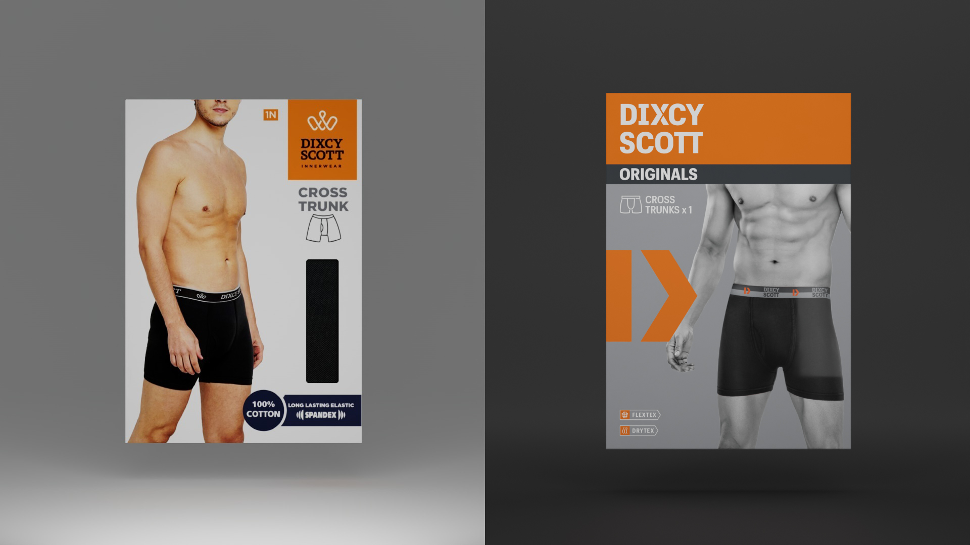
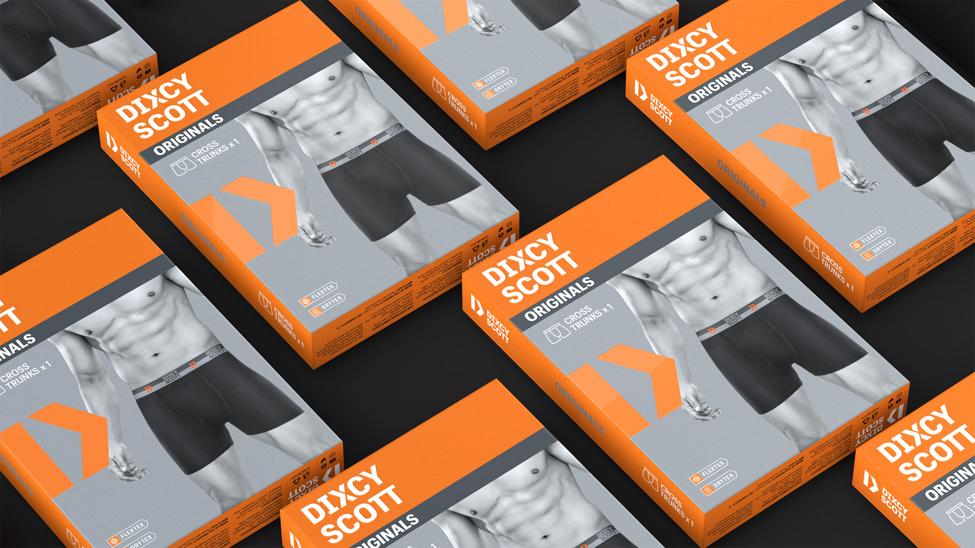
L: Old Pack, R: New Pack
A New View of Masculinity
The mass market men’s inner wear category has long suffered from a rigid and dated imagination of overtly aggressive masculinity that does not speak to changing and liberated aspirations. Inner wear, specifically for men, is traditionally seen as a functional garment, with limited scope for style or personal expression. Over reliance on celebrity brand endorsements in the absence of compelling brand narratives led to superficial & often disconnected experiences with the brand.
Dixcy Scott’s brand transformation is a response to the newer views of masculinity taking shape—one that champions confident expression and individual aspiration, one that resonates with changing times.
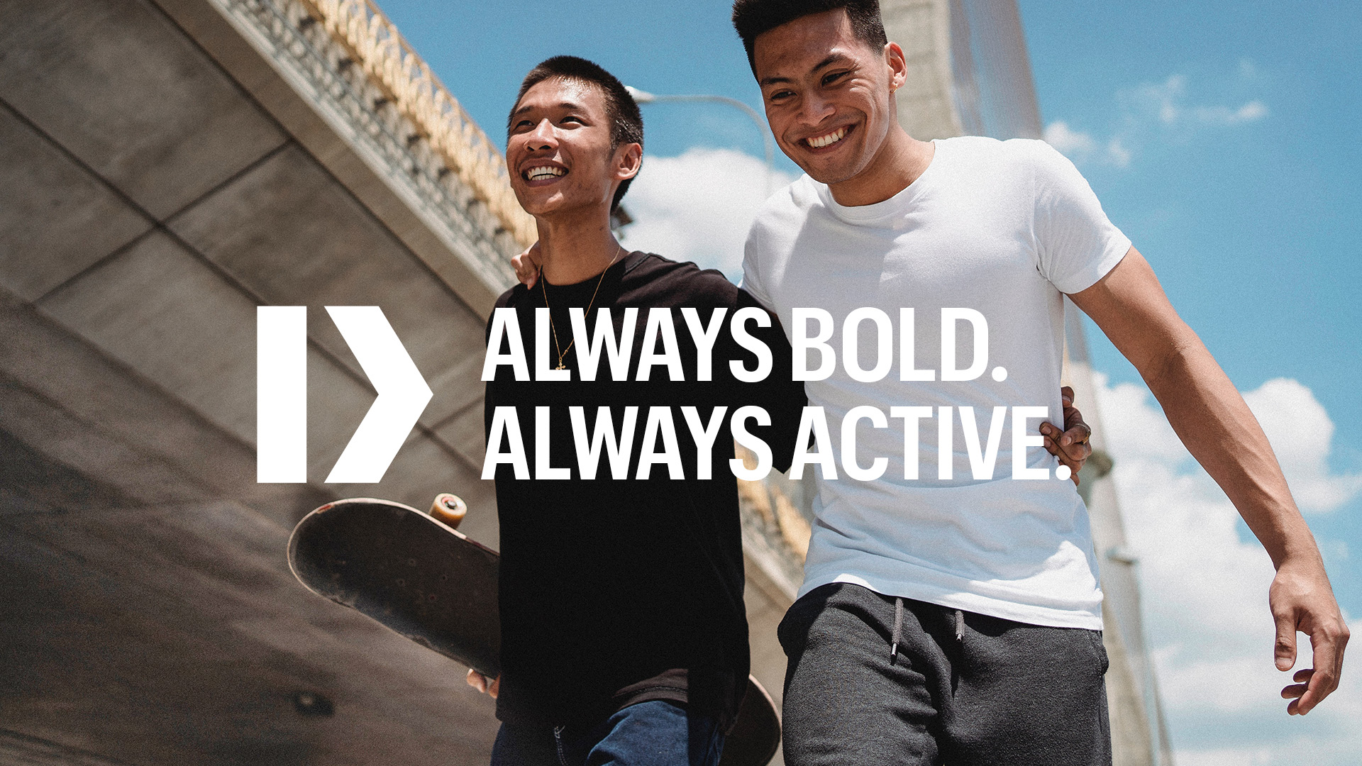
The New Language
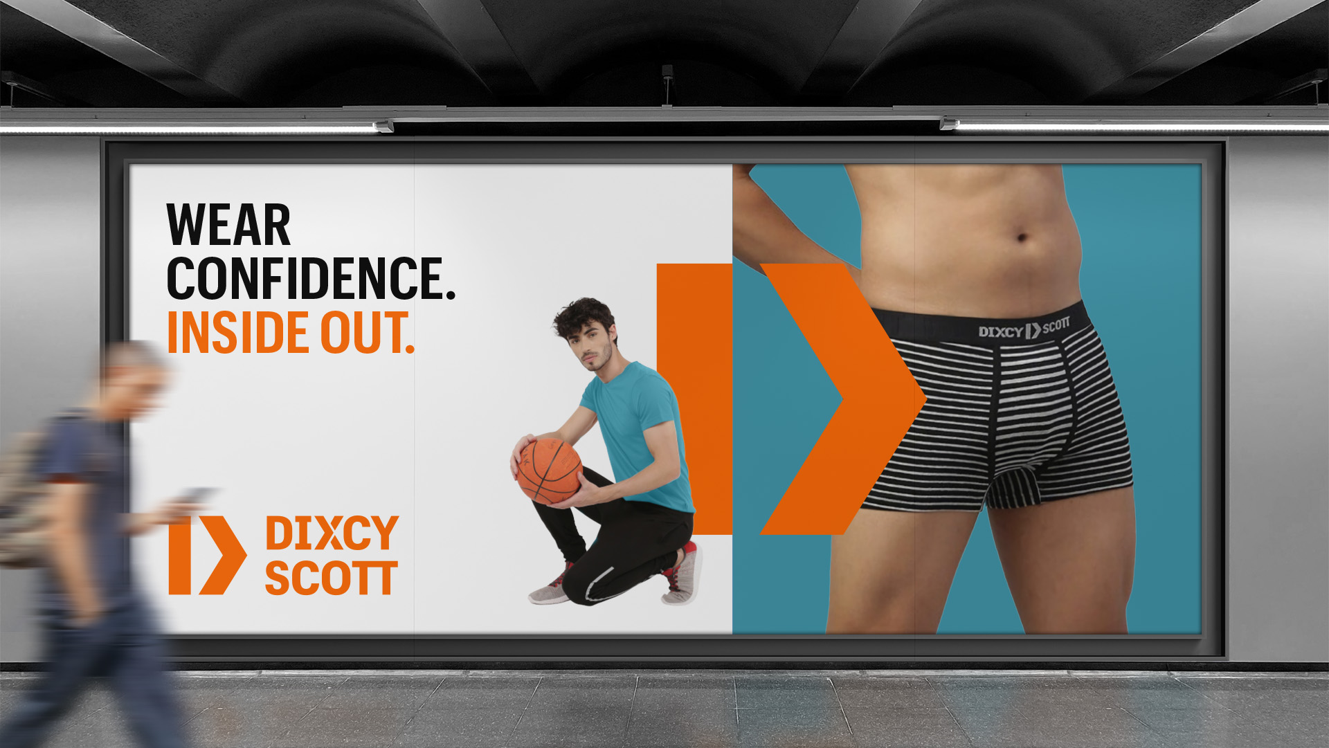
Always Bold. Always Active.
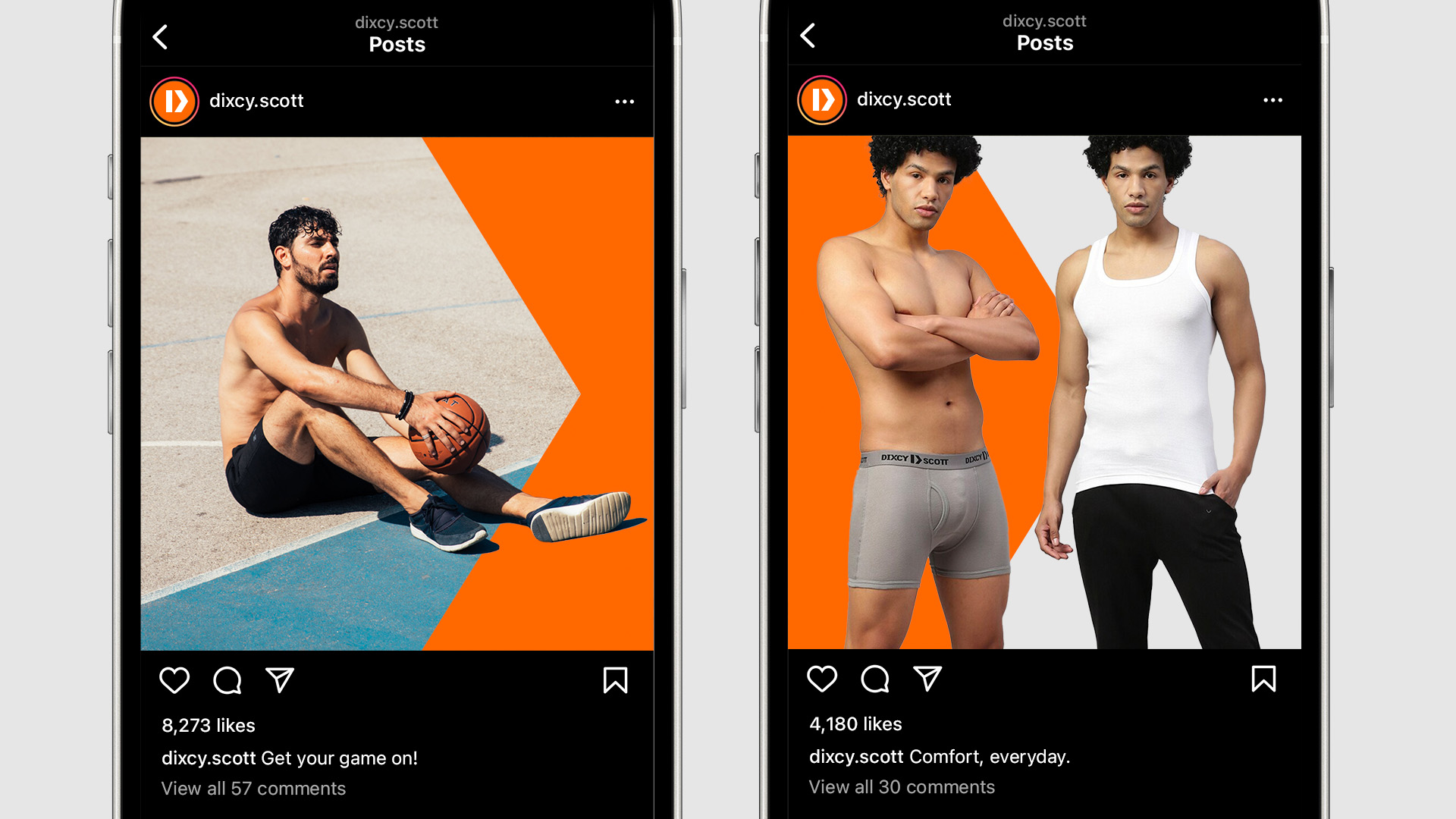
The identity and its visual assets mark a shift from a previously static stance to an engaged & active stance. Every brand asset—the sharp & dynamic logo, the bold palette, typography and refreshed photography, is designed to deliver confidence in action.
"To be able to elevate the brand from cliched hyper-masculine messaging and make the narrative positively relevant for the new age man was no easy feat and a huge achievement for this partnership. Kudos to the Codesign team for bold and fresh thinking which is reflected in the designs of the new identity."
—Sunil Sethi, Executive Chairman, Modenik Lifestyle
The communication is geared to hero the everyday man and supercharge his every moment. Photography highlights performance in the real world—from work to play and everything in between. Graphik, the brand font, reinforces body confidence, and principles of colour blocking and dynamic compositions bring alive the active & bold stance of the brand.
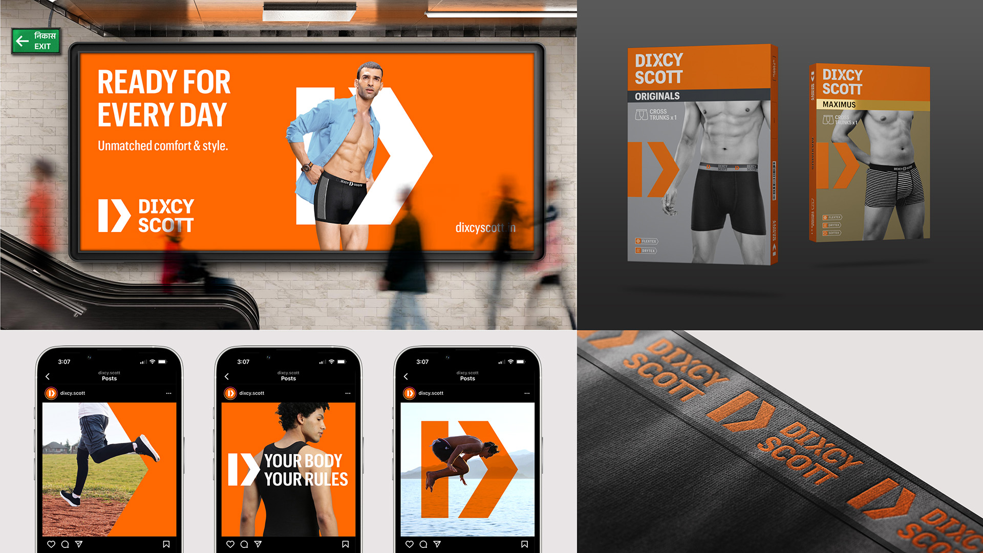
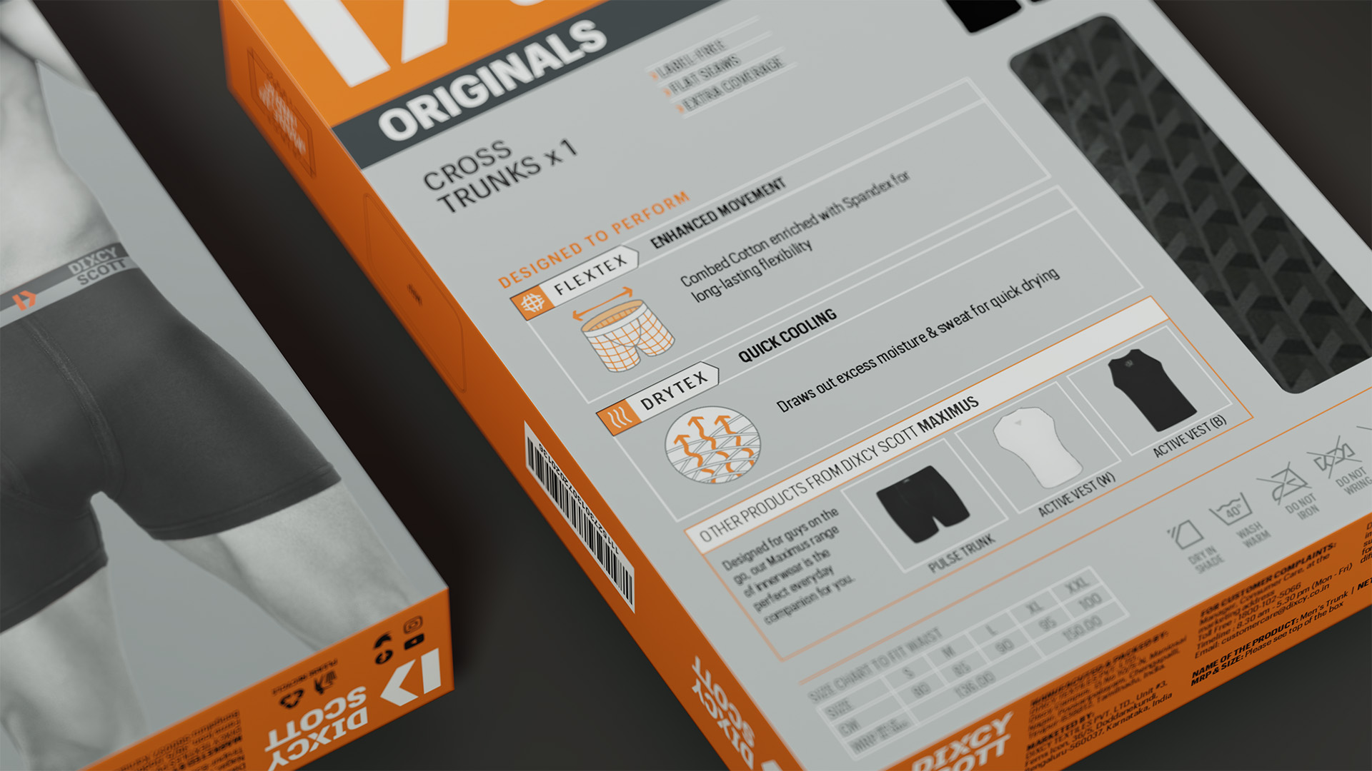
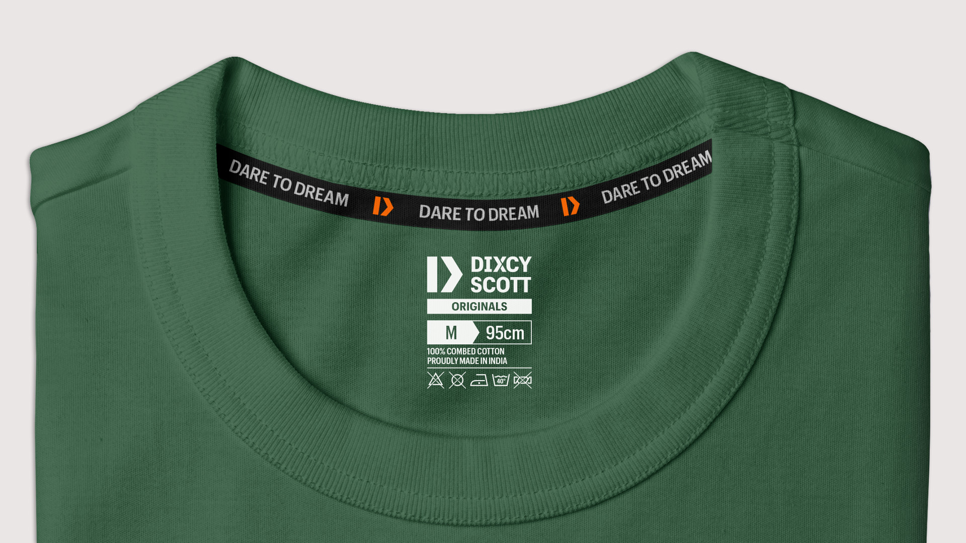
Packaging Design System
Packaging became a key touchpoint to signal the brand’s refreshed stance, and engage the consumer in a more intimate setting with the evolved language of both brand & product. The packaging design system was designed to:
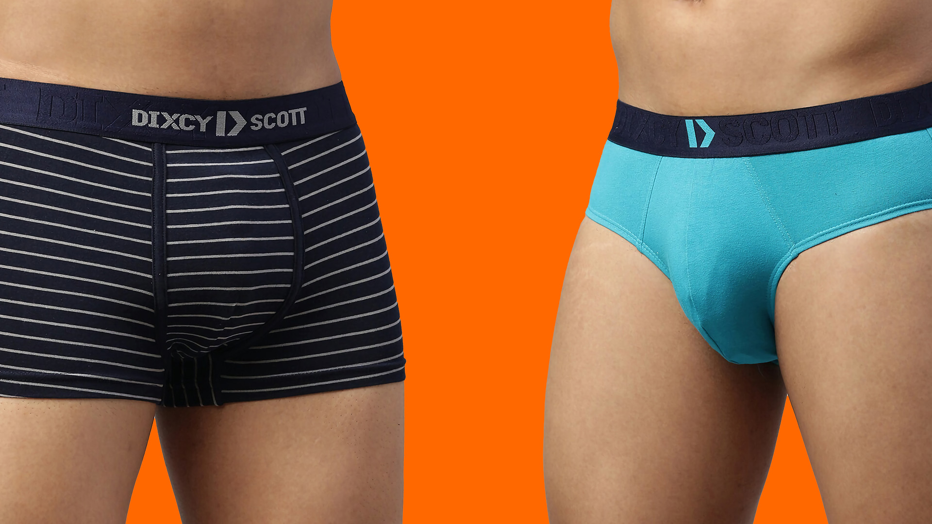
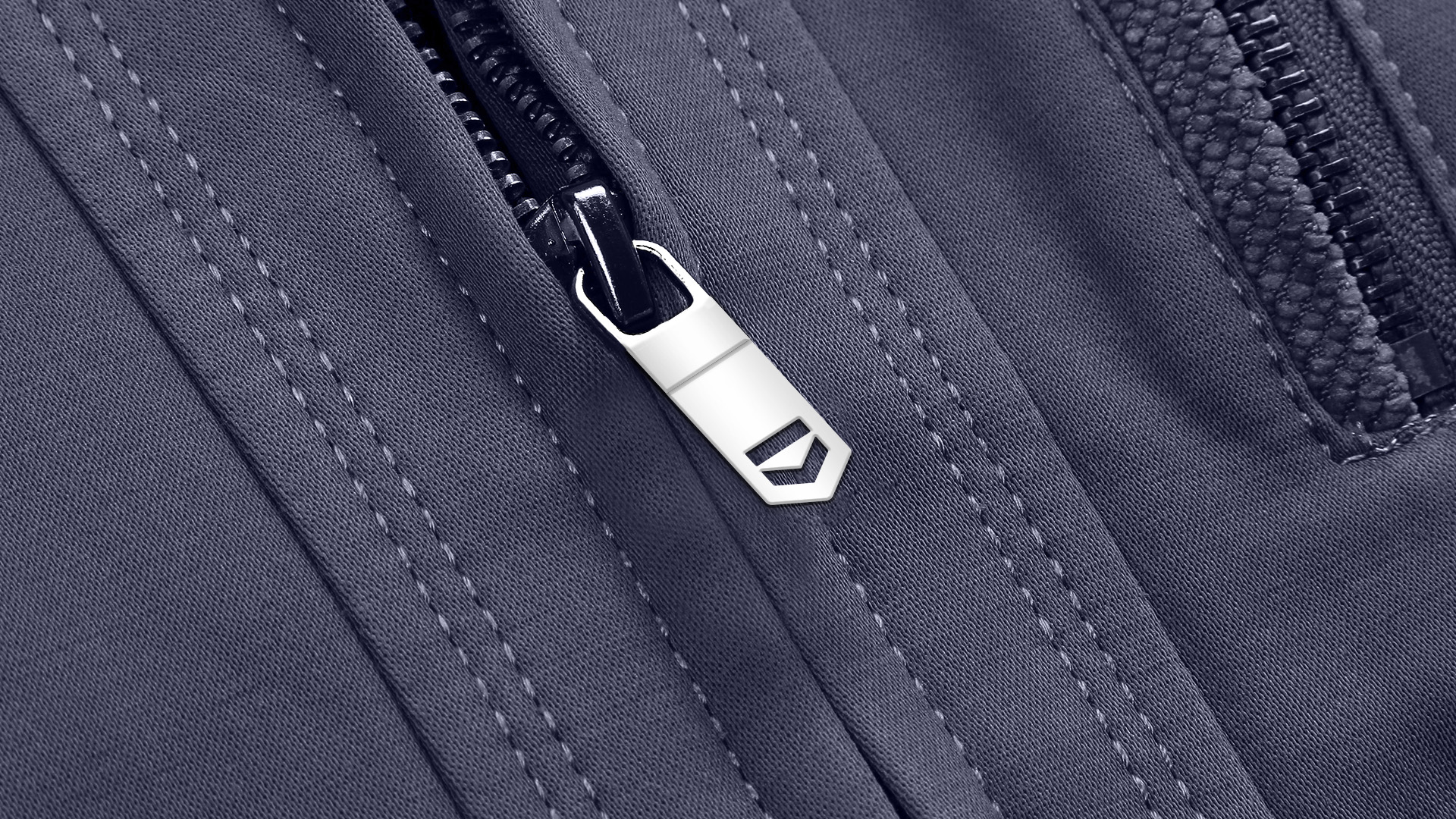
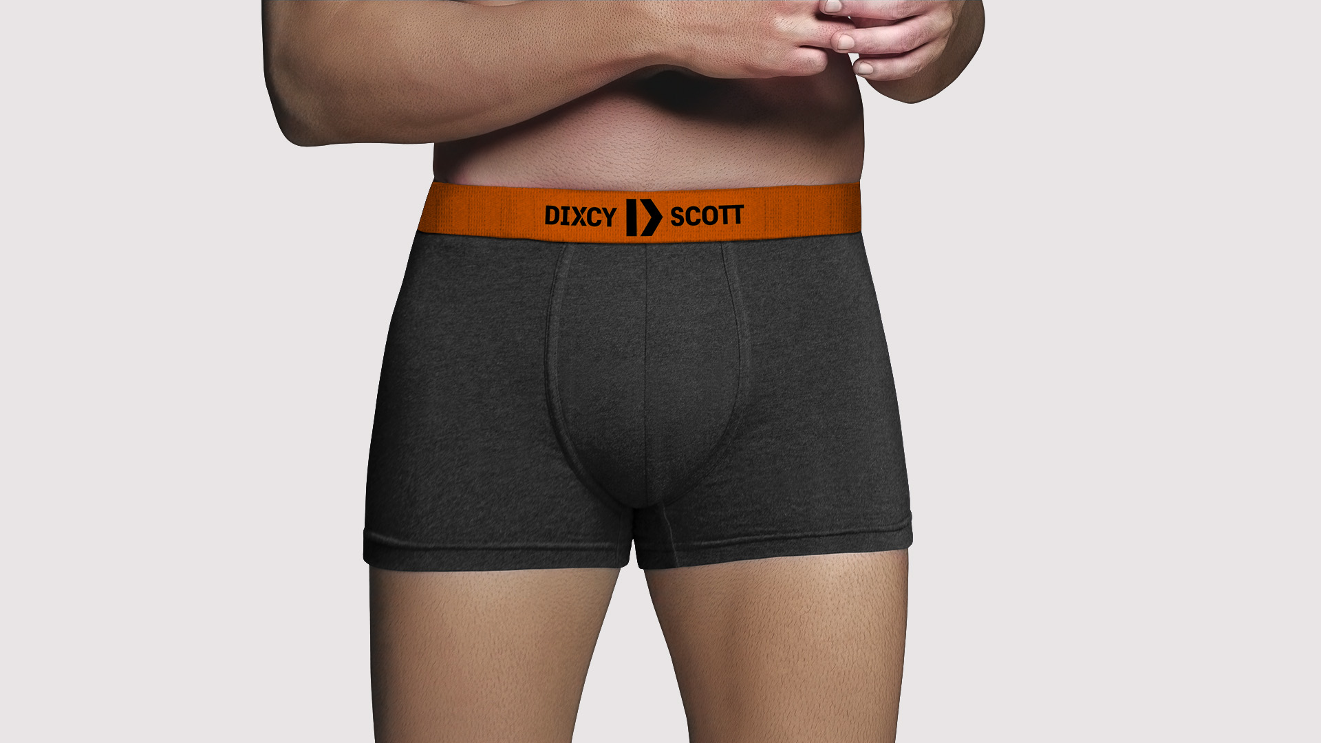
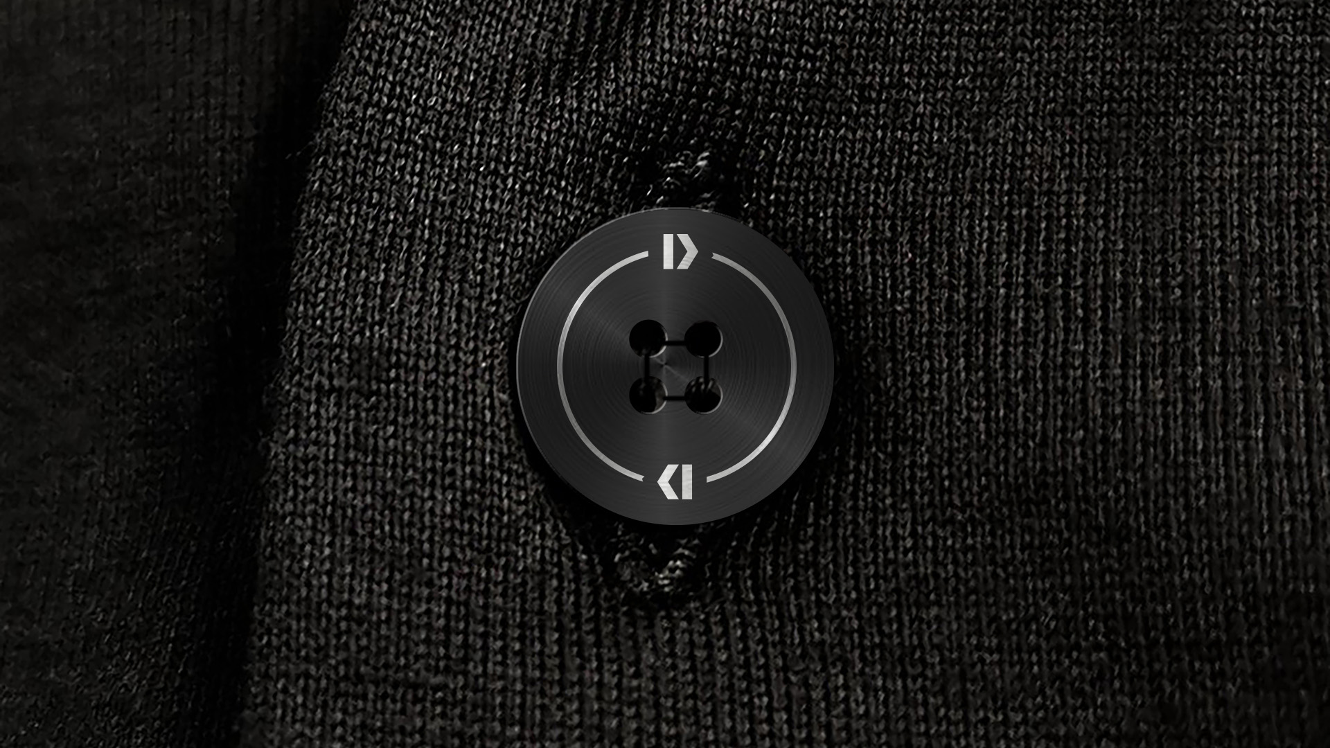
On-product Application
The on product application of identity acts not only as a marker of trust but also as a marker of aspiration. The identity allows for expressive & playful adaptation on garments and as trims, and above all is designed to be worn with pride.
Team
Vishnu M Nair, Shreeya Kurien, Rajesh Dahiya, Mohor Ray, Aayushi Katare, Nikhil Ranganathan, Ved Uttam