The Gold Rush
Brewing since 2015, Bira 91 ushered in a fresh wave of flavorful beers for India, and has a rapidly increasing global footprint today. We worked with them to create the positioning & identity for a new premium offering Bira 91 Gold, their second foray into the largest category of beer consumption in India—strong beers with a hefty 8% ABV.
Strong beers in India have traditionally projected an aggressive masculine image, choosing strength over flavour or finesse as a general category cue. The overarching Bira 91 brand, since its inception has championed its ‘Make Play’ way, bringing endearing freshness to the conversation on craft, across its portfolio. Recognising this as the DNA of the parent brand, and working closely with the client team to understand the nuances of the wheat brew, we created a differentiated narrative for Bira 91 Gold.
Our scope of engagement included brand positioning, vocabulary, tone of voice, product & packaging identity & overall design language.
Positioning—Strength reimagined.
The Bira 91 Gold brand celebrates the refined intensity of flavour, over and above the generic category claim of strength. The shift in imagination of strength to the intensity of flavour profile, provides ownable differentiation in the category, and enables premiumisation. It positions the product as a finely-crafted premium brew for those who are discerning and want more from their strong beer. In true Bira 91 spirit, the brand tone is sharp-witted & sophisticated.
Together with the identity design, the product brand is built to grow beyond boundaries of the ‘strong beer category’ which is limited by its aggressive & overtly masculine behaviour and low emphasis on flavour.

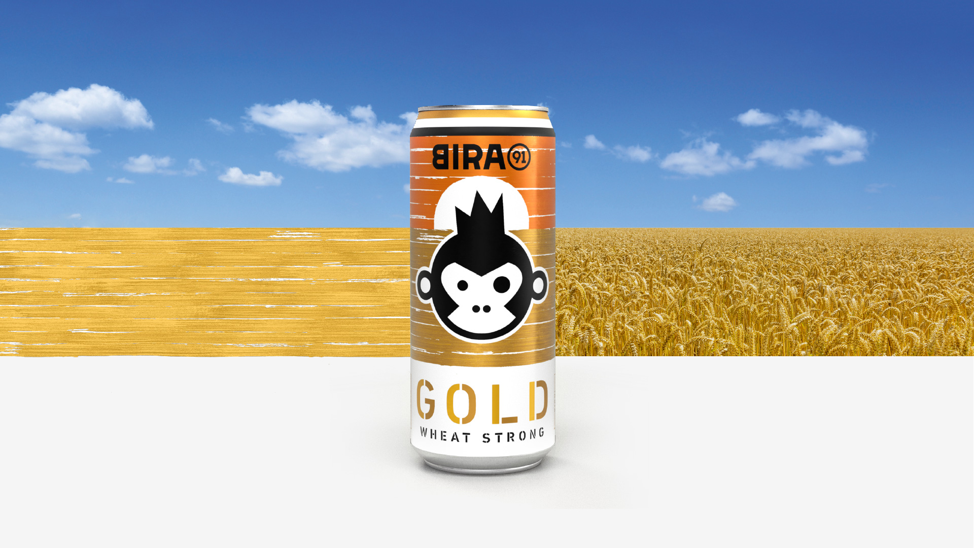
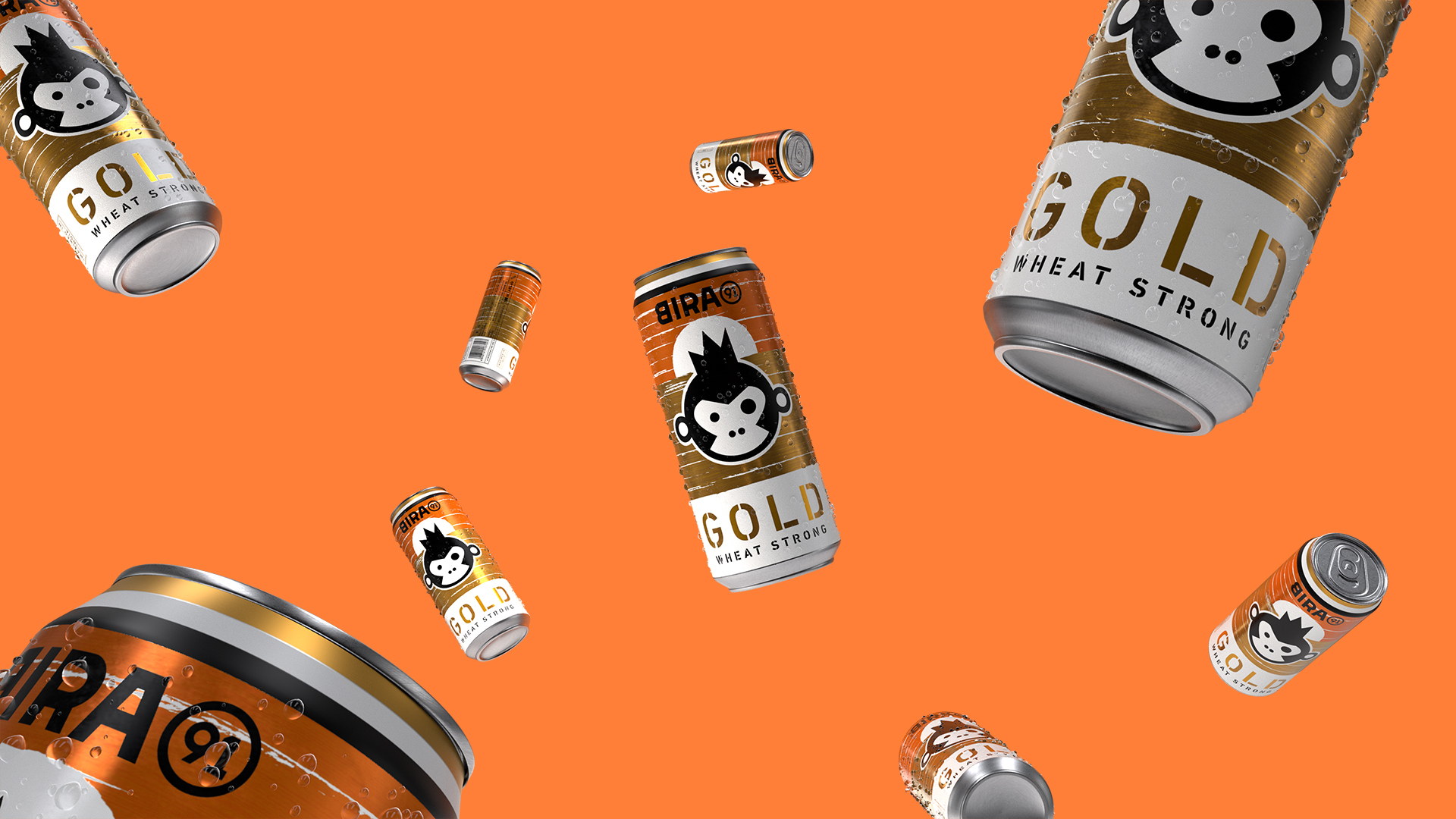
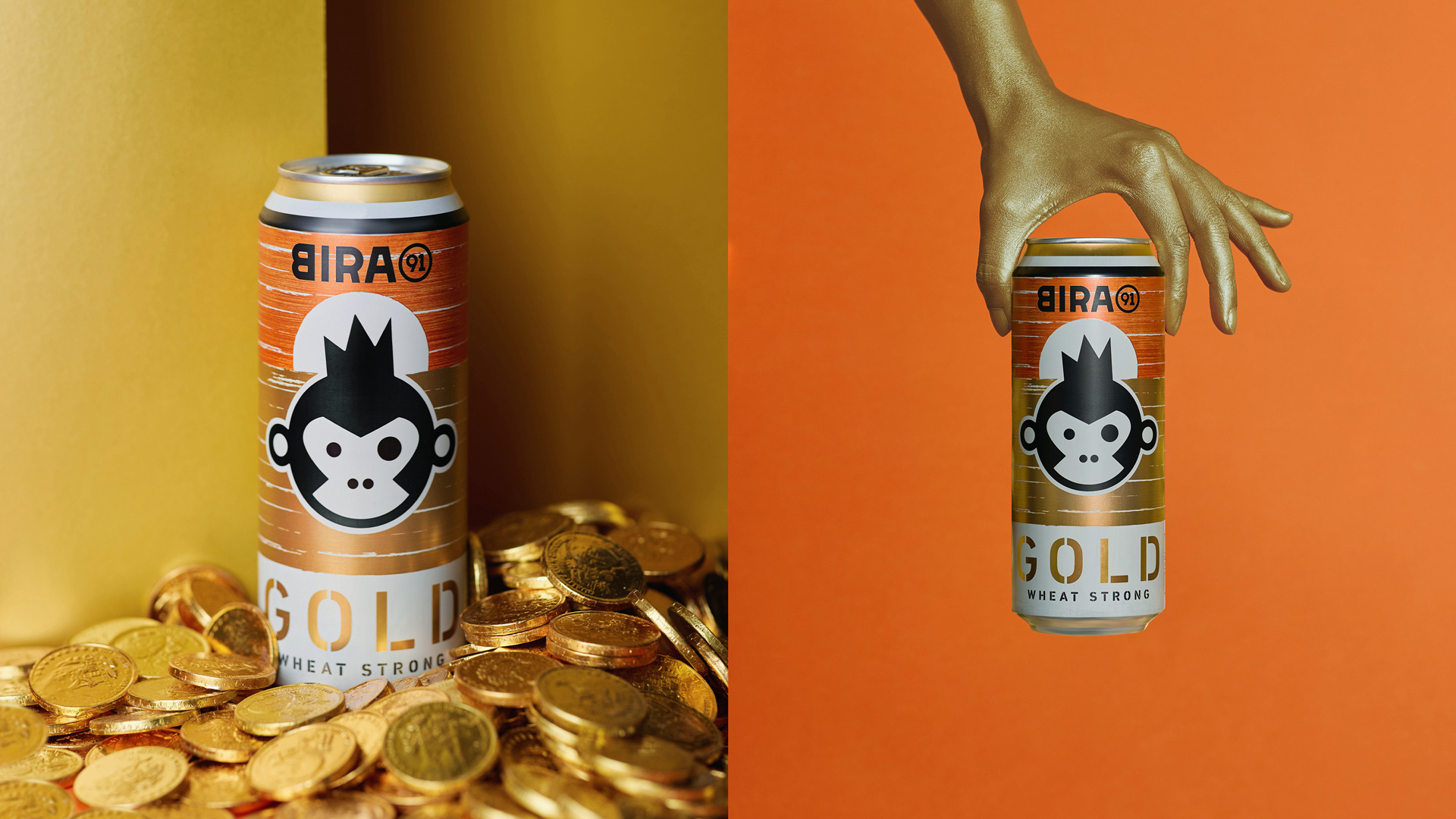
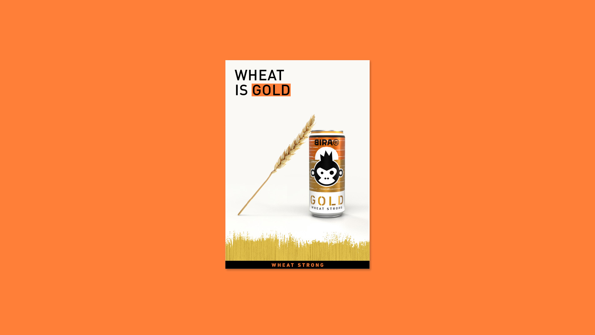
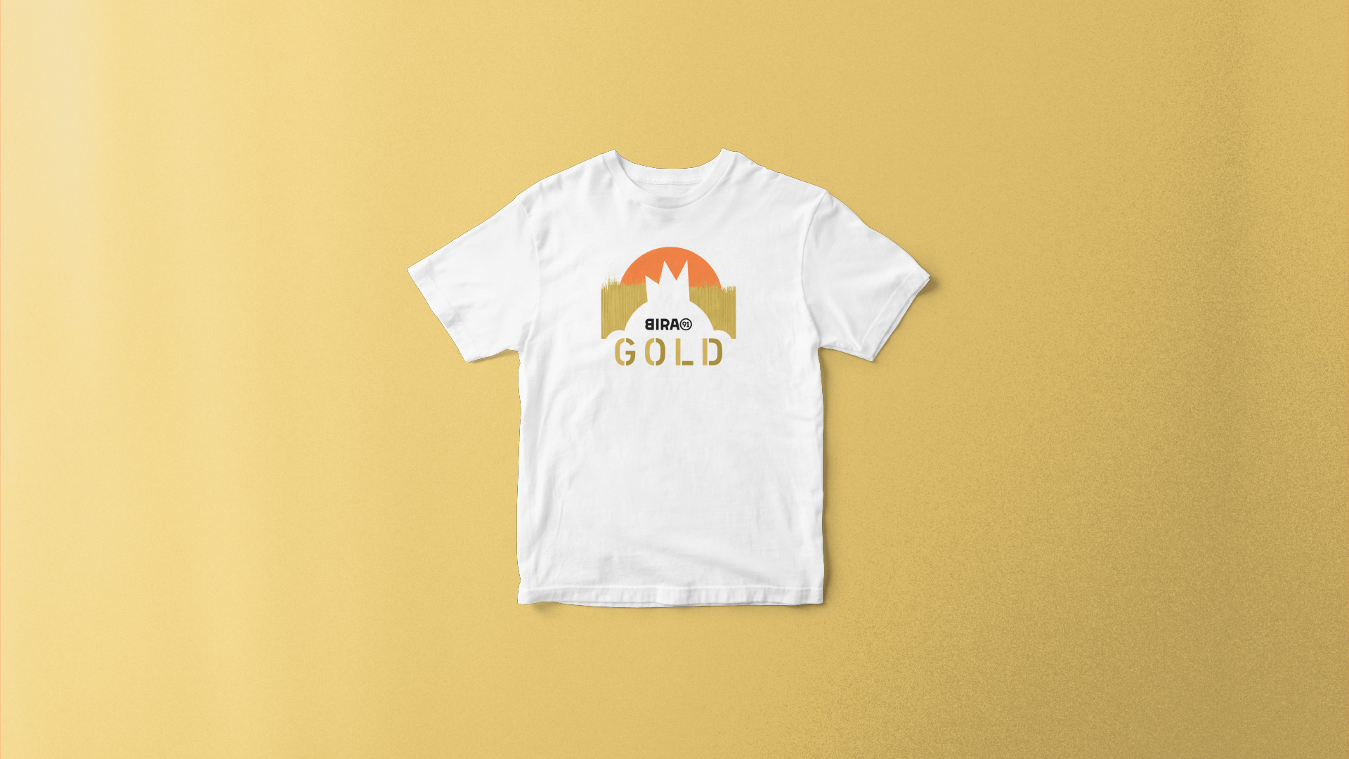
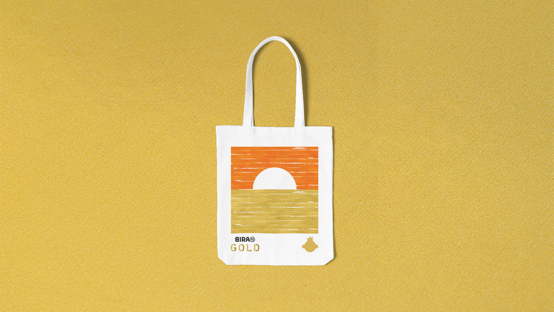
Identity—Wheat is Gold.
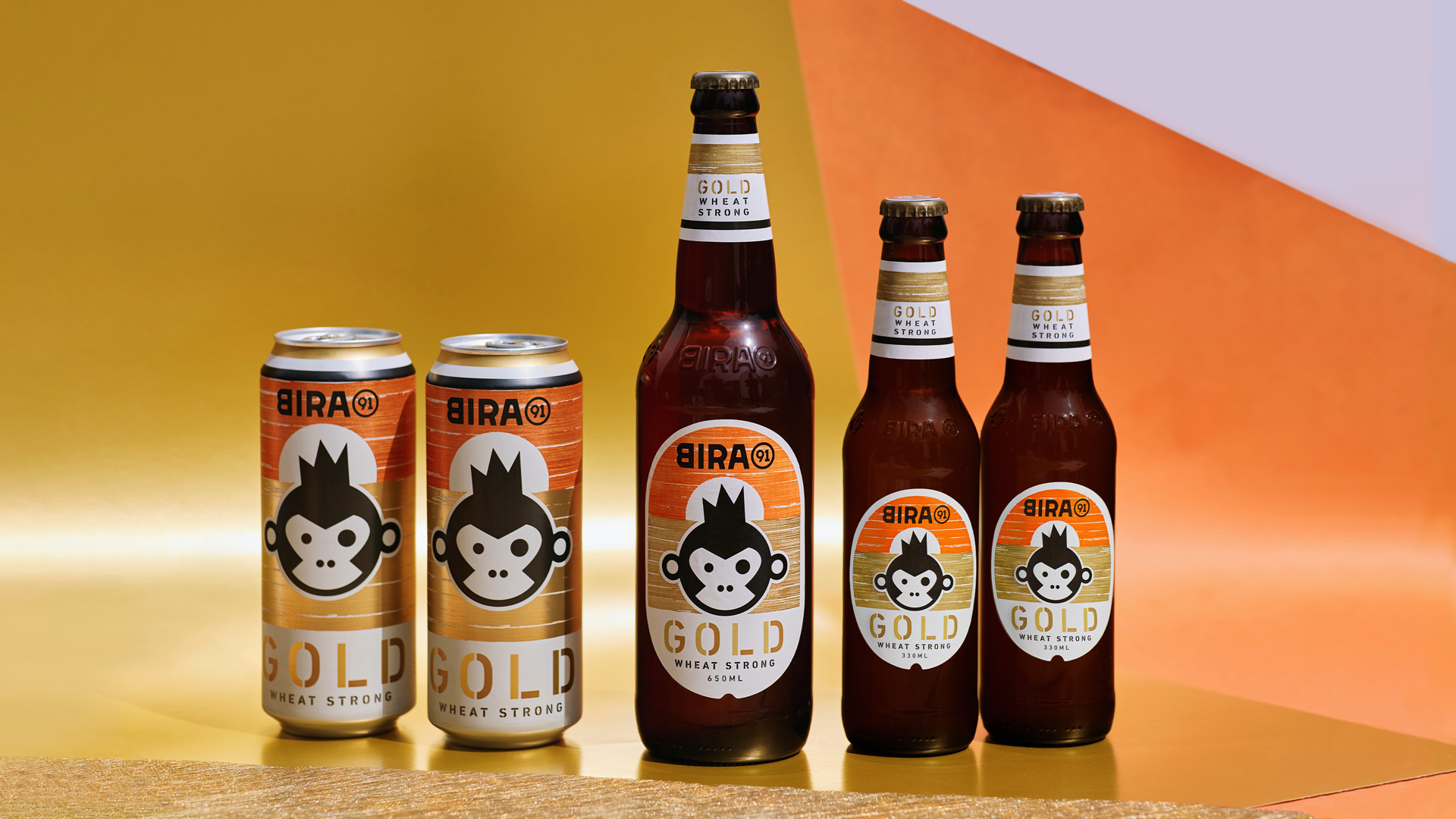
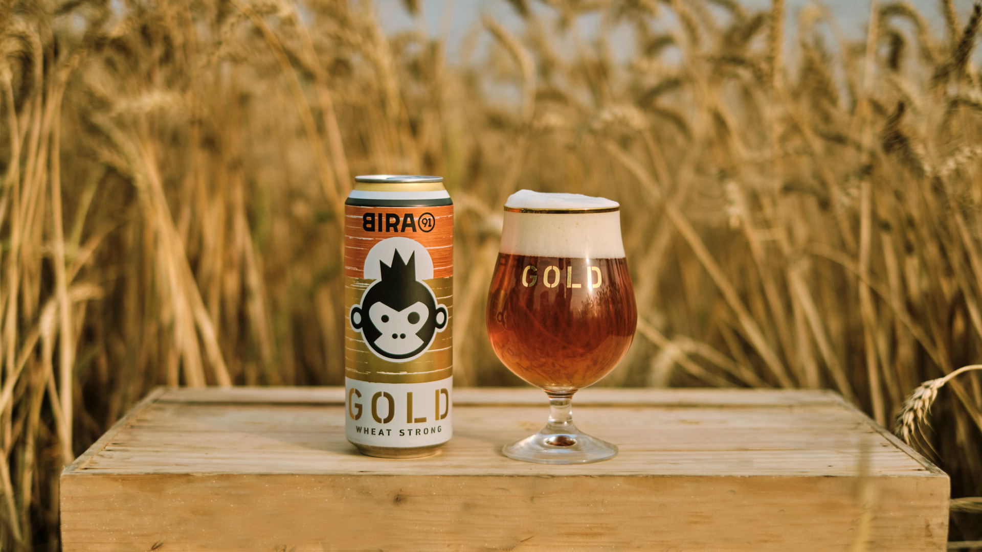
Wheat as the key ingredient is elevated with visuals of precious abundance—interpreted as lush wheat fields and luxurious swashes of gold. The identity retains its connection with the parent brand, integrating assets like the iconic mascot in the new world of gold, and adding new stylistic dimensions to the brand font. Both in its visual expression and vocabulary, the identity reinforces ideas of precious wheat, intense flavour and finer experiences through bold, playful and sophisticated renditions.
The product descriptor WHEAT STRONG performs dual roles of calling out the strength attribute of the brew, while linking it to the flavourful intensity of Bira 91 Gold.
The product lettering is set in Din Stencil, a new take on Bira’s usage of Din across the portfolio. While the stencil style cues strength, the use of 2 tones of gold creates subtle richness.
In true Bira 91 spirit, the brand tone is sharp-witted & sophisticated.
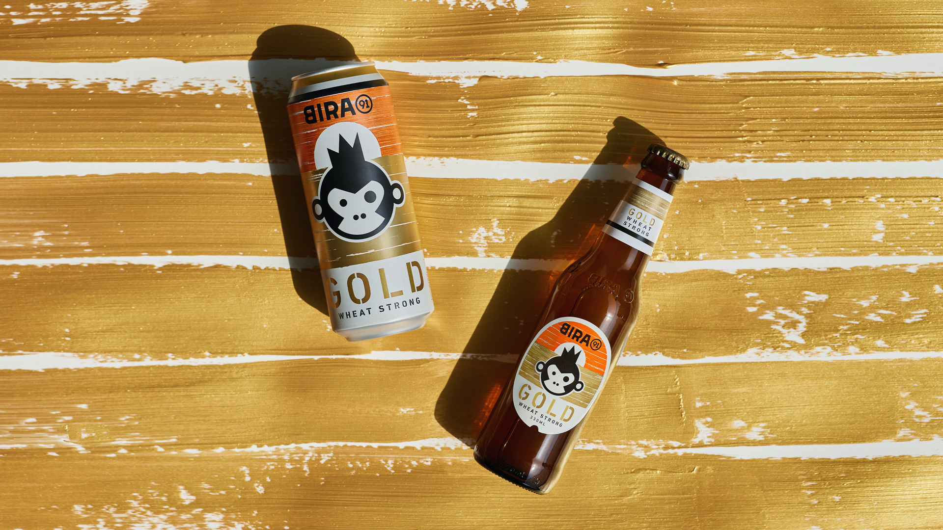
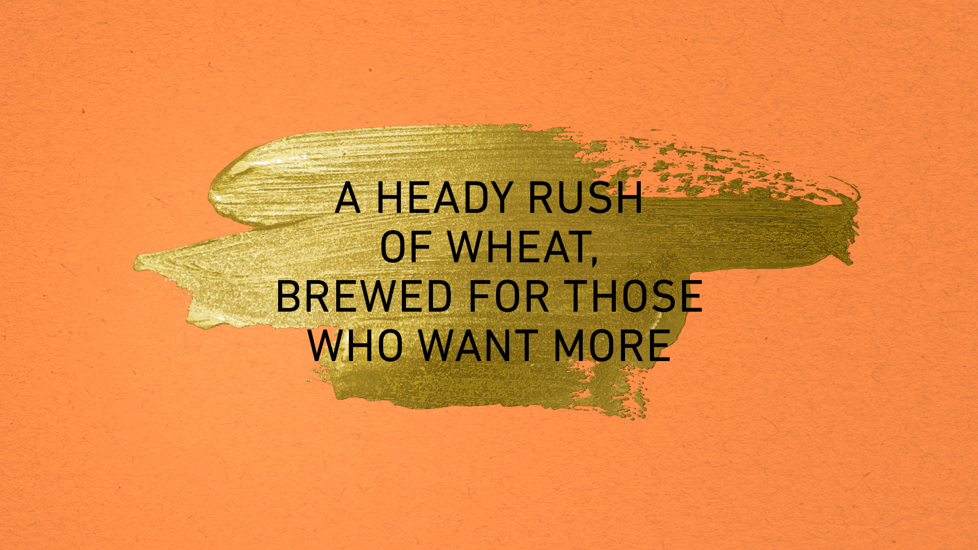
The hand-drawn gold brush strokes create a visual evocation of golden wheat fields across the product world.
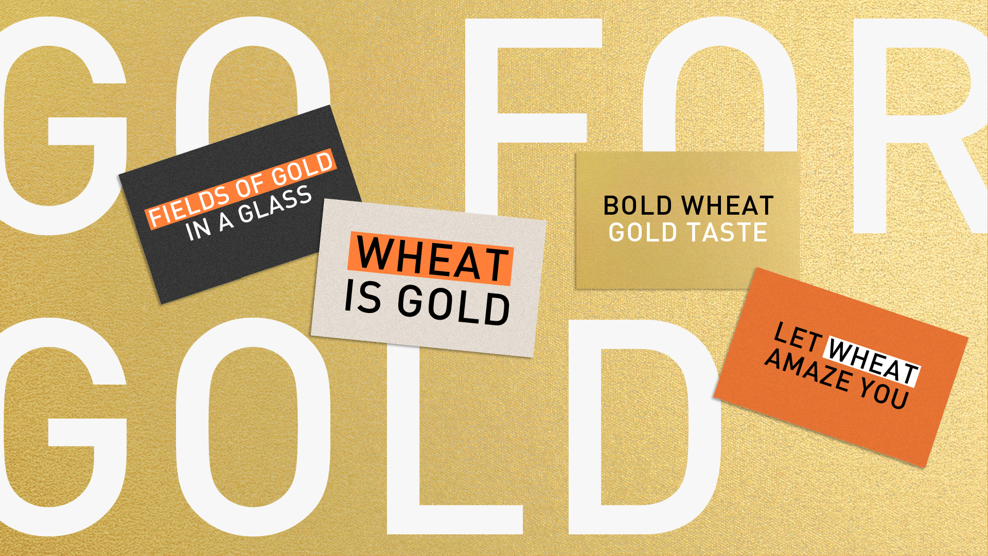
Bold Wheat, Gold Taste. The Bira 91 Gold brand is a fresh, playful voice in a category awash with aggressive posturing.
Cheers!
Team: Vishnu M Nair, Ved Uttam, Siddharth Nair, Rajesh Dahiya, Mohor Ray, Aayushi Katare
Product photography: Bira 91