Background
Breakthrough is a global human rights organization working to end violence against women by transforming the norms and culture that enable it.
Working towards a multi-channel campaign addressing sexual harassment, Breakthrough approached us with the powerful idea of addressing the apathetic bystander with the cliched (and problematic) point-of-view: She’s asking for it. The communication strategy behind the campaign, was to hold up a stereotypical phrase (asking for it) that is symptomatic of deep-rooted gender bias, and use it to both condemn the act of blaming the victim and also demand a positive action from the bystander.
Two Faces
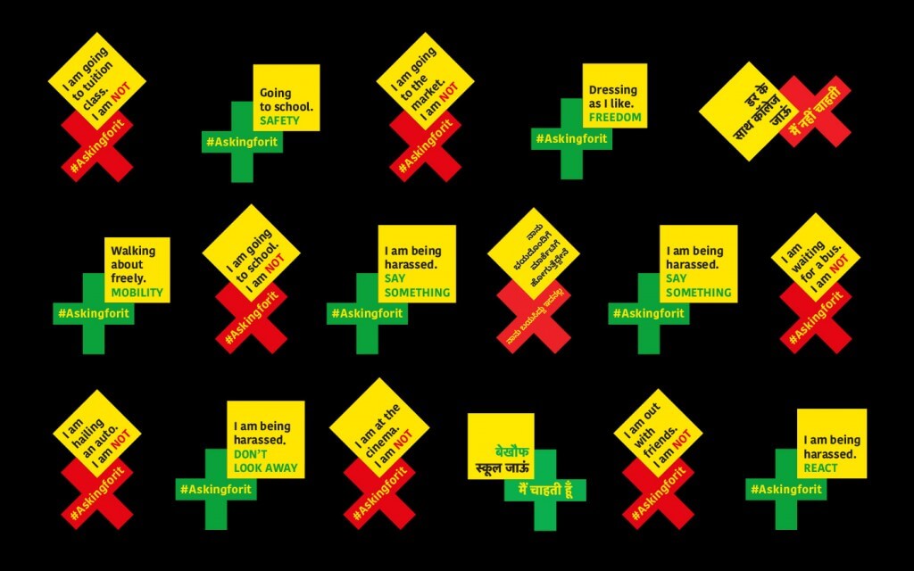
The dual connotation of the the campaign name ‘Asking For It’ presented an interesting challenge for identity design. Going through the plan for activation across media, we realised that both connotations were impactful in different settings, and there was merit in considering two avatars of the campaign identity with a strong central idea.
Our Approach
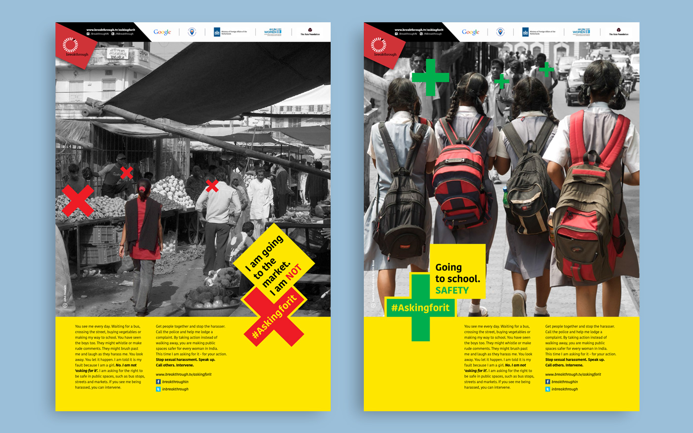
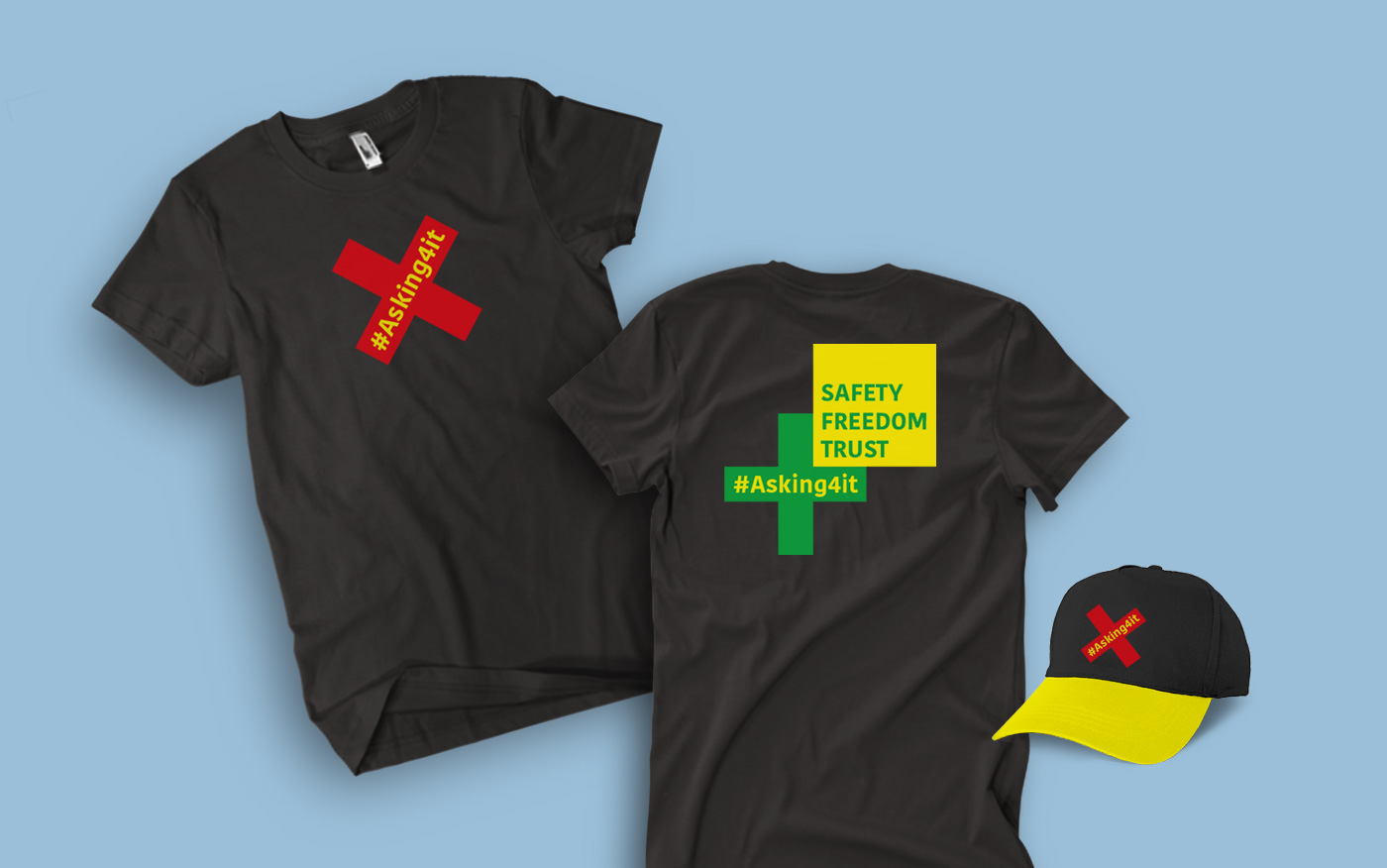
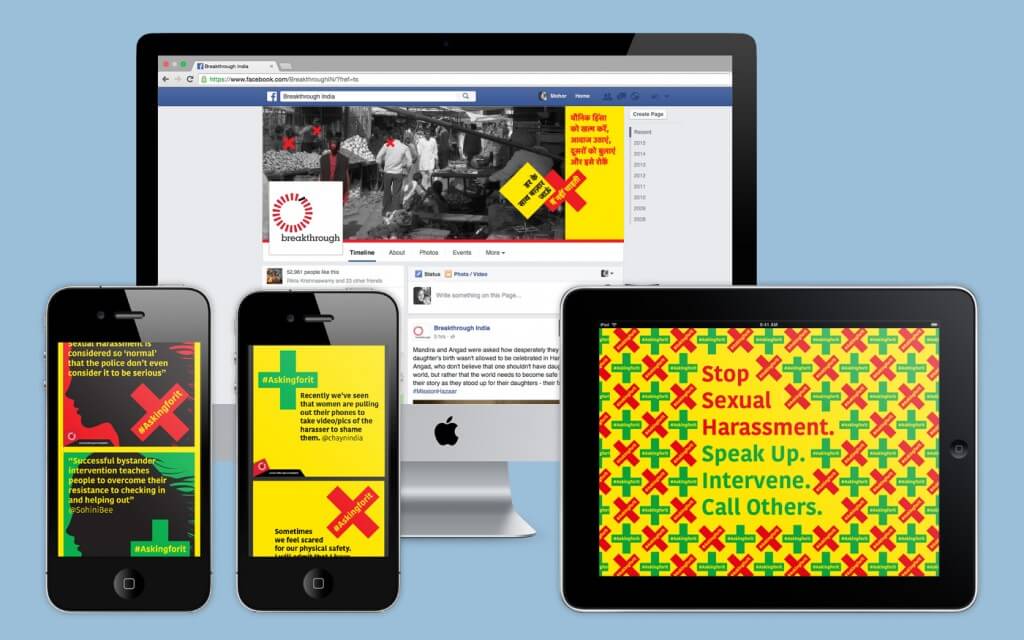
For us, ‘Asking For It’ was a powerful starting point, because it comes from everyday situations and conversations. Therefore our proposal for the identity focussed on drawing attention to what is being said, giving a voice to the sexual harassment campaign. We designed the identity to ‘talk’ and deliver key messaging. With this approach the identity moves beyond the role of a mark for recall, and becomes an active participant in conversations. Through its two different avatars the identity is able to reflect both negative and positive usages of the ‘asking for it’ phrase.
Conscious Design for Constraints
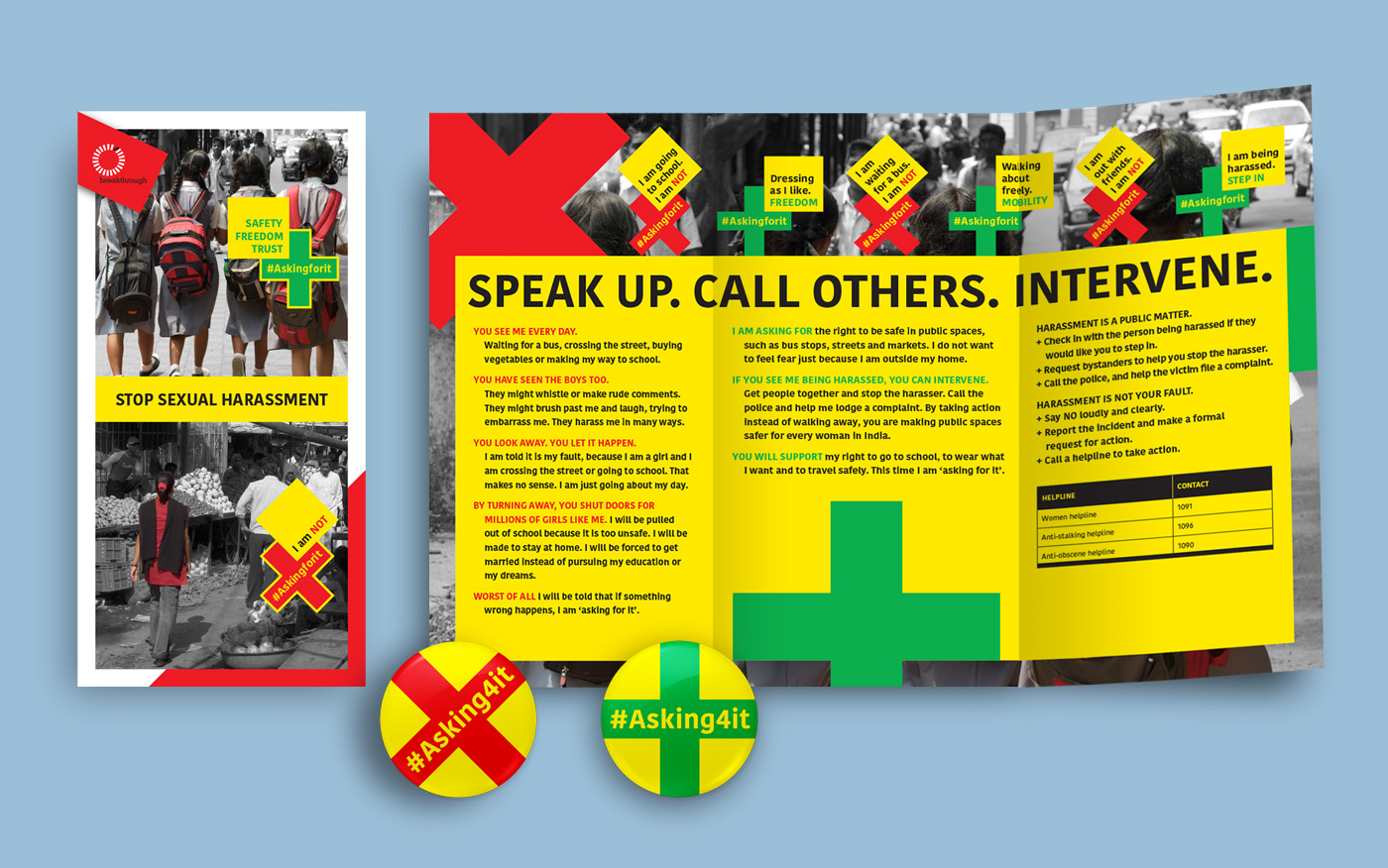
Mindful of the constraints on both resources and timelines for Breakthrough, our execution was planned to enable their project team, with simple and flexible guidance. The core identity unit was stripped to the most basic elements, ensuring that extensions into other languages in the future, would not necessitate any dependence on specialised design skills. The application of the identity was designed keeping in mind the absence of a highly controlled or systematic design of colateral. Used strategically the core identity elements retain the tone and intent of the campaign, despite differences in execution, imagery and media.
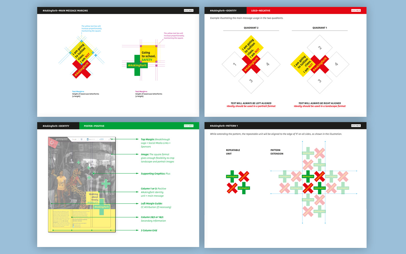
Guidelines for identity usage
Reach
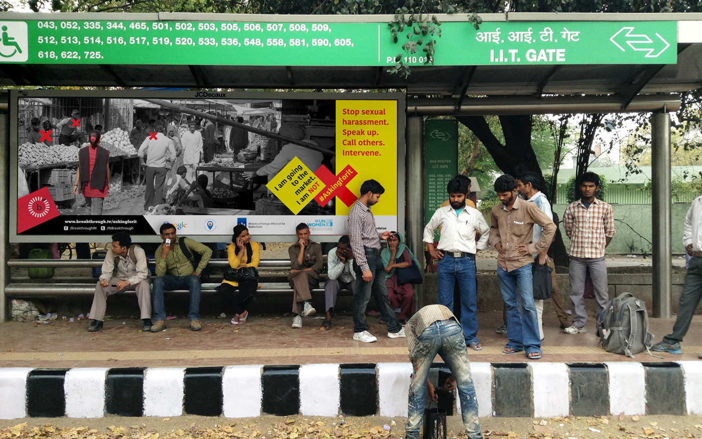
Within 3 months of launch in March 2015, campaign activation for #Askingforit was rolled out in 3 languages across 12 cities in 5 states, including Uttar Pradesh, Delhi, Haryana, Jharkhand and Karnataka. Within a year, the campaign is poised to reach close to 1.5 Lac people through on-ground activations and 0.5 Million people through digital media, across India.
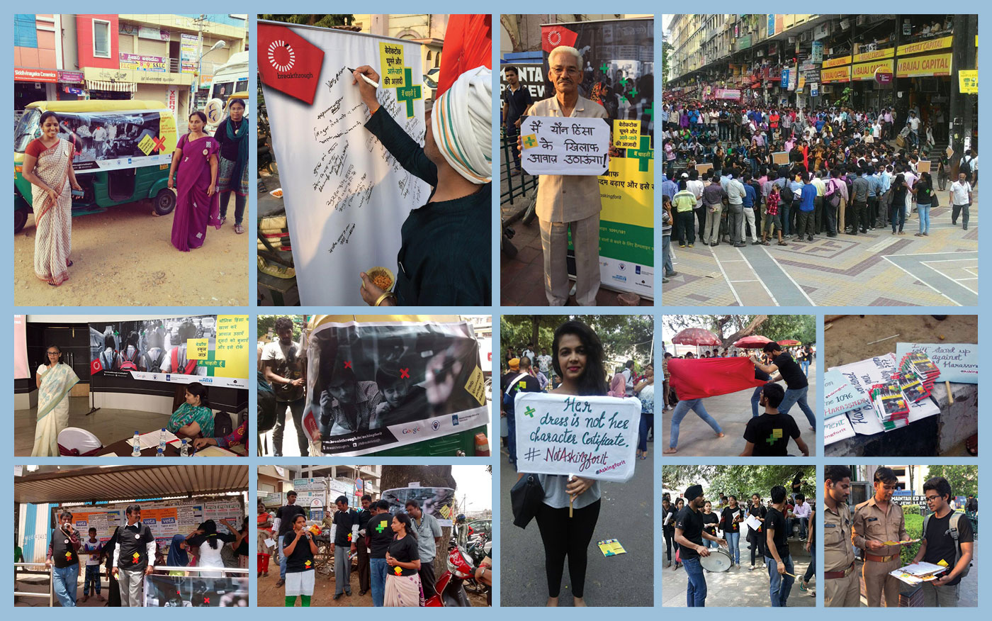
Images courtesy Breakthrough field teams.
Recognition
Visual Communication (Overall Category Winner), CII Design Excellence Awards 2015
Visual Identity (Winner), CII Design Excellence Awards 2015
Design For Good (In Book Winner), Kyoorius Design Awards 2015