A Human Face for Tech
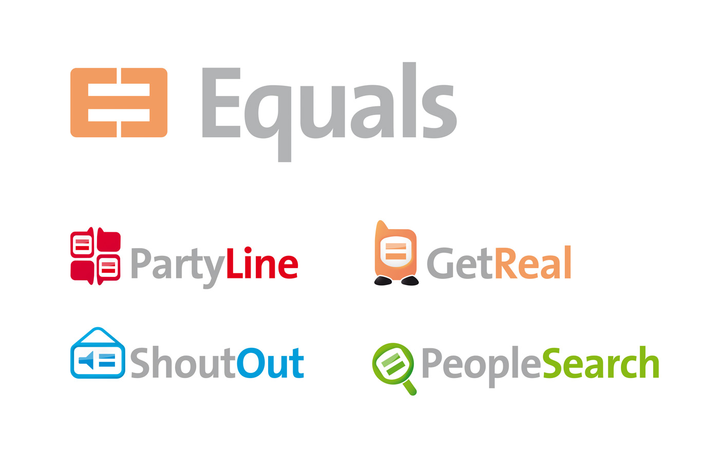
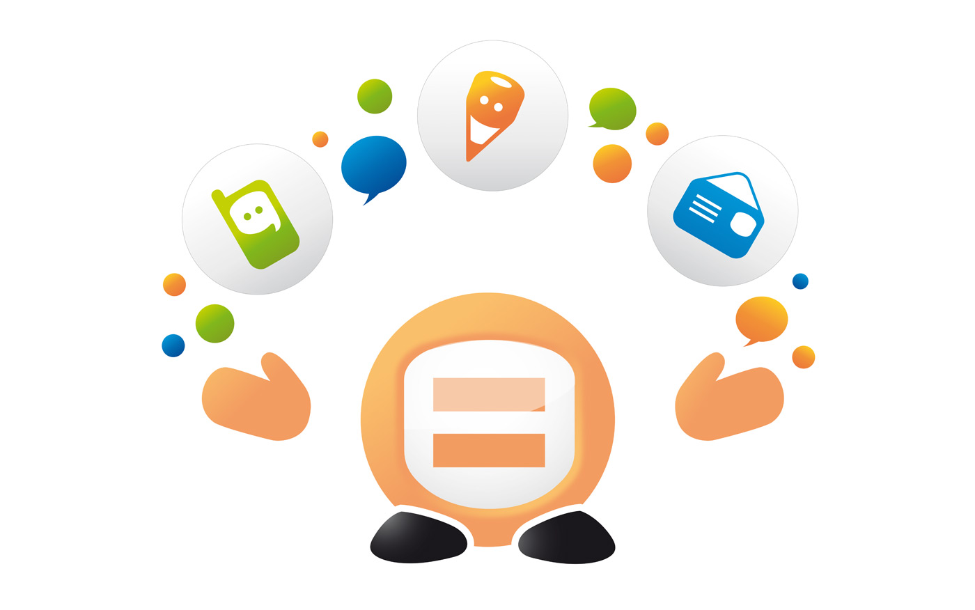
Equals is an umbrella brand for innovative technology products that enable smarter network-building with consolidation and control. The design development operated on two parallel tracks—Brand Identity and Design for Product/Services Development. Working simultaneously across the two workstreams, the learnings from one influenced the development of the other, and enabled the building of a consistent brand experience.
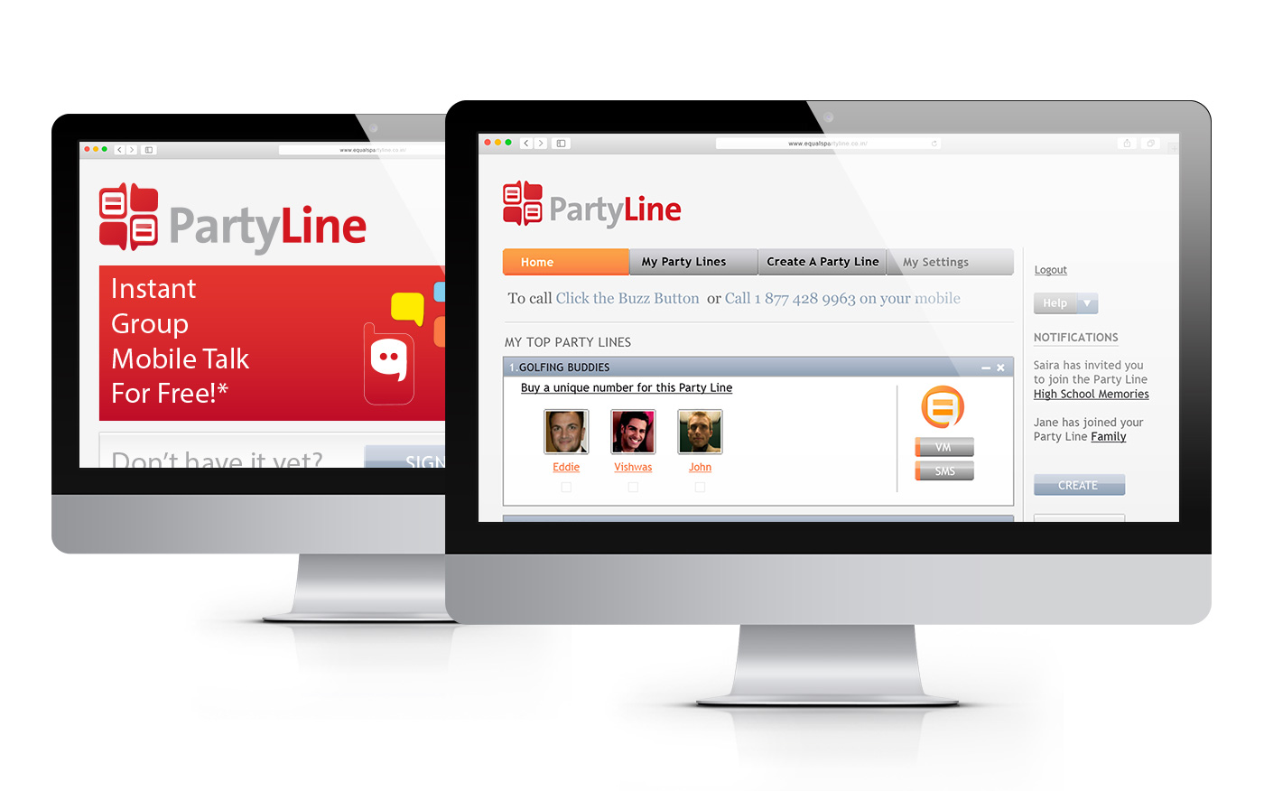
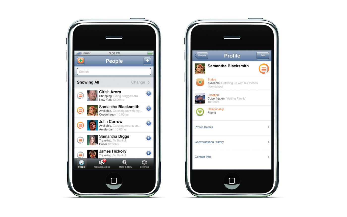
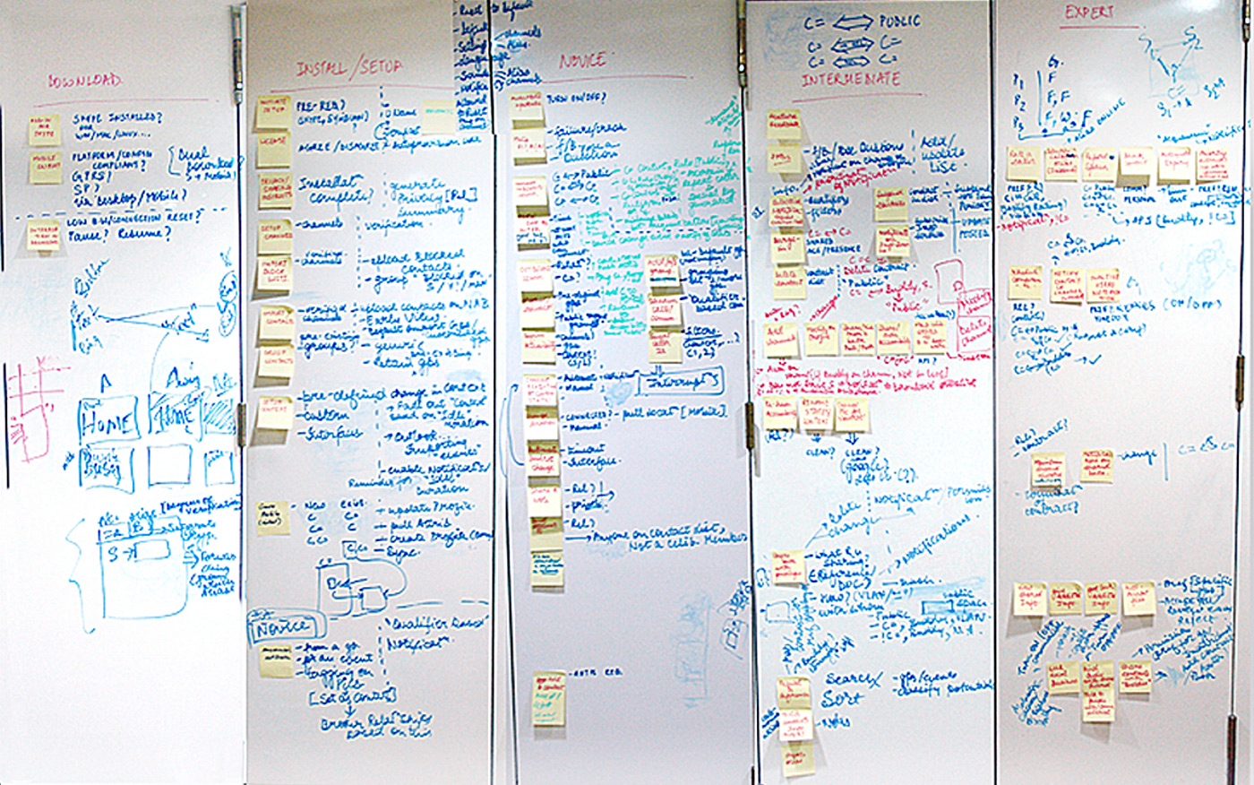
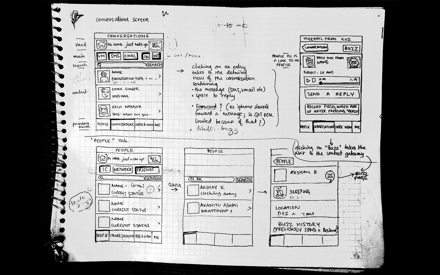
Our scope of work spanned the entire design and development cycle starting with Storyboarding and Quick Prototyping, to Wireframe Design, Usability Evaluation and Graphic User Interface Design.
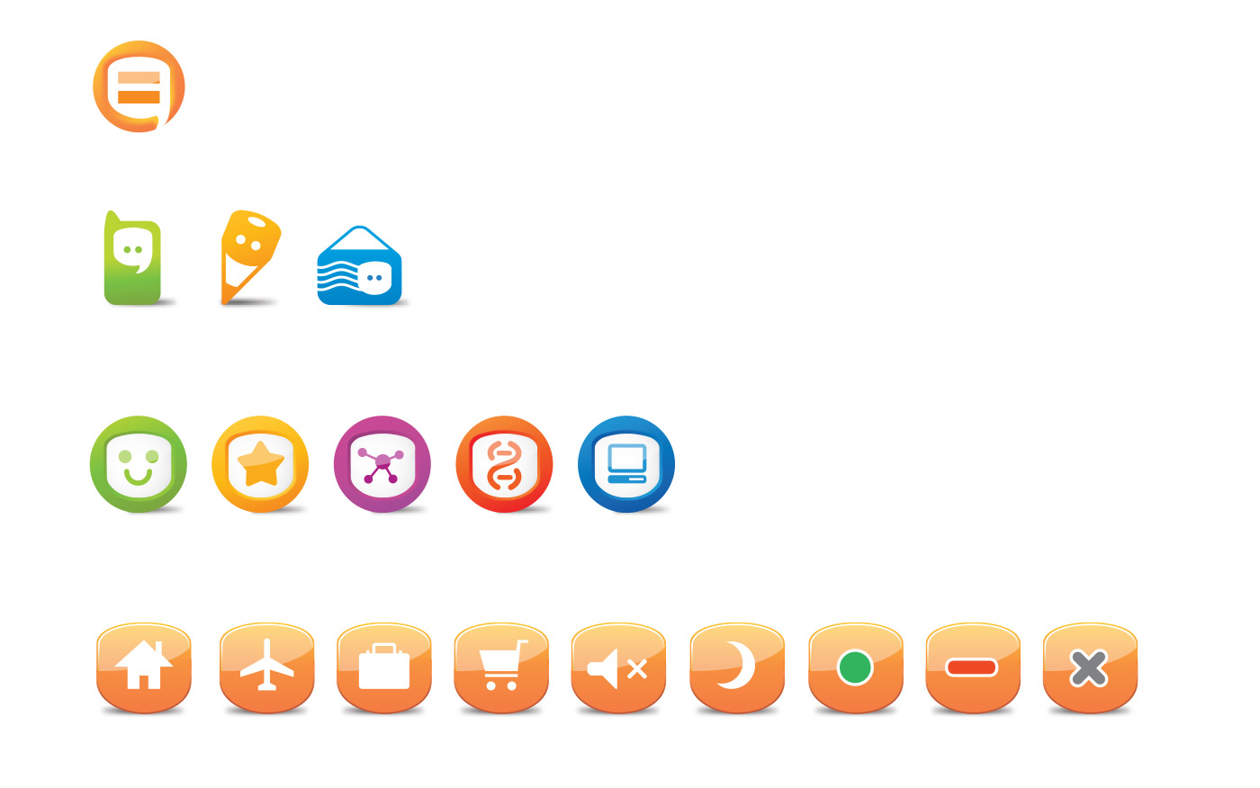
The identity for the parent brand aimed at humanising the face of cutting-edge technology into values that people care about. The Equals logo represents the emotional equality that an open network for communication creates. The visual identity for Equals evolved to express new services and products through the creation of a complete family of visual icons, product identities and product interfaces.